

This article is not a comprehensive guide to magnetic data processing using Geosoft Inc. Oasis montaj. Montaj is as big as the universe, and having used it almost every day for the past five years, I know 10% of its functionality or even less.
The power of the Oasis montaj is also its weak point. New montaj users spend much time bogged down in countless menus, commands, processing options, and settings. I hope this article will help beginners solve similar problems - processing aeromagnetic data for UXO (unexploded ordnance), tramp metals, underground utilities, archeology, etc.
The dataset used in this article can be downloaded here or by this link, if the previous one does not work.
Data was gathered using a MagNIMBUS magnetometer over the SENSYS - Magnetometers & Survey Solutions test range. Again, I would like to thank SENSYS for allowing us to test our magnetometer on their test range.
More or less, the same sequence can be used for any magnetometer data available as a CSV file with coordinates (longitude and latitude) and total magnetic field value. For vector magnetometers, only one additional step is required to calculate the total field from the x, y, and z components.
Note. I have intentionally used only the features available in the Oasis montaj base license (called "Oasis montaj Essentials"). Additional license modules will add many useful features, but the basic license is sufficient for most real-world use cases.
Note 2: I am not a geophysicist. I'm a software developer (in the past :-), and many of the advanced processing features in Oasis montaj are too complex for me. Therefore, I try to use simple and understandable methods.
Note 3: The article contains > 110 steps/screenshots. It looks like a very long and complicated procedure, but data processing takes me only 10 minutes. Manually filling out the target list takes longer, naturally in proportion to the number of anomalies detected. But in any case, it takes much less time than excavating targets... It's also good that most of the repetitive operations can be scripted, but this could be the topic of a separate article.
So, let's begin!
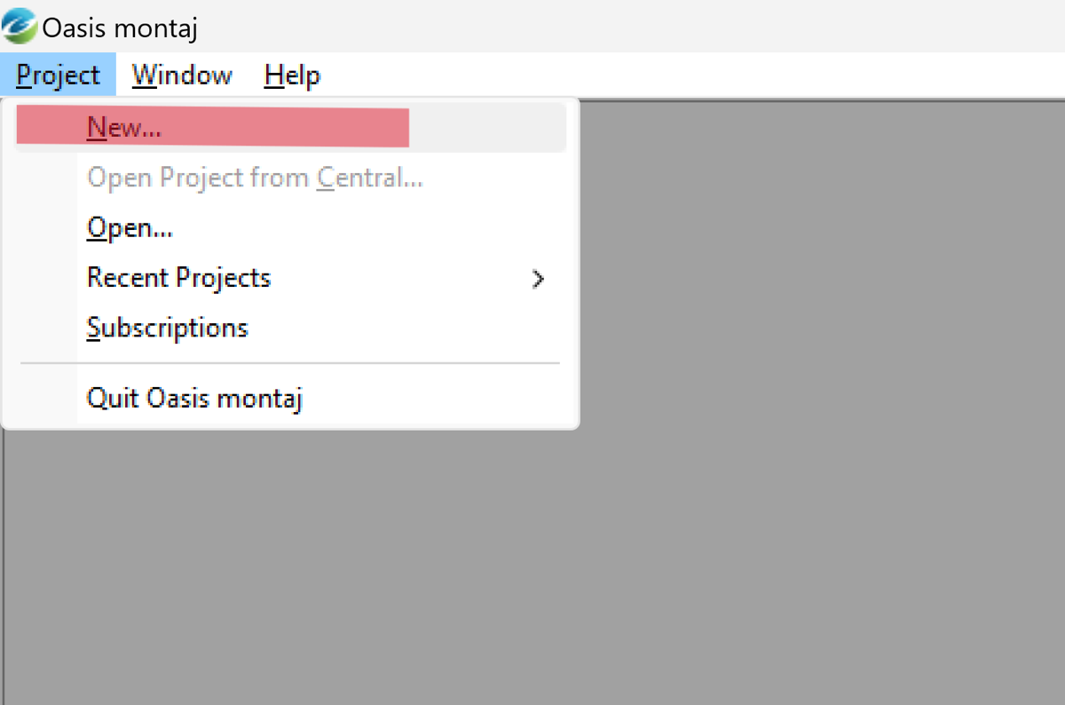
Start Oasis montaj & create a new project
- Select Project -> New…
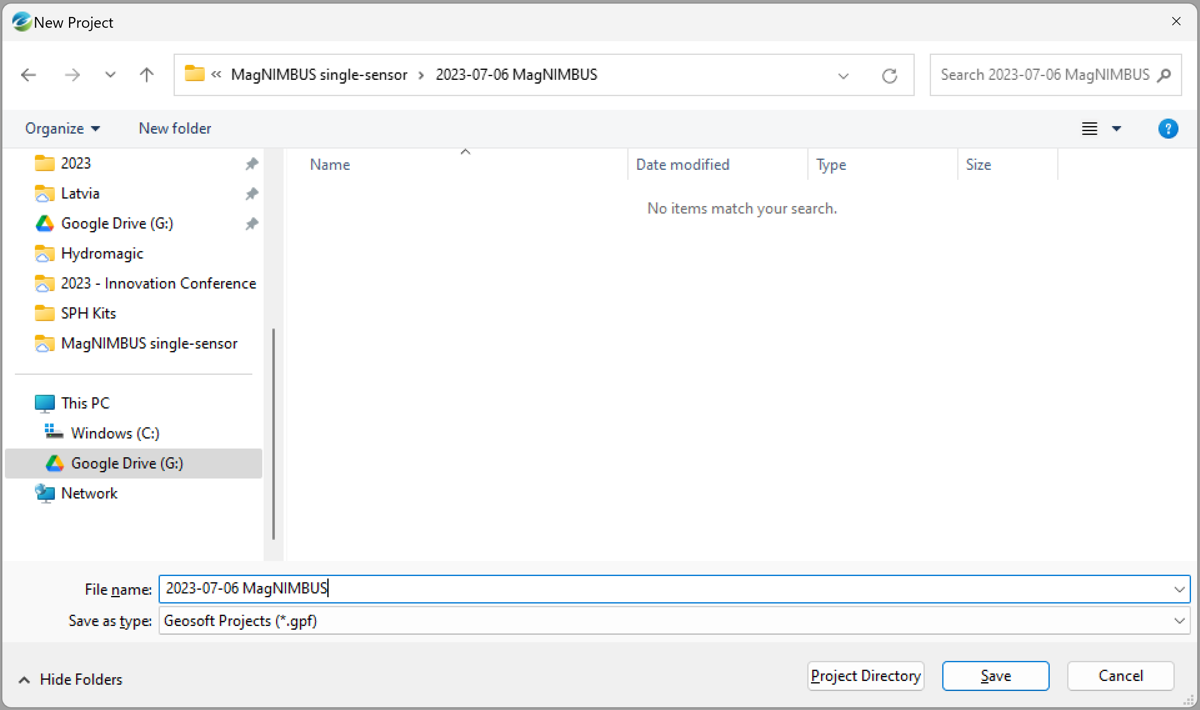
- Select a folder for the project and enter a name for the project file. Montaj will generate dozens of files, so creating the project in a directory other than your original data files is best.
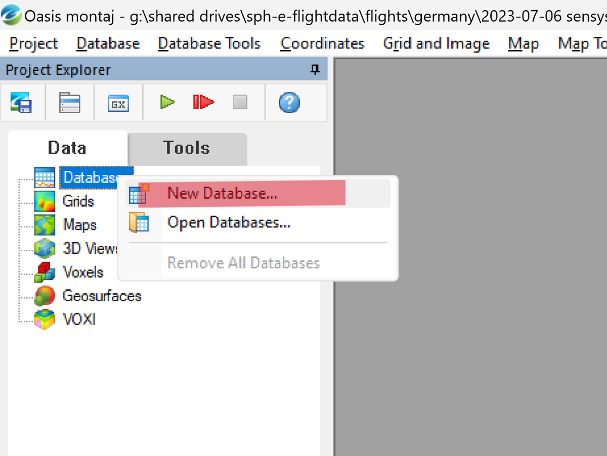
- Create the database for your data. Right-click the Database node in the Project Explorer and select New Database.
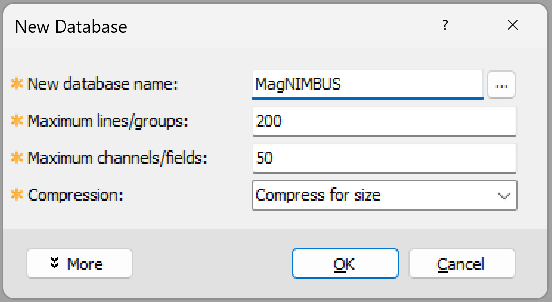
- Enter a name for the new database, leaving the rest of the fields as default, and click OK.
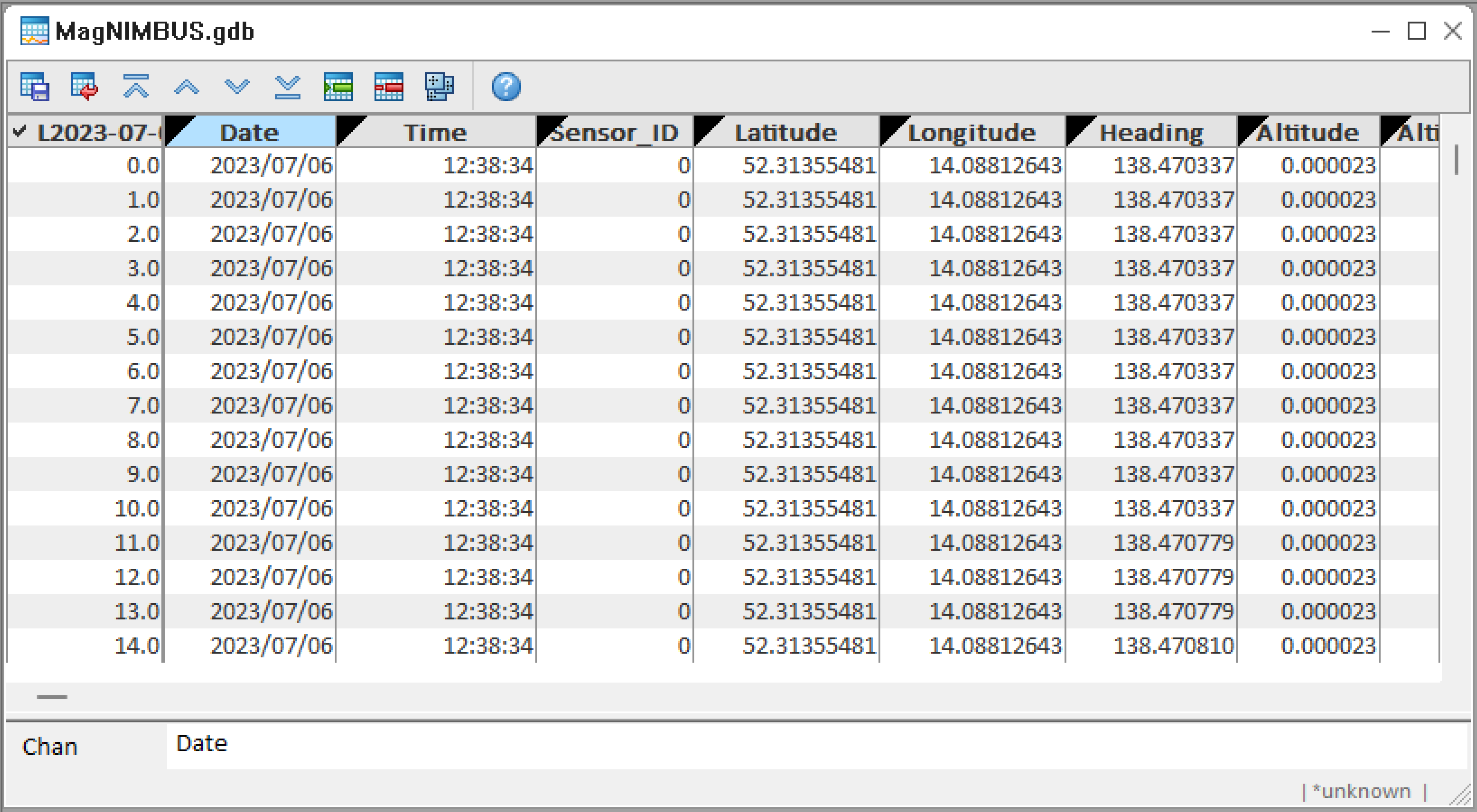
A new empty database window will be displayed.
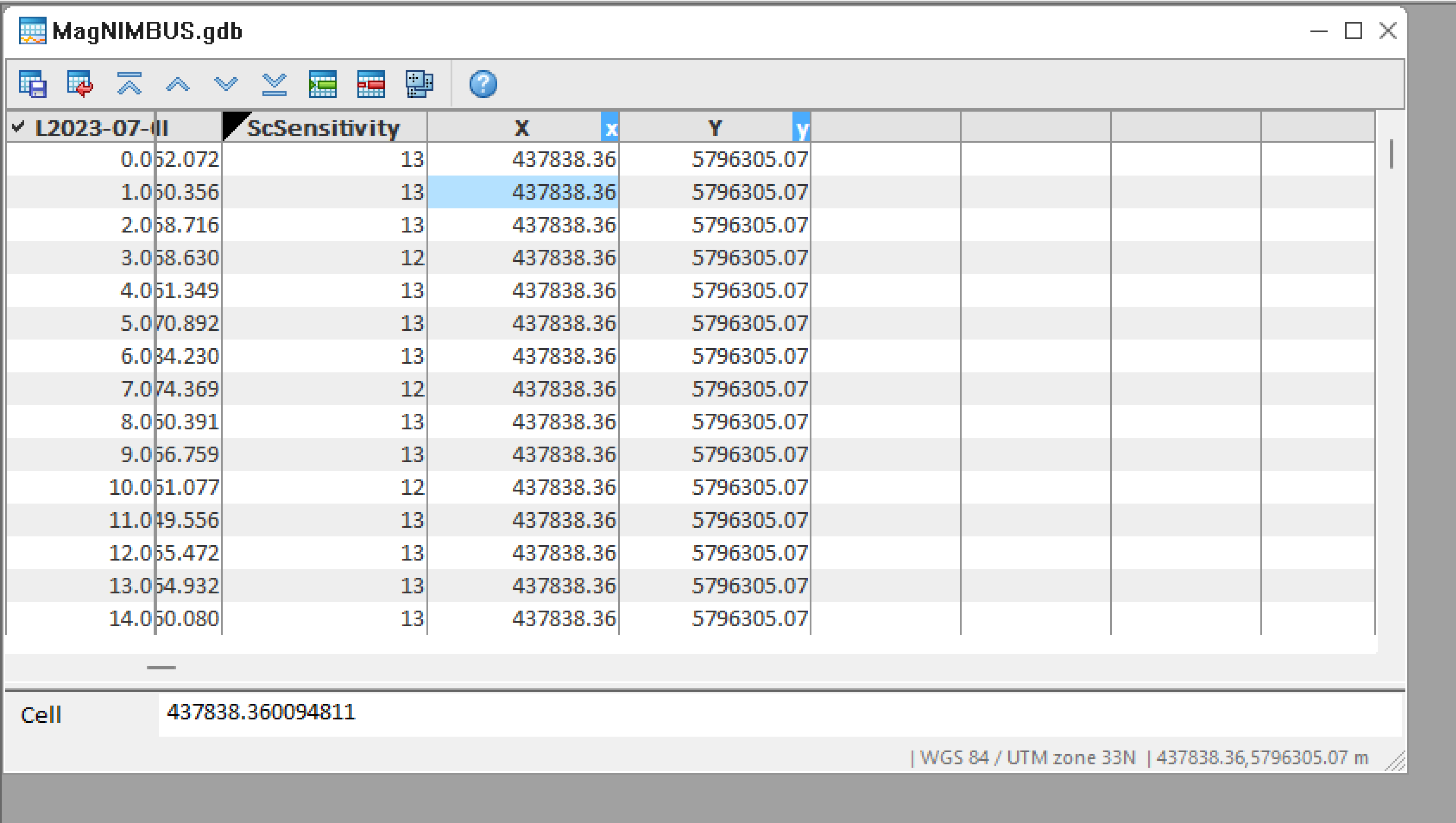
5. Import magnetometer data. Select Database -> Import -> ASCII.
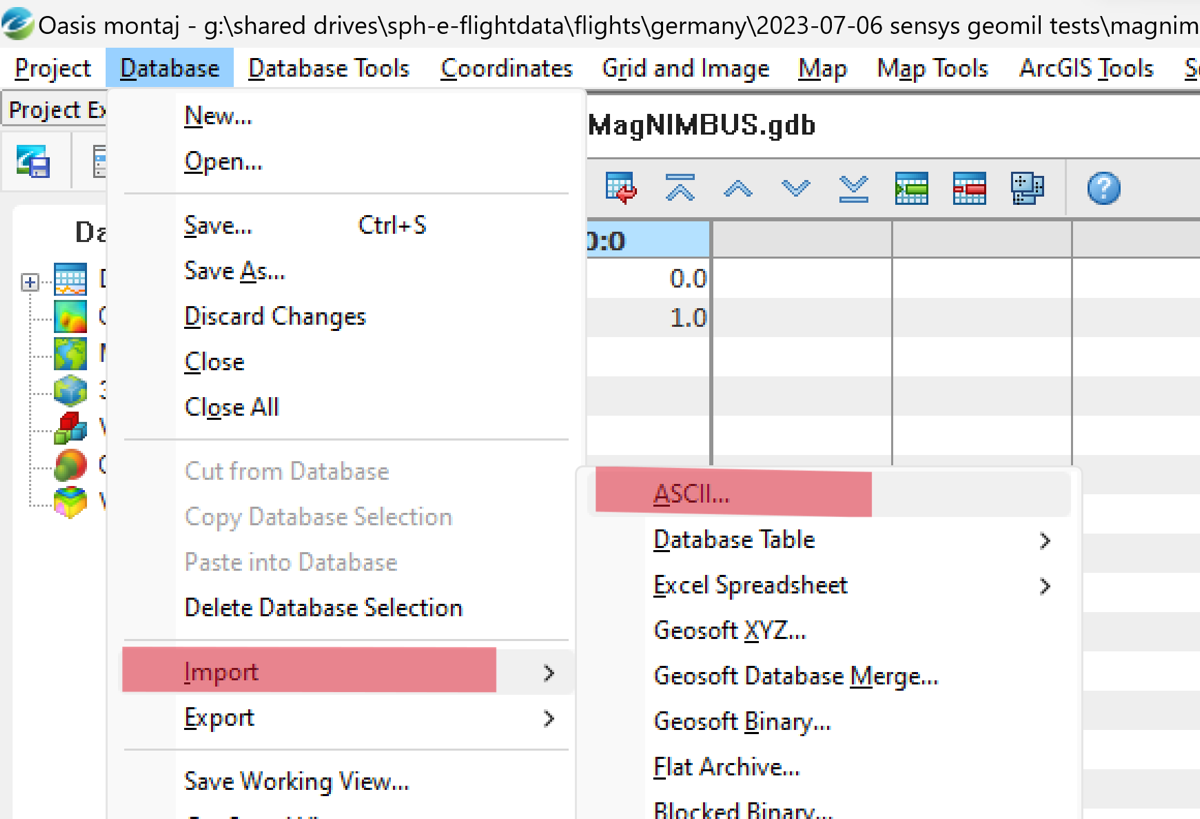
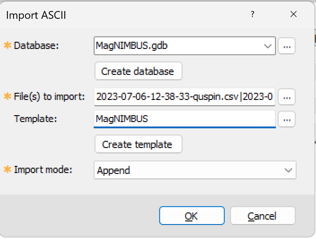
- Make sure the database is selected, and then select the data files. Our demo dataset contains two files: 2023-07-06-12-38-33-quspin.csv and 2023-07-06-13-12-39-quspin.csv, select both. Enter the template name (you may reuse it next time for the same type of data files) and click Create a template.
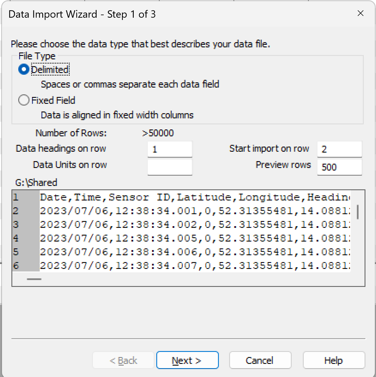
- Click Next
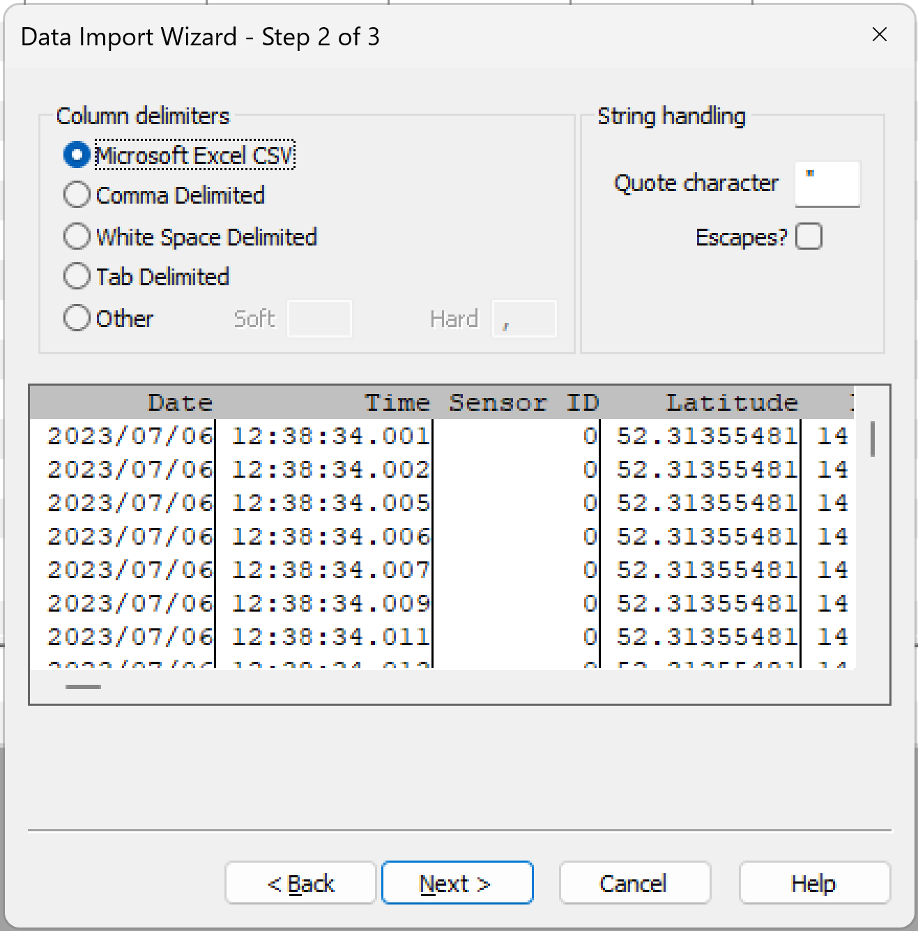
- Next…
- Finish...
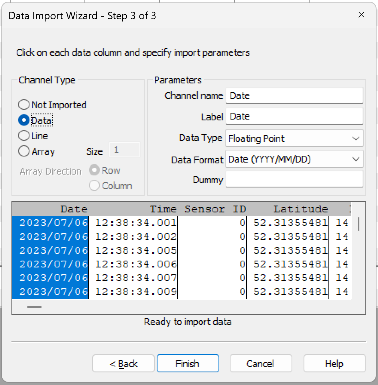
- Finally, click OK on the Import ASCII dialog box. The database will be populated with data from the files.
Setting projected coordinate system
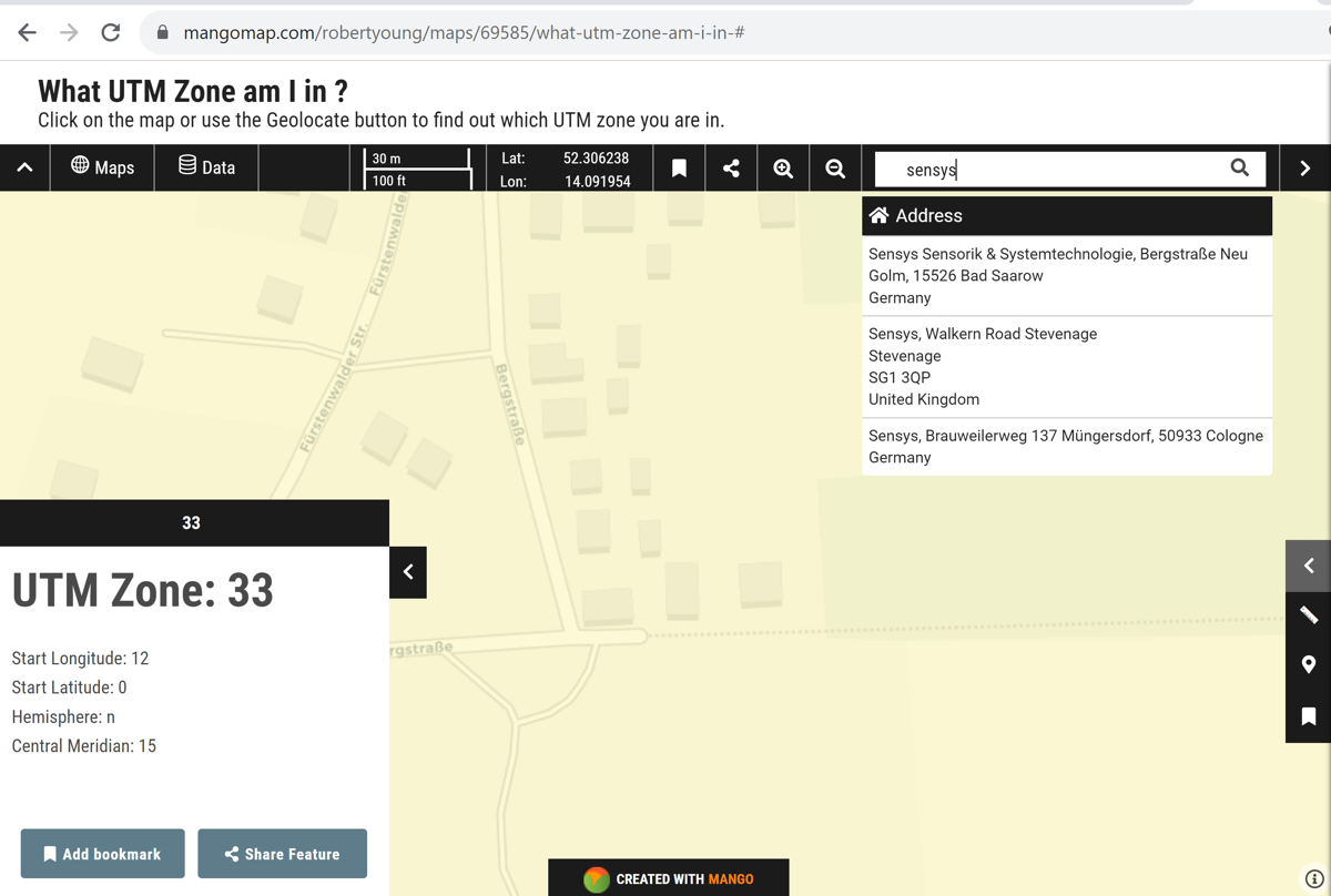
Our source data has latitude/longitude coordinates for every magnetometer measurement. Montaj requires a projected coordinate system for further processing. Here, I'll use UTM - quite a popular global projected coordinate system. As I often don't know the UTM zone for a particular survey area, I use "mangomap" site to find the UTM zone using the address or lat/lon coordinates.
SENSYS office is in UTM zone 33N:
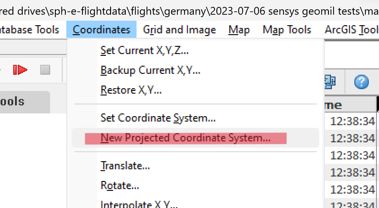
- Select Coordinates -> New Projected Coordinate System.
- Select the Longitude & Latitude field and click Next.
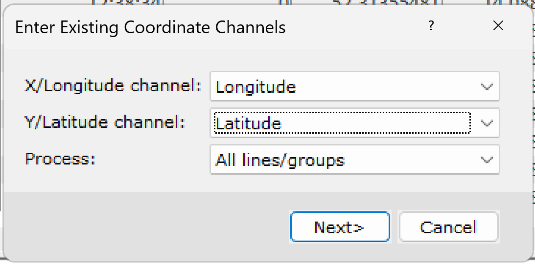
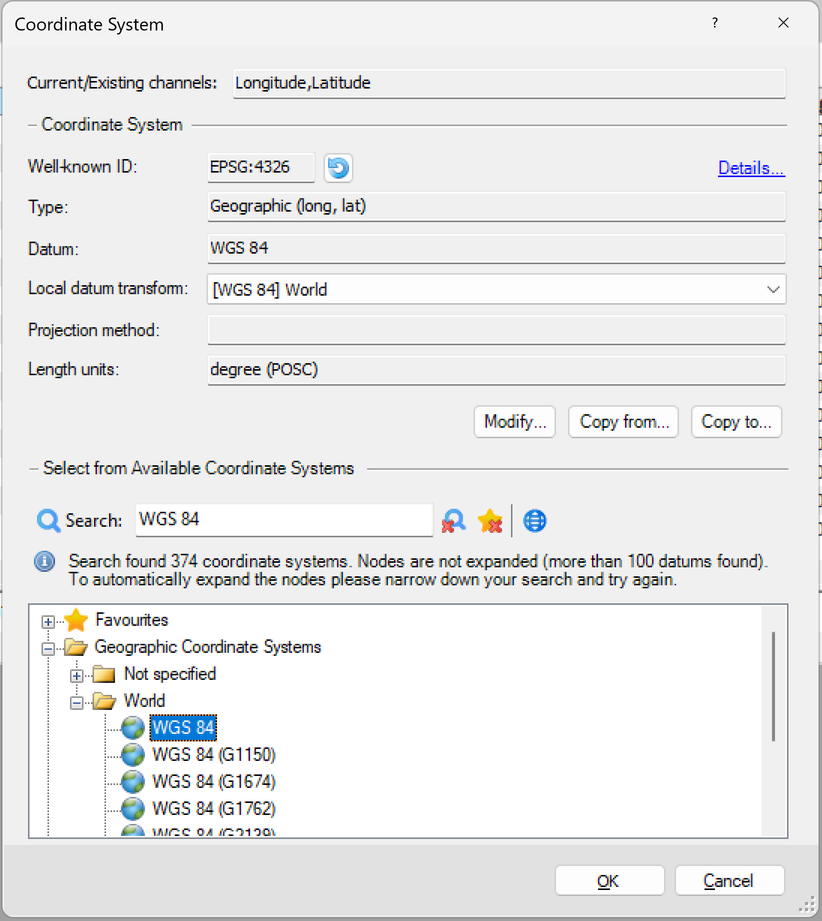
- Our data is geotagged with coordinates from the GNSS receiver of the drone, so find & select WGS 84 and click OK.
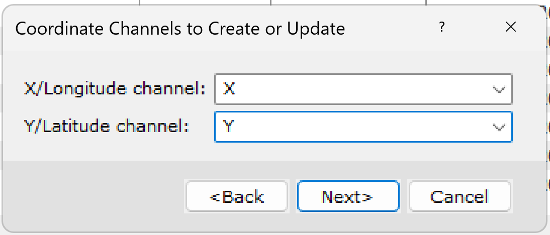
- Enter columns (channels in Oasis montaj terminology) names for storing projected coordinates and click Next.
- Find and select "WGS 84 / UTM Zone 33N" and click OK.
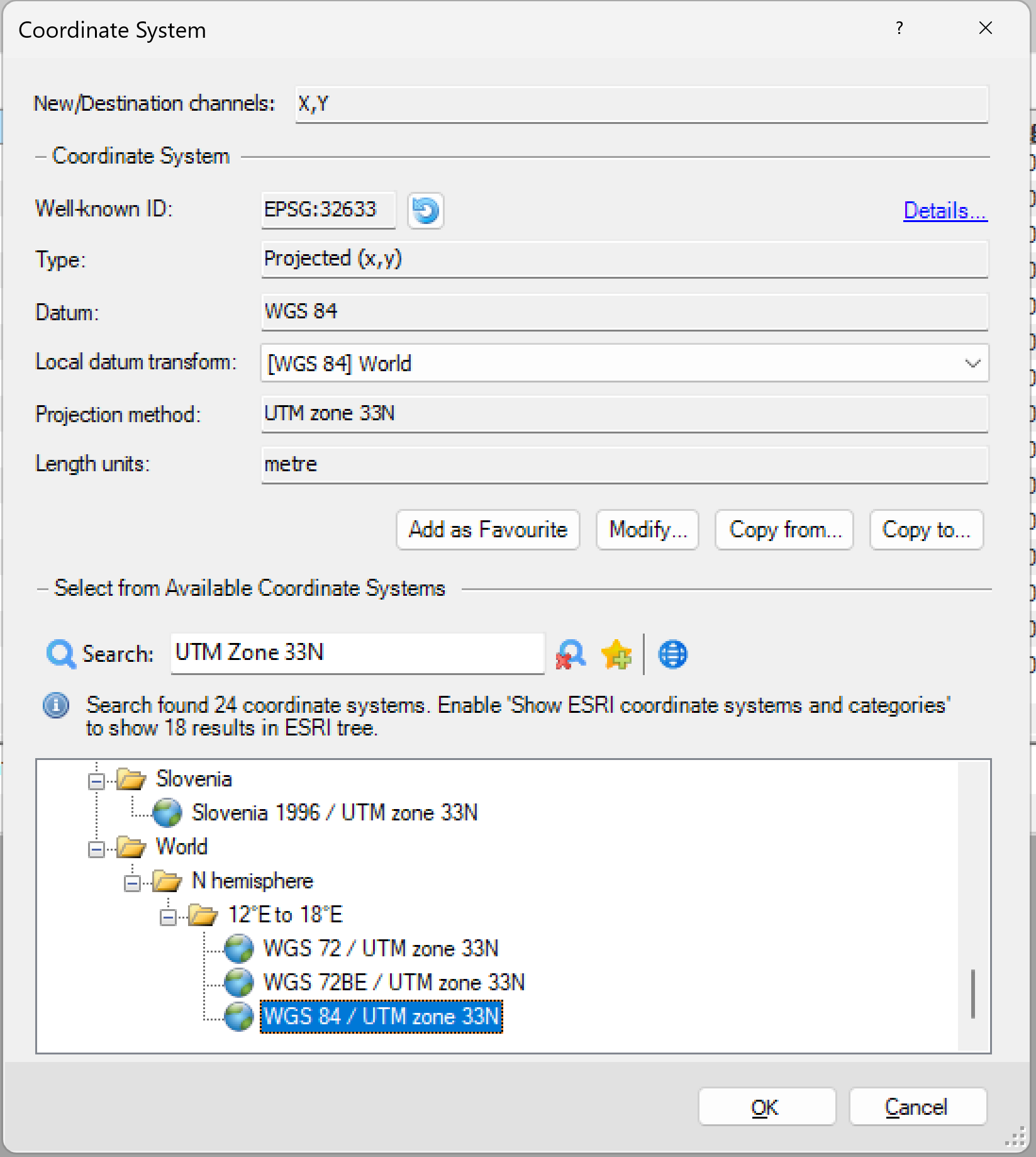
Now, you can see the X and Y columns (channels) in the database.
Let's start processing: removing hi-frequency noise
The presence of high-frequency noise is typical for airborne (drone-mounted) magnetometers due to the proximity of the drone's motors and electronics, so the first step in processing is usually to remove this noise.
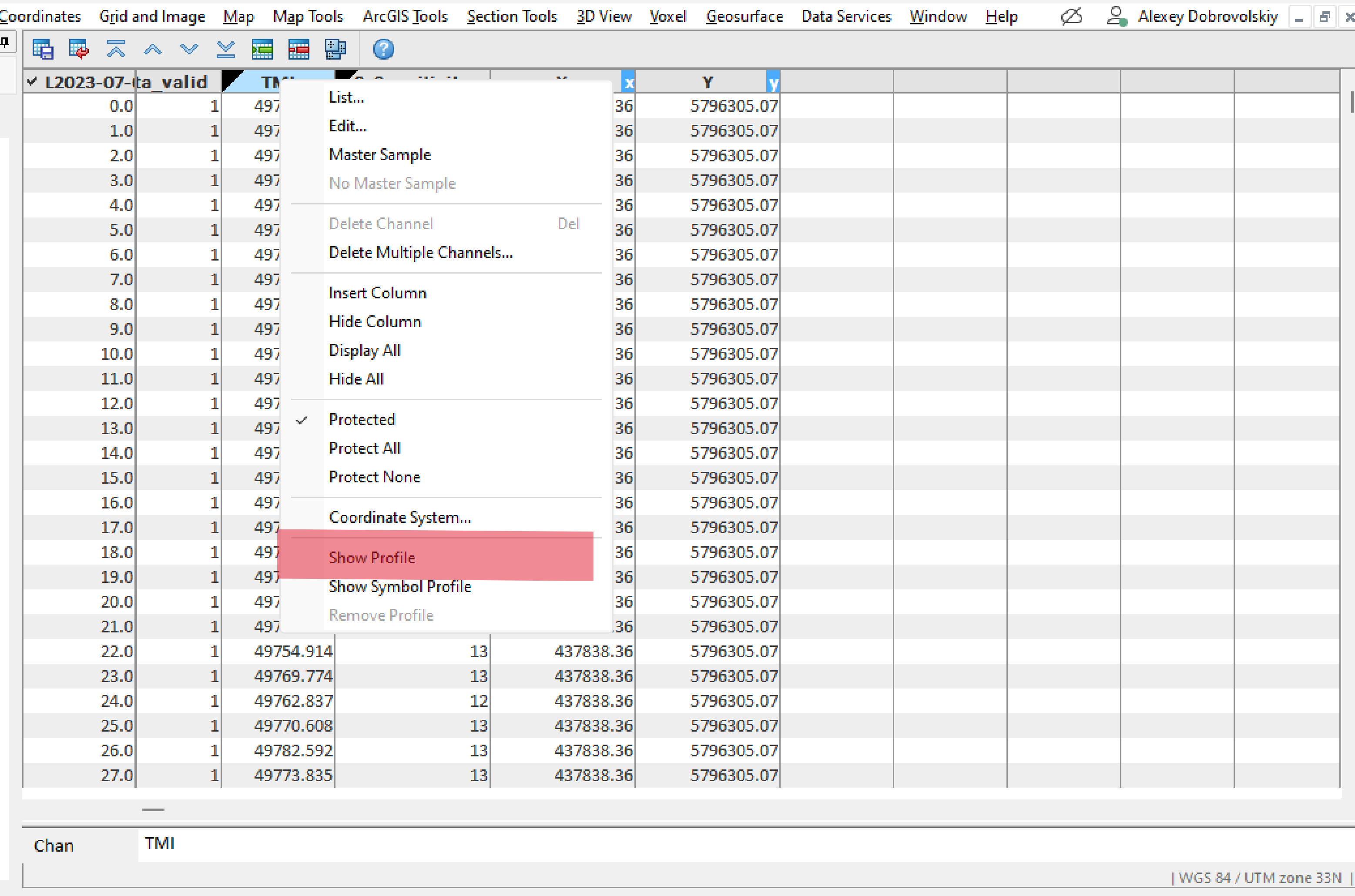
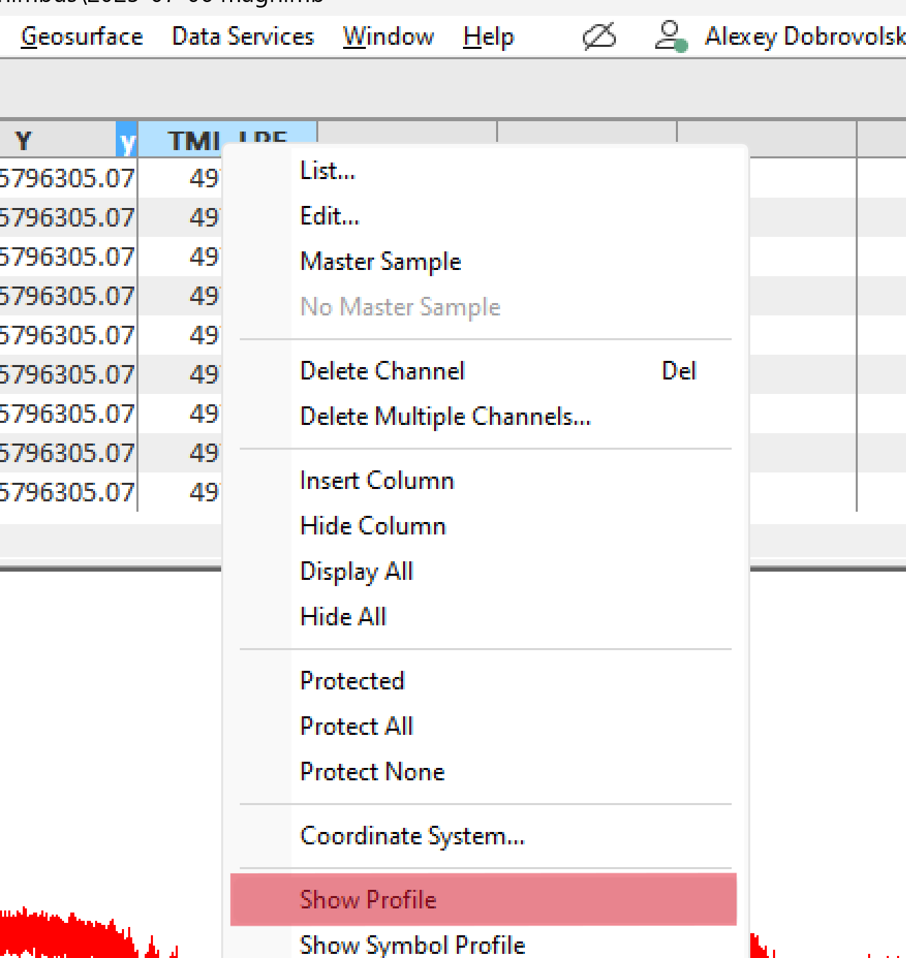
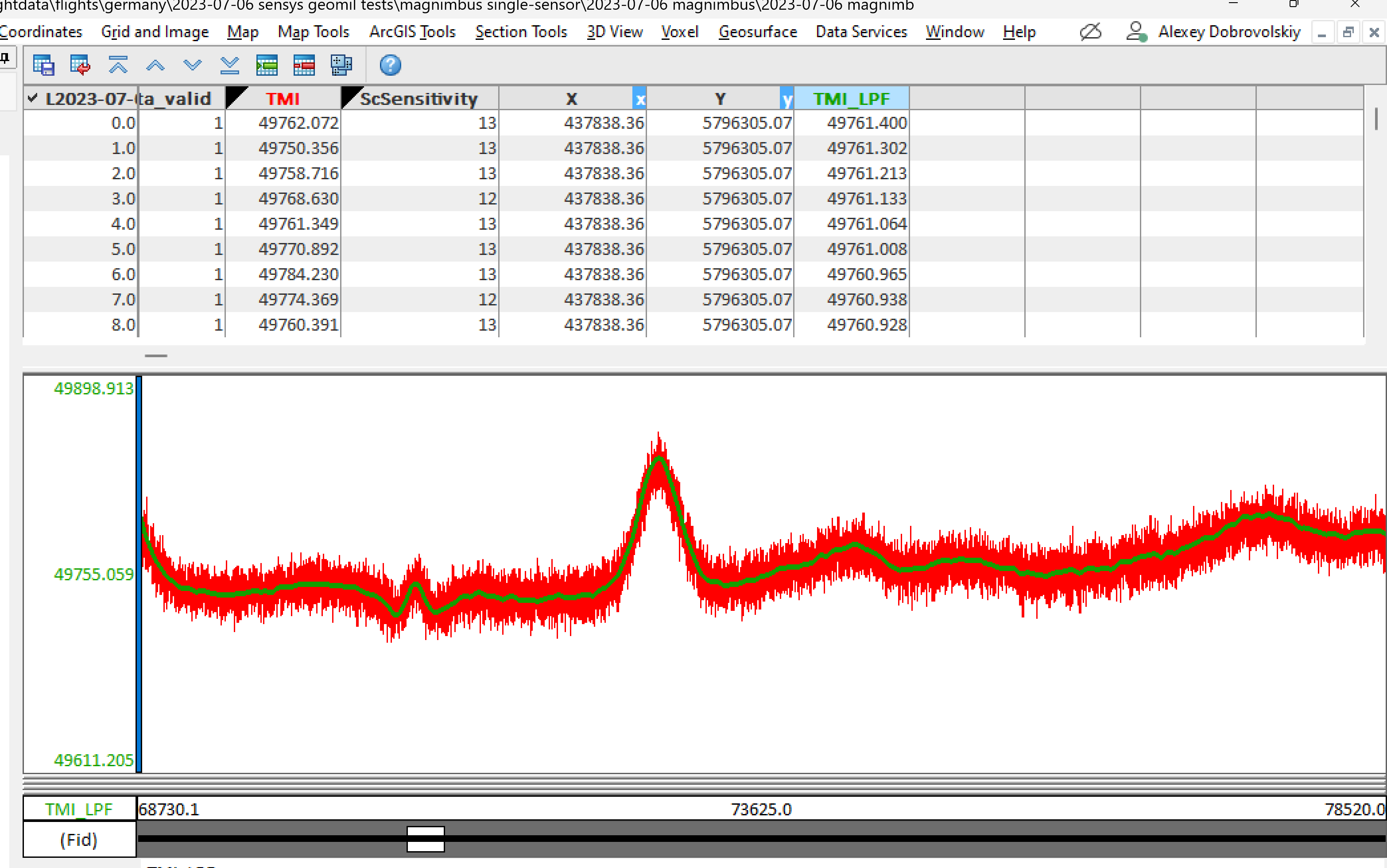
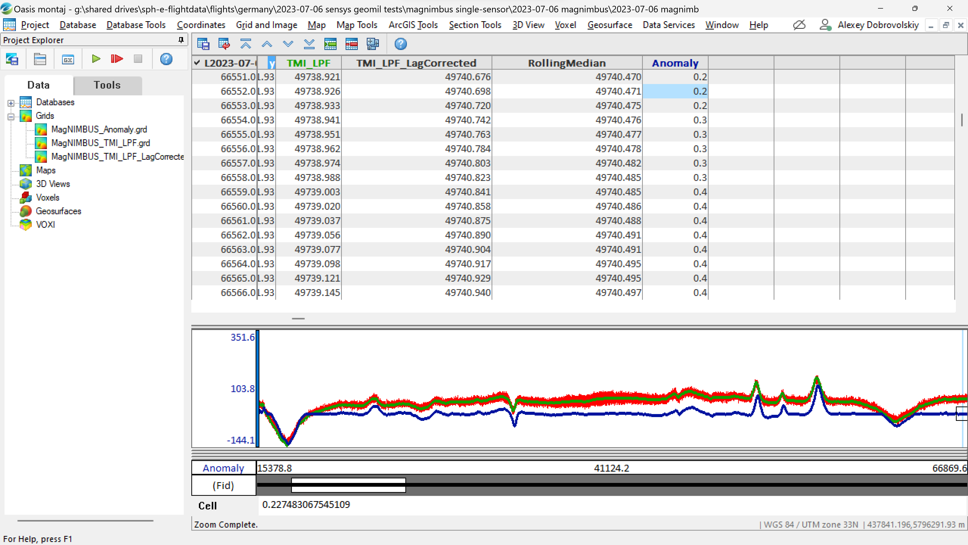
- Right-click the "TMI" column (channel) header and select "Show Profile." TMI stores raw data from the magnetometer sensor.
- A graph of TMI values will appear. As this graph is for the entire data file, select part of the graph. Right-click in the graph area and select Zoom.
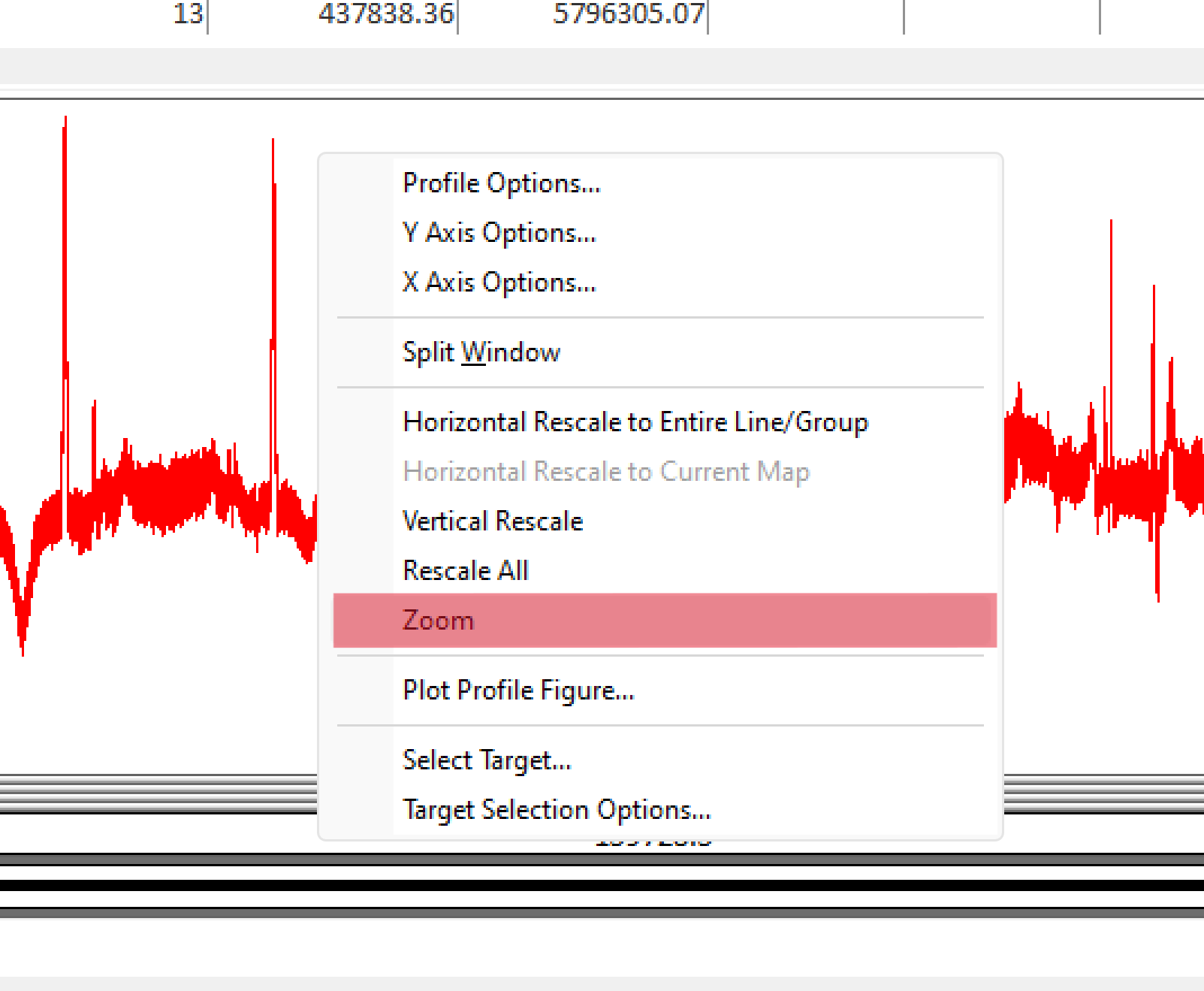
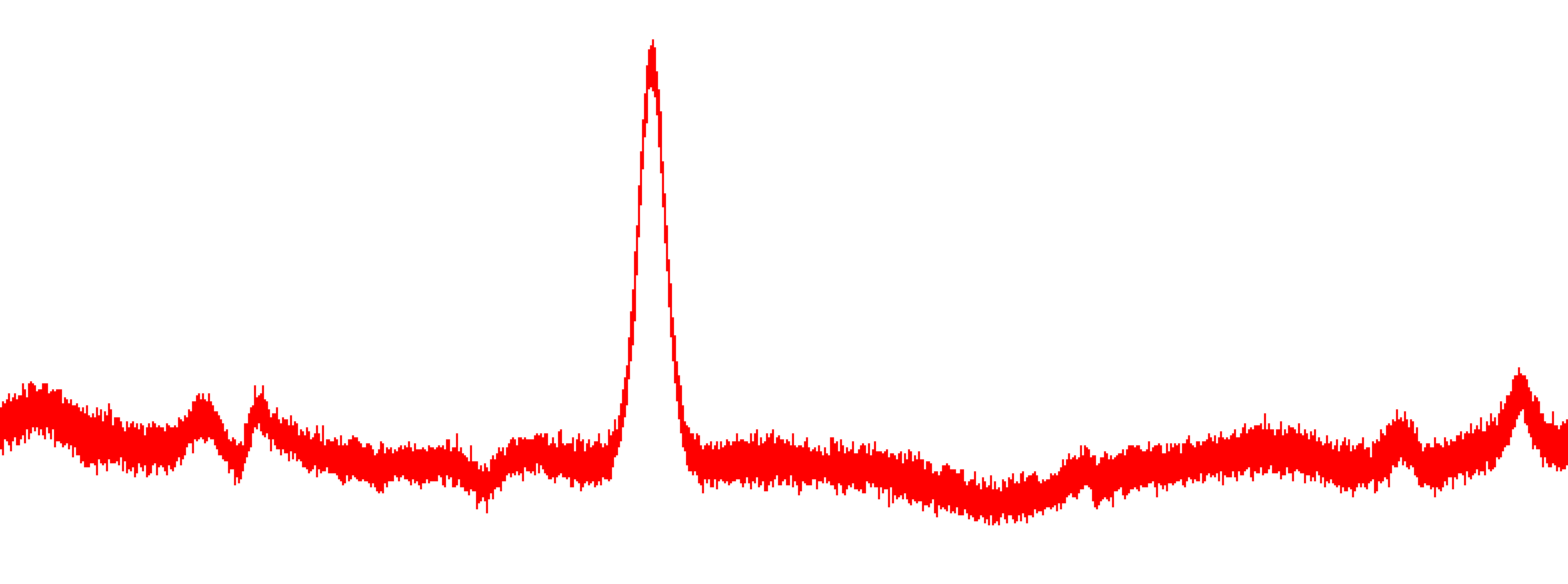
- Select some part of the graph using the rectangular selection tool and click again. You will see a rather noisy picture.
- Select Database Tools -> Filters -> Low Pass Filter.
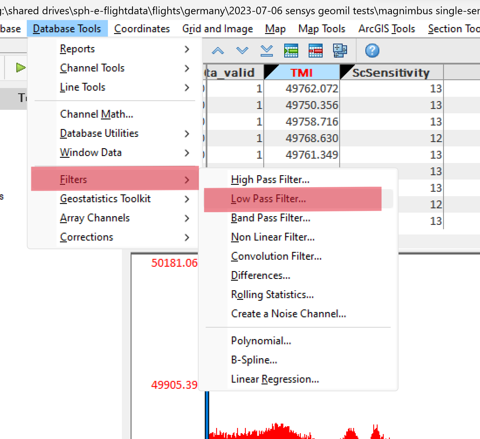
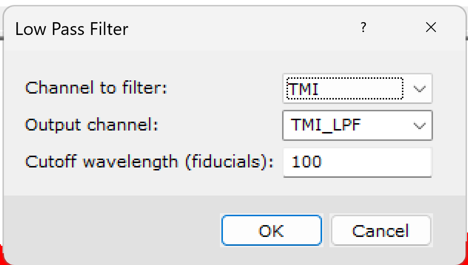
- Select a TMI channel and enter a name for the new channel to store the filtered data. I usually use the name of the original field with a postfix reflecting the filter/transformation/algorithm applied. Since I'm too lazy to write down the processing sequence, this approach helps me remember what I did with the data in this project after some time.
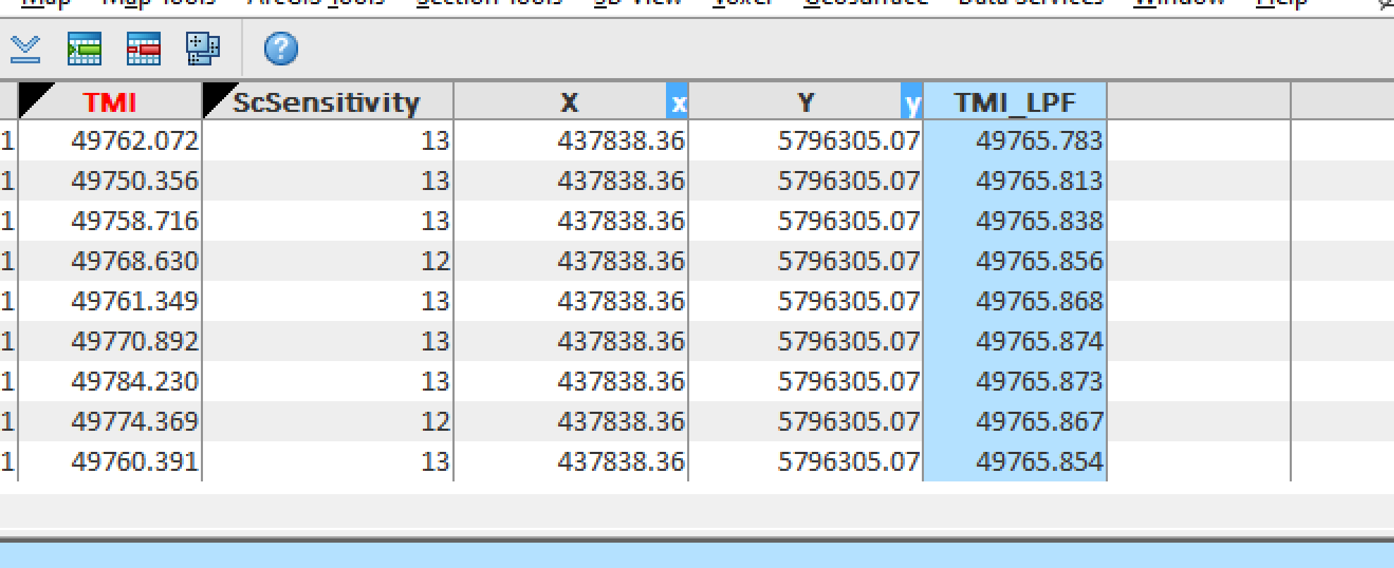
- Right-click the channel name and select Show Profile.
You will see a graph of the filtered data. Here, you can experiment with different low-pass filter cutoff values to see how they work. 100 is a very reasonable value for this data set collected at a sampling rate of 500 Hz.
GNSS time lag correction
Data in this dataset is geotagged using a coordinates stream from the GNSS receiver of the drone. As data comes a long way from the GNSS receiver through autopilot, its extensibility port, SPH Engineering's SkyHub onboard computer, will always be some offset between moments when the magnetometer outputs its measurements and when coordinates will come to the data logging code. Magnetometer data also comes through a few hardware/software interfaces inside of the system.
GNSS lag is not a MagNIMBUS-specific issue - it exists in all complex systems, and all processing software packages, not just Oasis montaj, address this issue.
Let's compensate for the GNSS lag in our dataset.
- The first step is to visualize (grid) magnetometer data as-is. Select Grid and Image -> Gridding -> Grid Data.
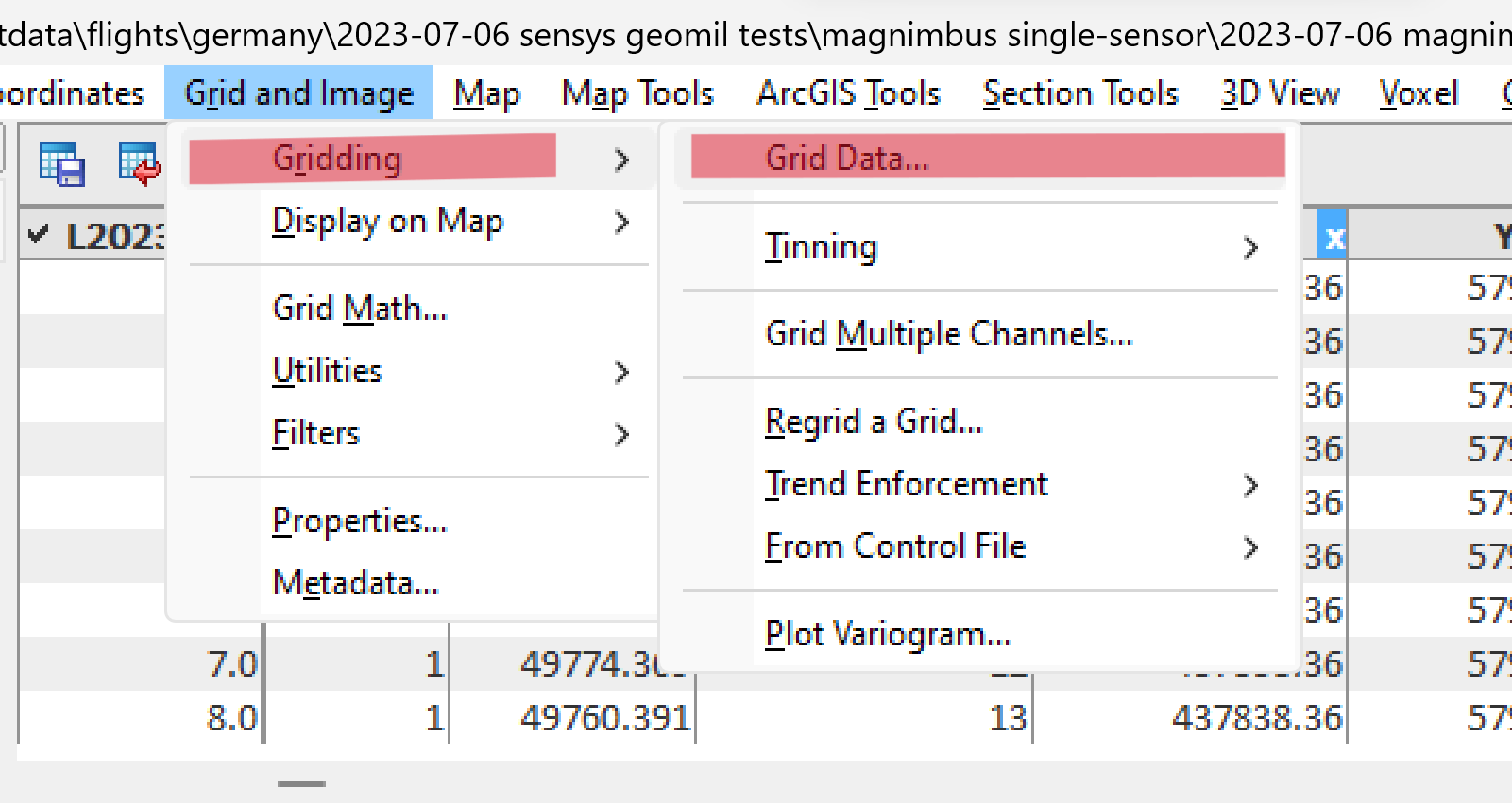
- Select the TMI_LPF channel in the Data to grid field, enter 0.1 as Cell size, and one as Blanking distance.
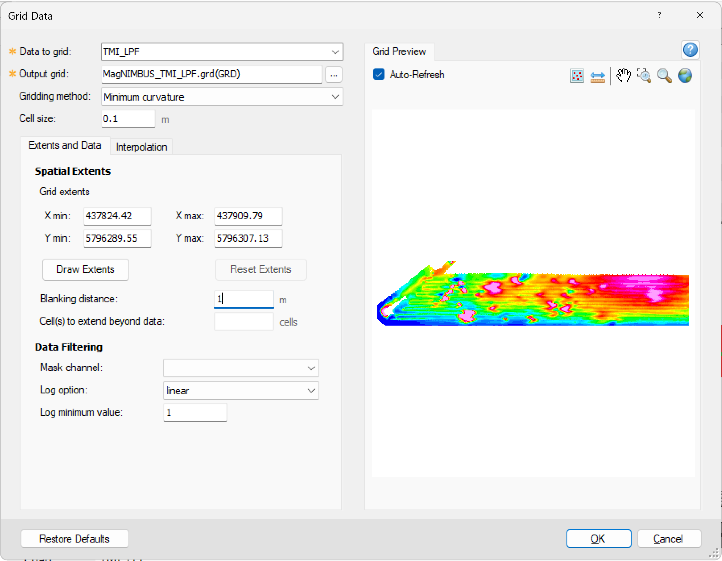
- Click the Zoom to Box icon and select the anomaly suggested by the arrow.
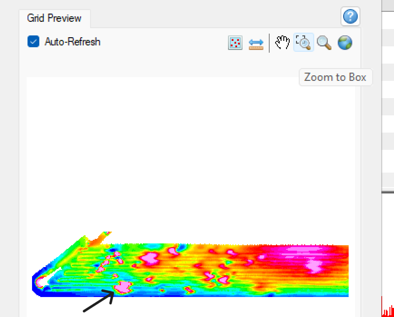
As you can see, the shape of this anomaly is “strange.” This GNSS lag effect is clearly visible in anomalies detected across multiple survey lines.
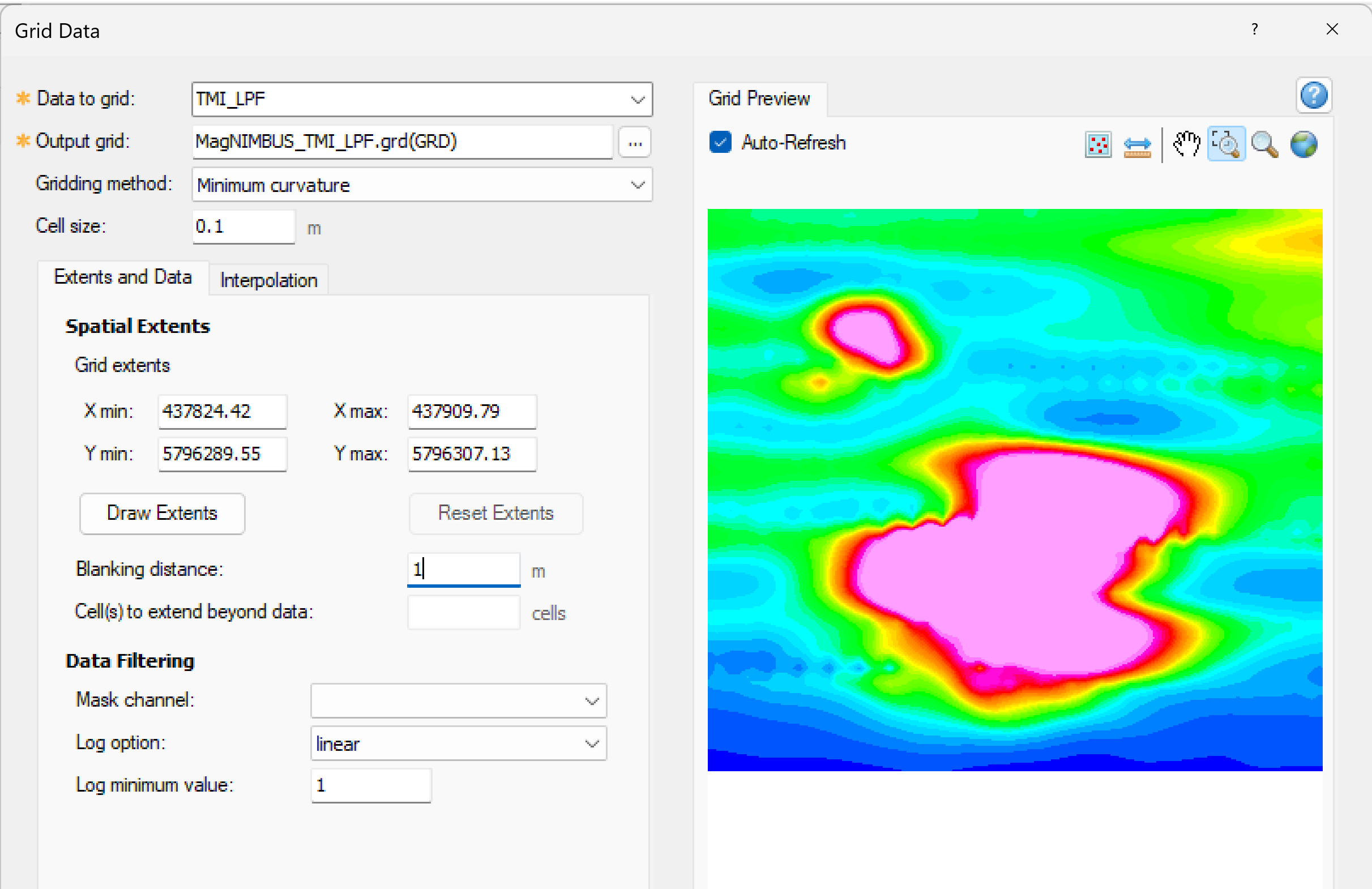
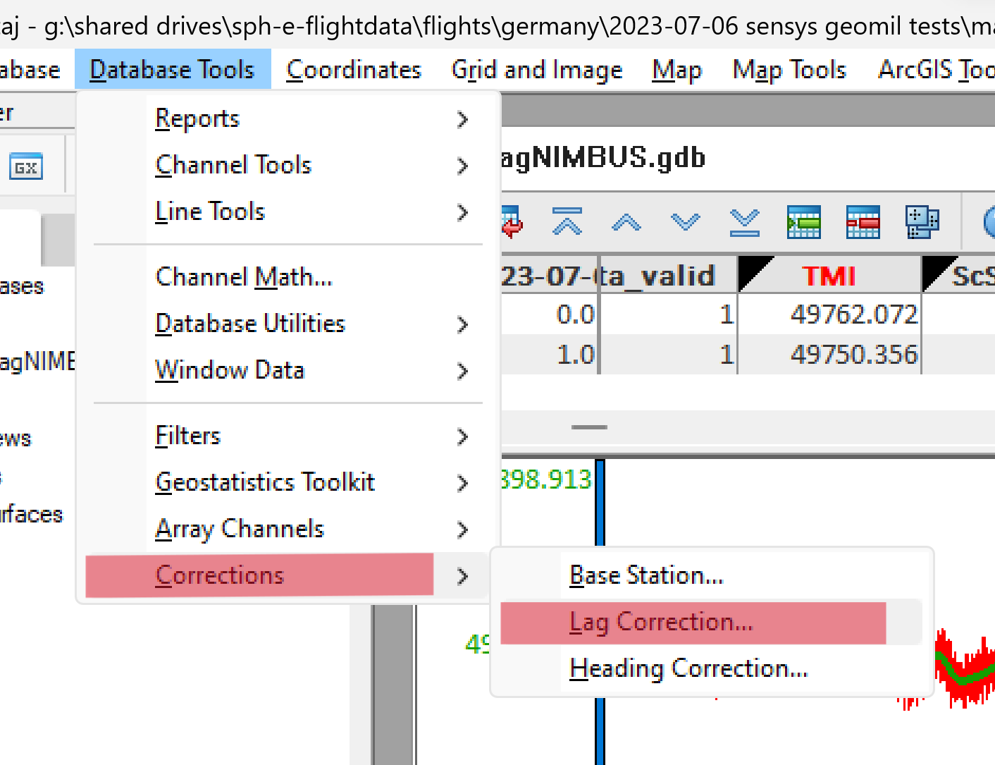
- Click OK to save the grid for not GNSS-lag compensated data. Close the grid window, and select Database Tool -> Corrections -> Lag Correction.
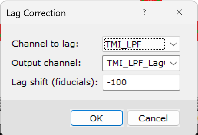
- Select TMI_LPF as source data for correction, and enter the name TMI_LPF_LagCorrected for the output channel - to follow an approach that every processing step will add meaningful postfix to the source channel name. Enter -100 into the Lag shift field and click OK.
- Let's visualize the data after lag corrections. Select Grid and Image -> Gridding -> Grid Data. Select TMI_LPF_LagCorrected in the Data to Grid field, and make sure all other values match the image below. You can see that the shape of the anomaly is getting better. If you are unsatisfied, repeat the GNSS lag correction steps until you get acceptable results.
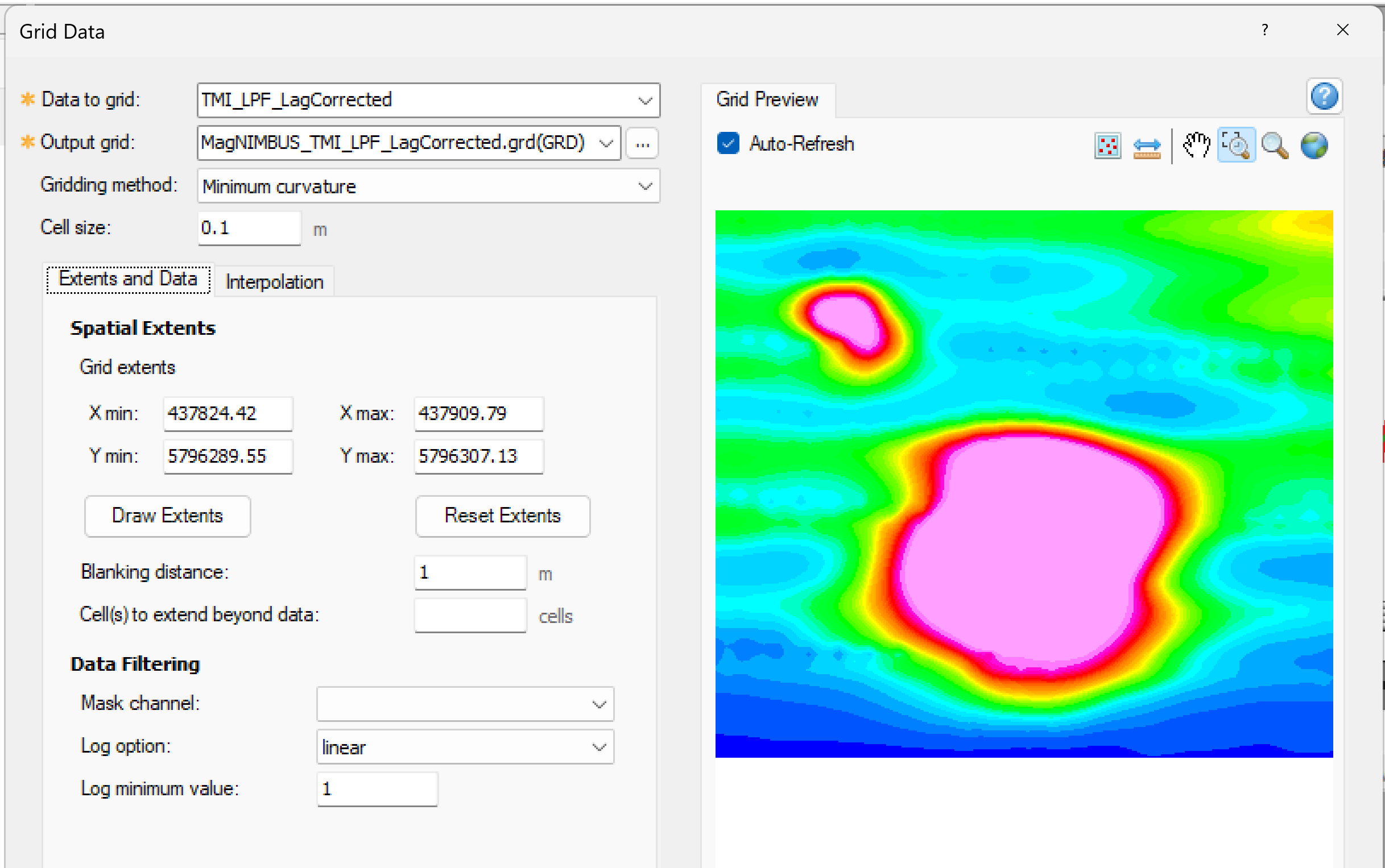
- Click OK to save the grid for the GNSS lag-compensated data. You can open both grids on the screen and compare.
Heading error compensation and removing of surrounding magnetic field gradient
The GNSS lag compensated data looks better (please check the screenshot above again), but another obvious problem is "banding" in the data. This is another standard problem with absolutely all magnetometer sensors - they are sensitive to orientation in the surrounding magnetic field, primarily the Earth’s magnetic field. If you rotate the sensor while holding it at the same point, it will report slightly different values depending on its orientation. Banding on the grid is due to magnetometer heading error caused by different flight directions along the survey lines.
Another problem is the different average levels of magnetic field measurements in different subregions of our survey area. This is not a technical problem with the sensor; it is a normal situation - the surrounding magnetic field (not anomalies from our objects of interest) may have a gradient.
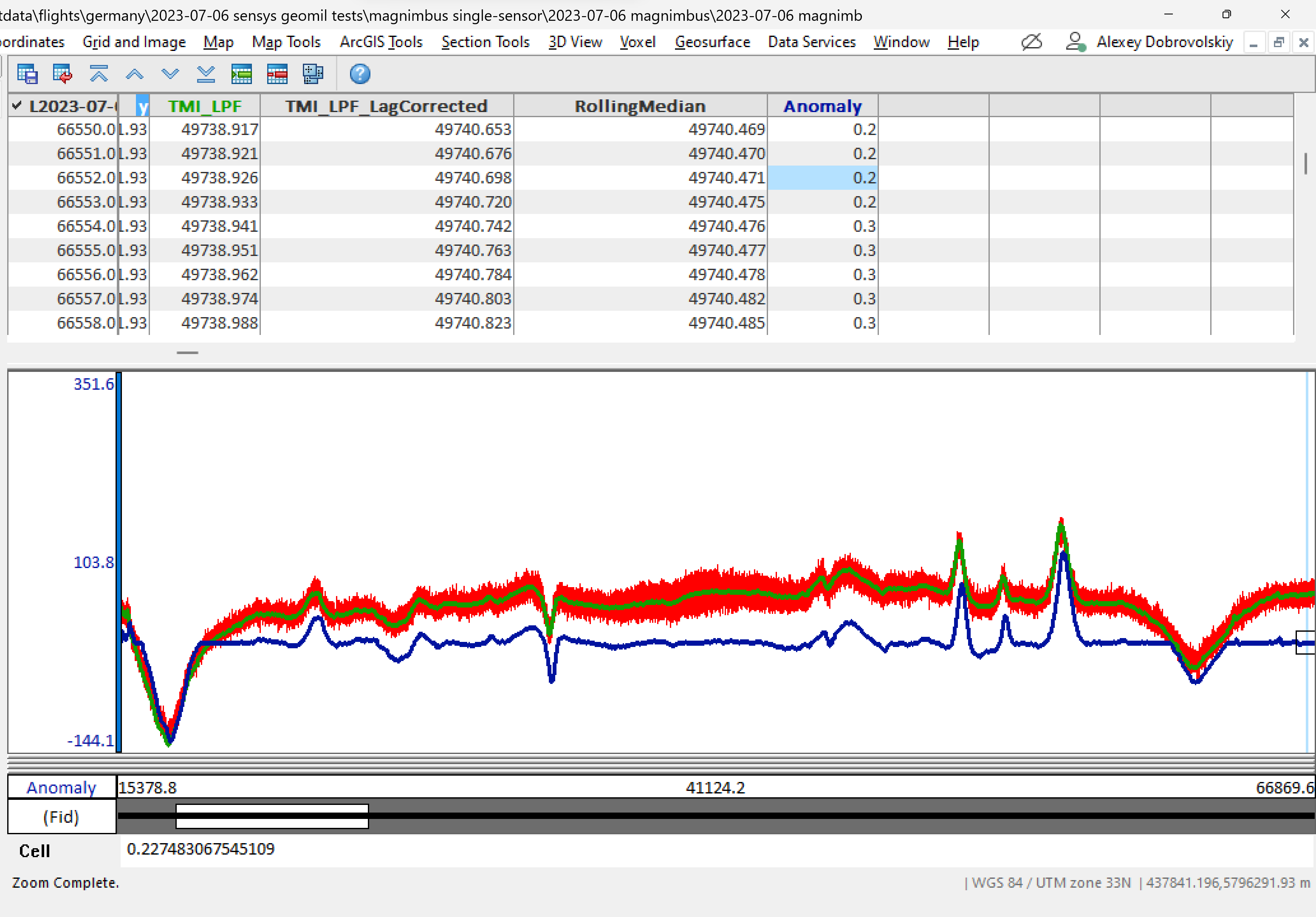
We will remove both problems using one simple method - calculating the running average (median) value in the moving window and next calculating the difference between the median average and the current value. That will give us the amplitude of localized magnetic anomalies relative to the median value, making small anomalies contrast and removing the surrounding magnetic field gradient.
- Select Database Tools -> Filters -> Rolling Statistics.
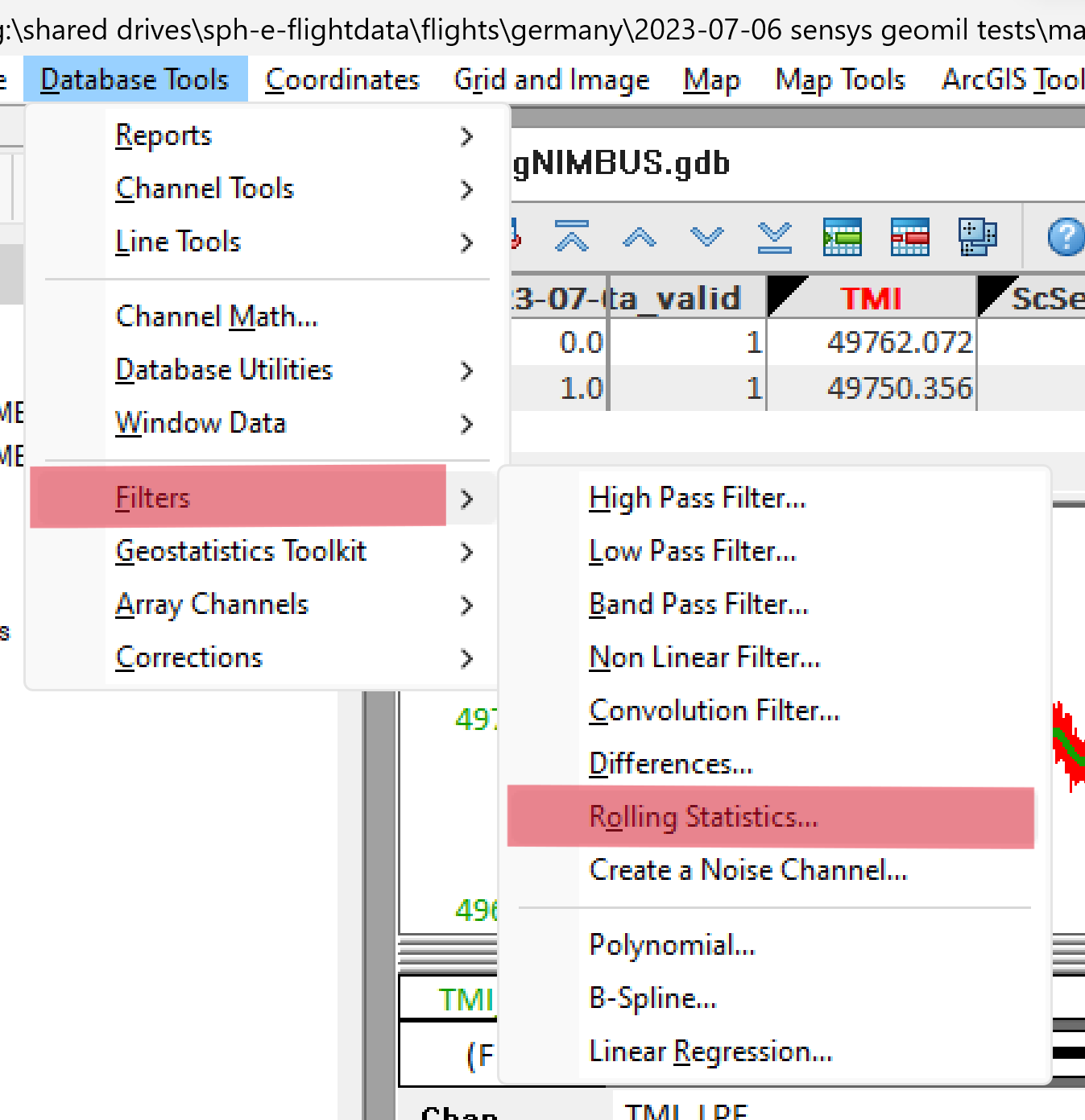
- Fill in the dialog box fields as in the screenshot. A window width of 5000 with a magnetometer sampling rate of 500Hz will give us an average of 10 seconds of measurements or a 20m line (flight speed in this test was 2 m/s).
Click OK. After some time, the RollingMedian channel will be added to our database.
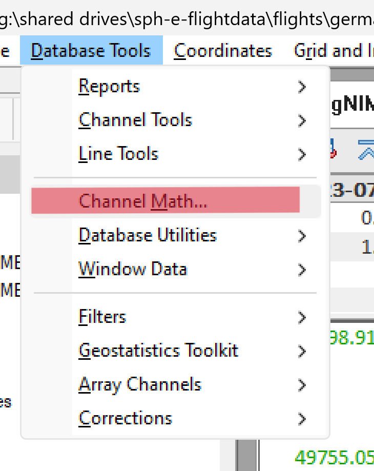
- Select Database Tools -> Filters -> Channel Math.
- Fill in the dialog box fields as in the screenshot. Note that in the Assign Channels area, you must type "Anomaly" for the first time since the channel does not initially exist. Channels for variables "c" and "m" should be selected from the drop-down lists. Click OK.
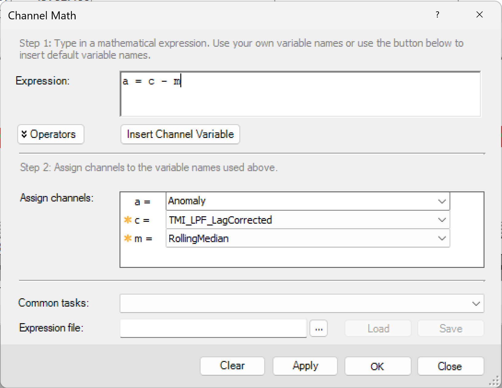
The channel Anomaly will be added to the database and populated with calculated values. You can display a graph (right-click on the channel name and select Show Profile) and compare it with the original magnetometer measurements. The Anomaly value plot is flattened, with local anomalies (significantly shorter than the length of our 5000-measurement window) clearly visible.
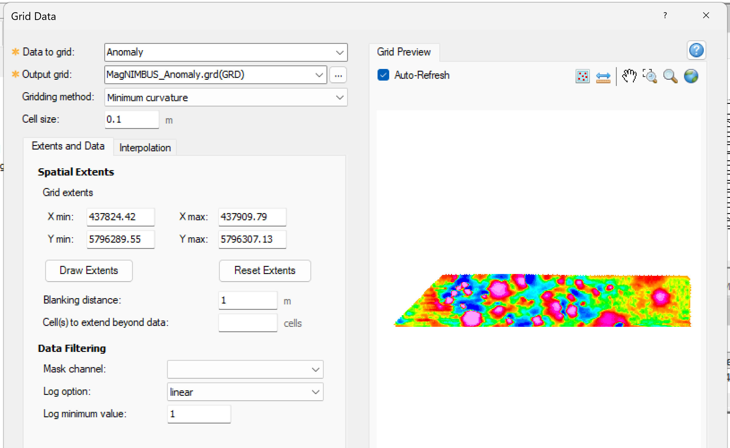
- Select Grid and Image -> Gridding -> Grid Data to generate a grid for the Anomaly field. Select Anomaly in the Data to grid field and click OK.
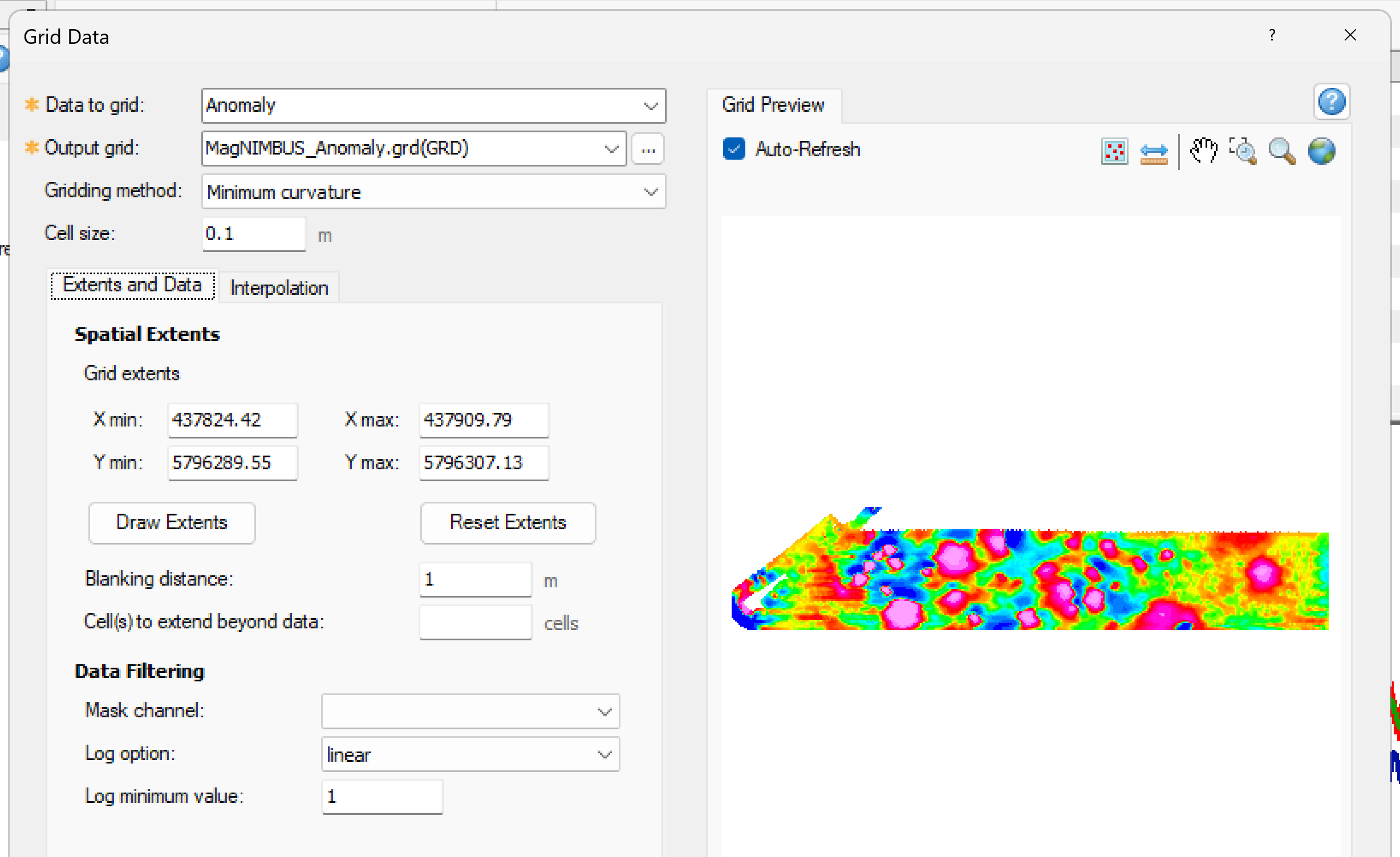
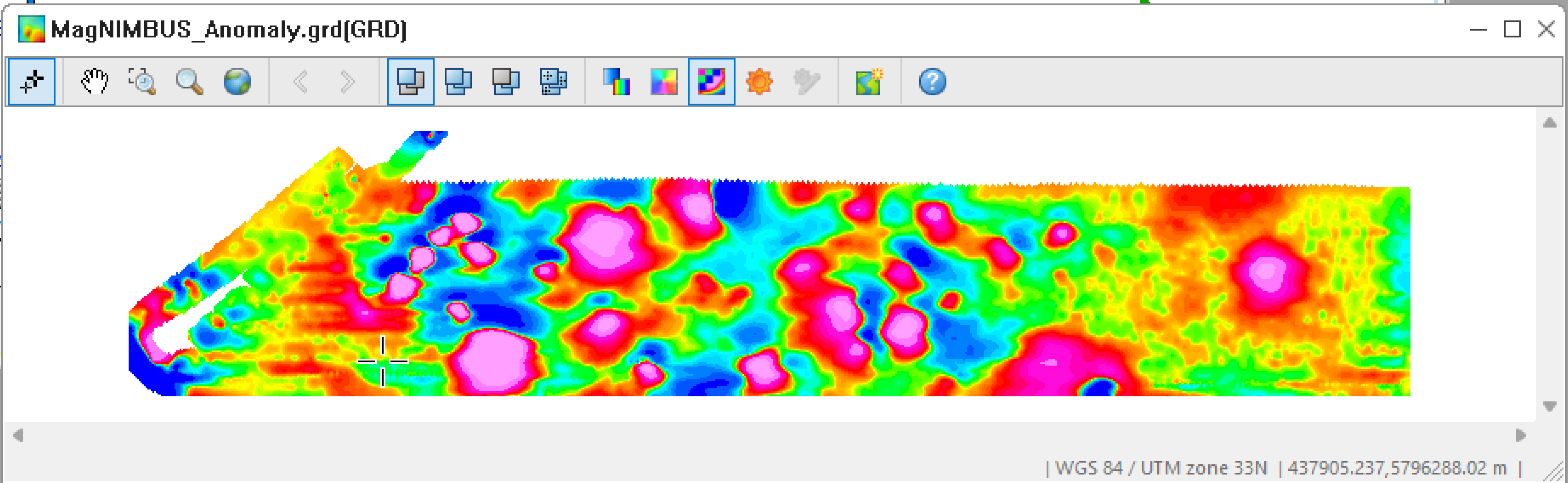
Window with gridded Anomaly values will appear on the screen.
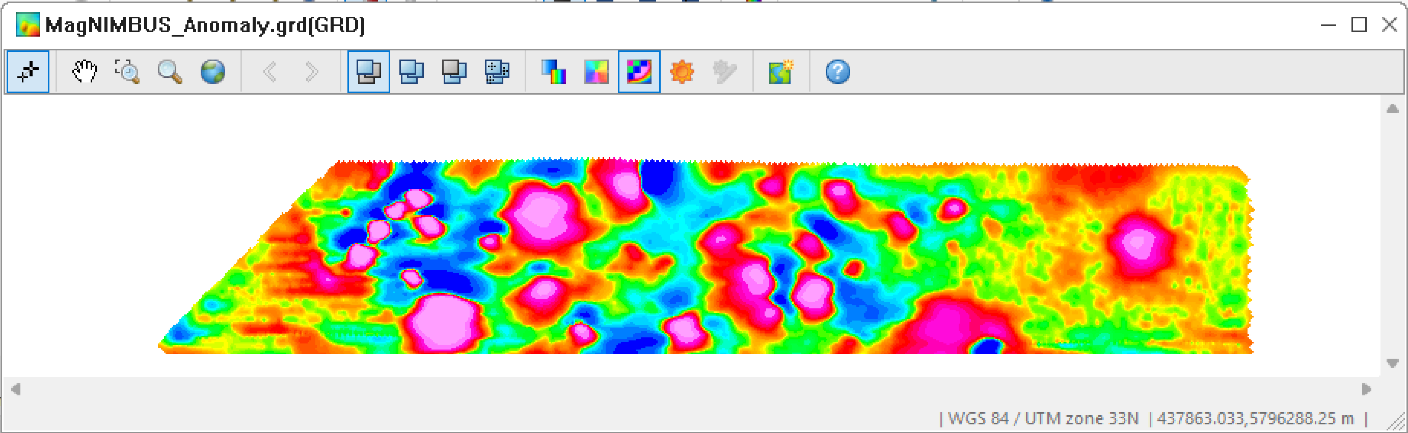
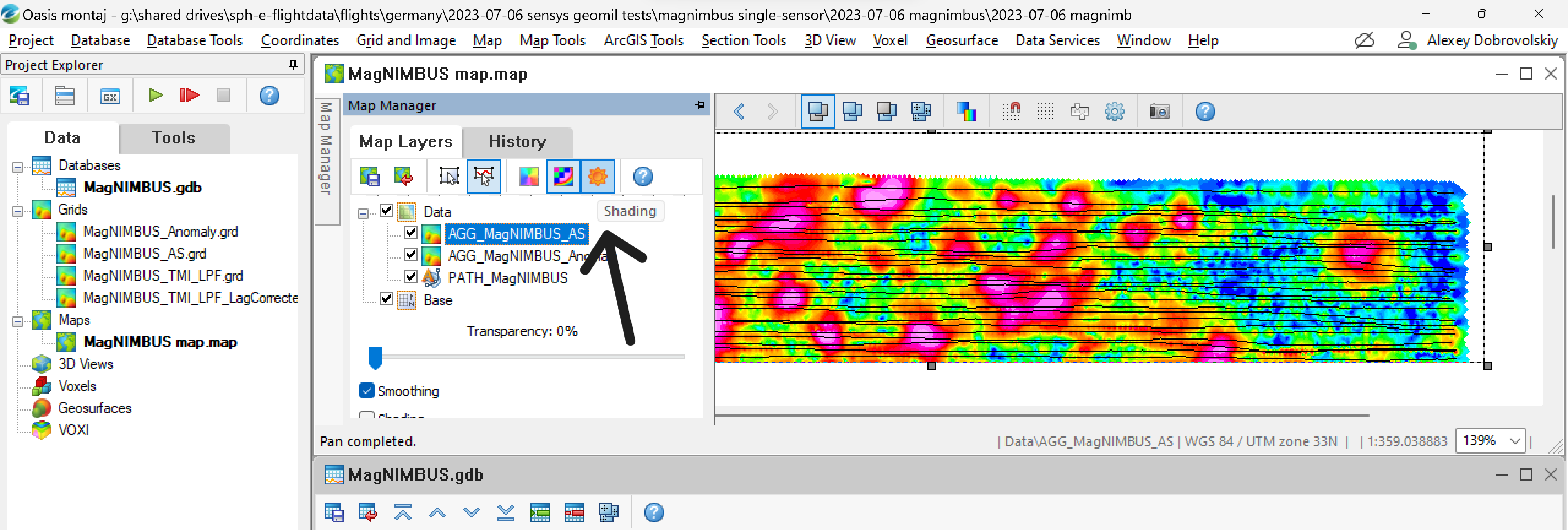
- Click the Shading icon to make it pseudo-3D.
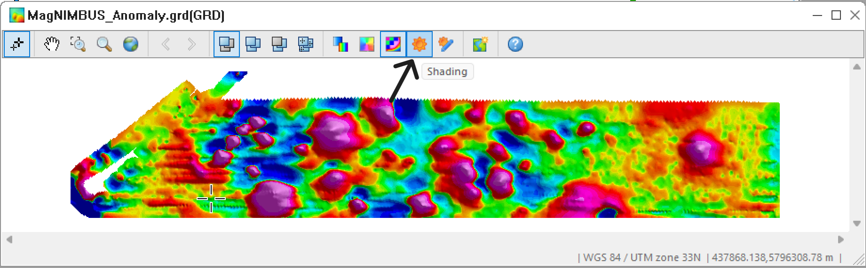
Review the grid. It contains the data collected as the drone flies to and from the survey area and as it turns. In the next steps, we will remove unnecessary data and improve the data presentation.
- Close all windows that overlap our database so that our database is the topmost visible window.\
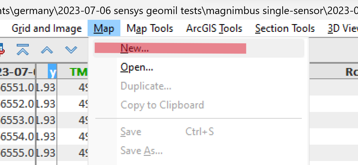
36. Select Map -> New.
- Click Scan data. It will scan the data in the topmost database window.
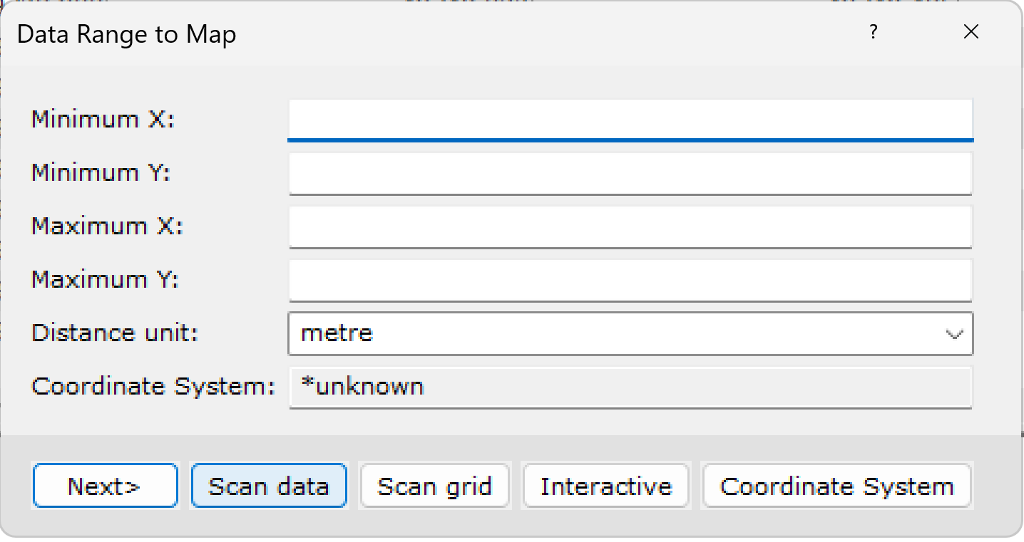
- After the scan you will see the minimum/maximum fields filled. Click Next.
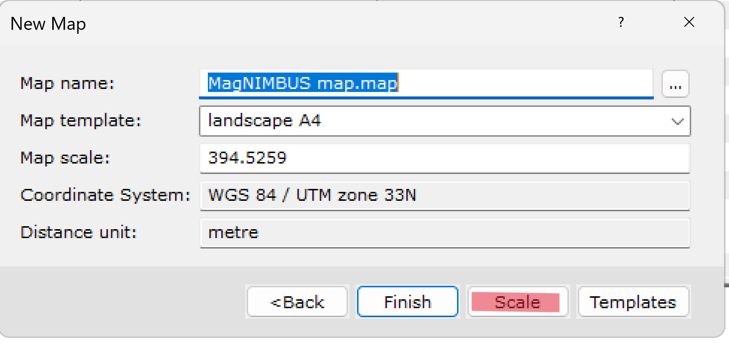
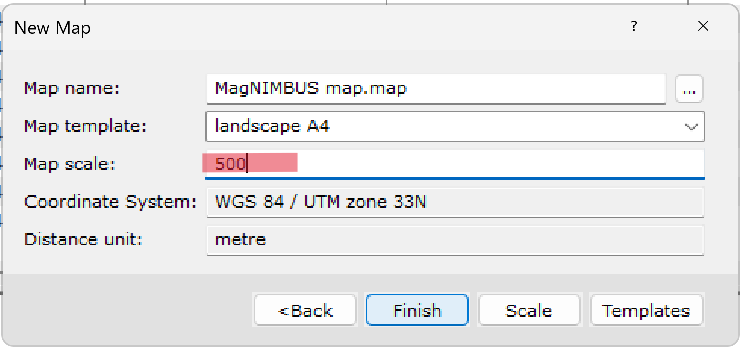
- Type "MagNIMBUS map" or what you prefer in the Map name field. Select a paper format in the Map template field. Click Scale.
- I recommend entering some bigger values in the Map scale field and clicking Finish.
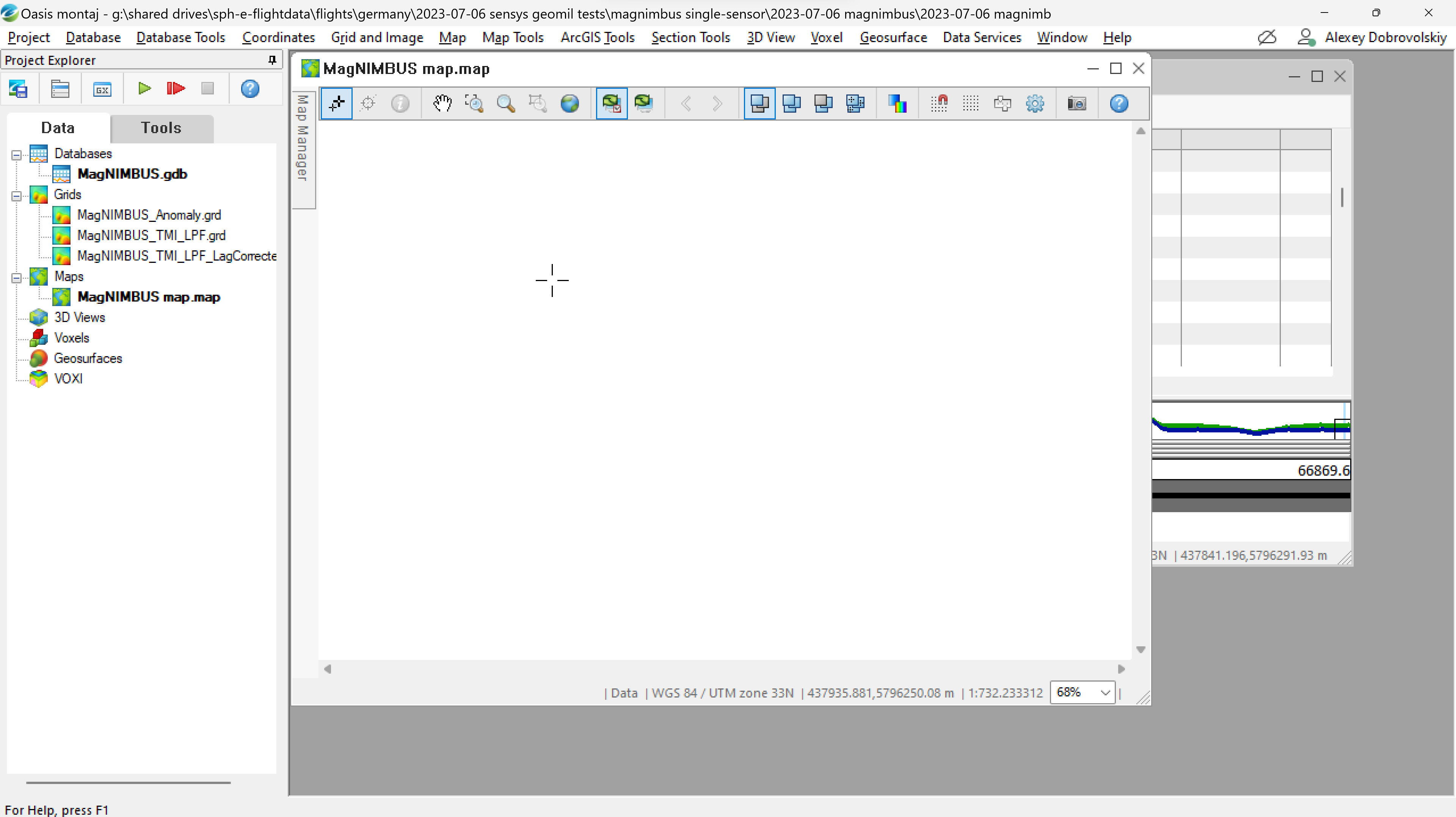
An empty map window will appear on the screen.
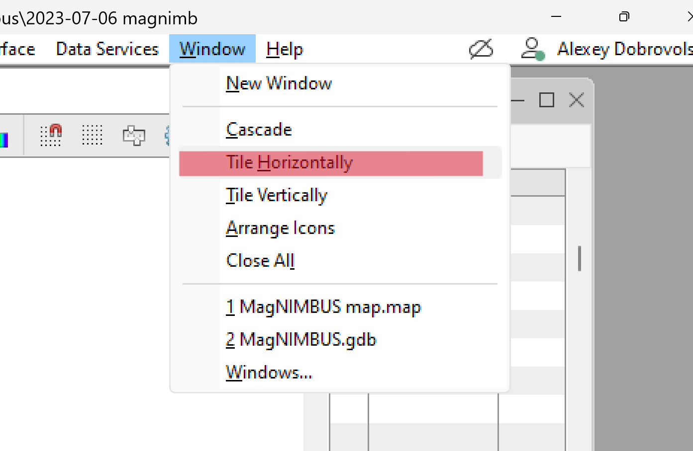
- Select Window->Tile Horizontally to arrange windows on the screen. You should see the database and map windows.
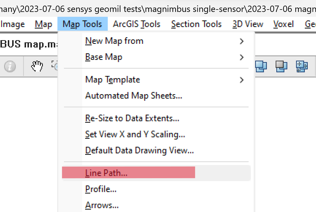
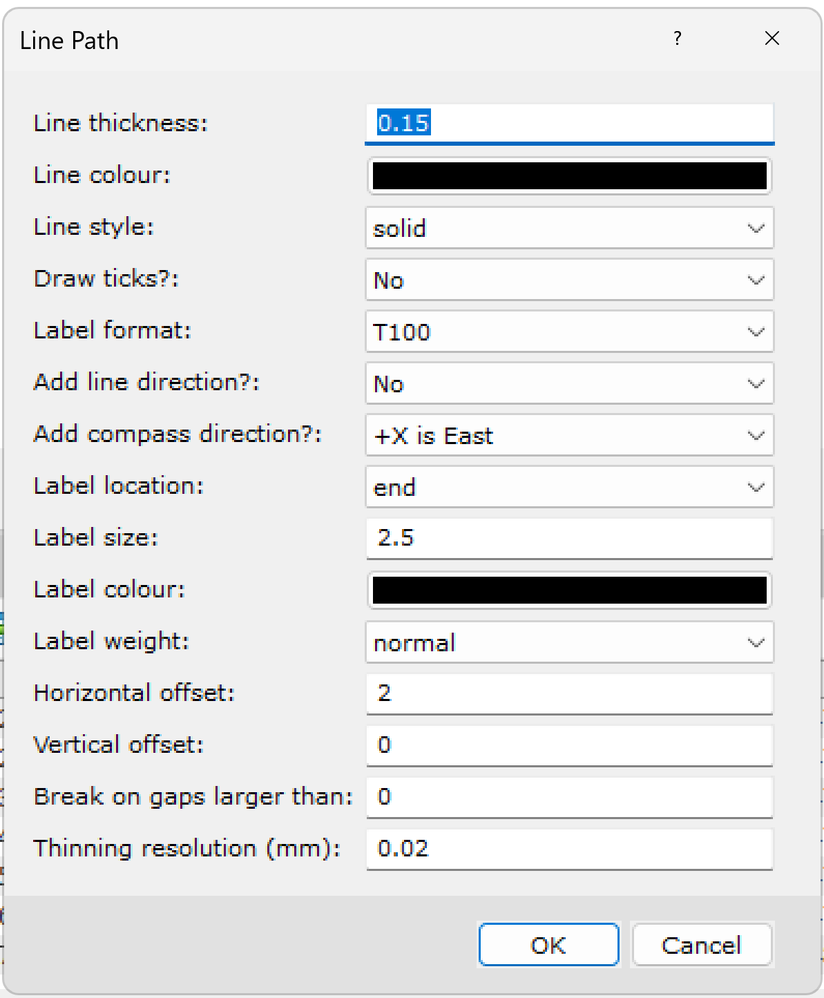
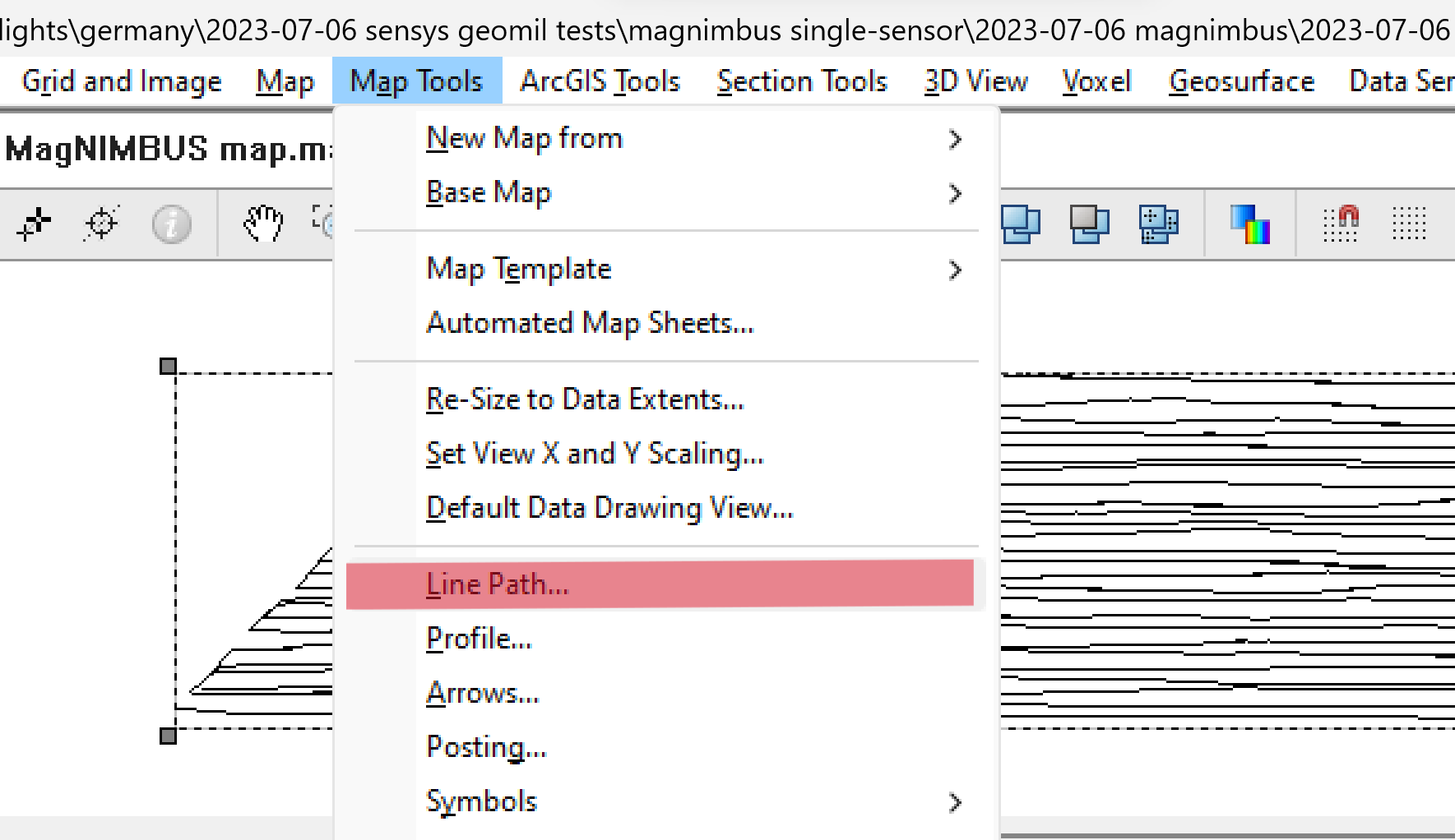
- Select Map Tools -> Line Path.
- Check the values in the fields and click OK.
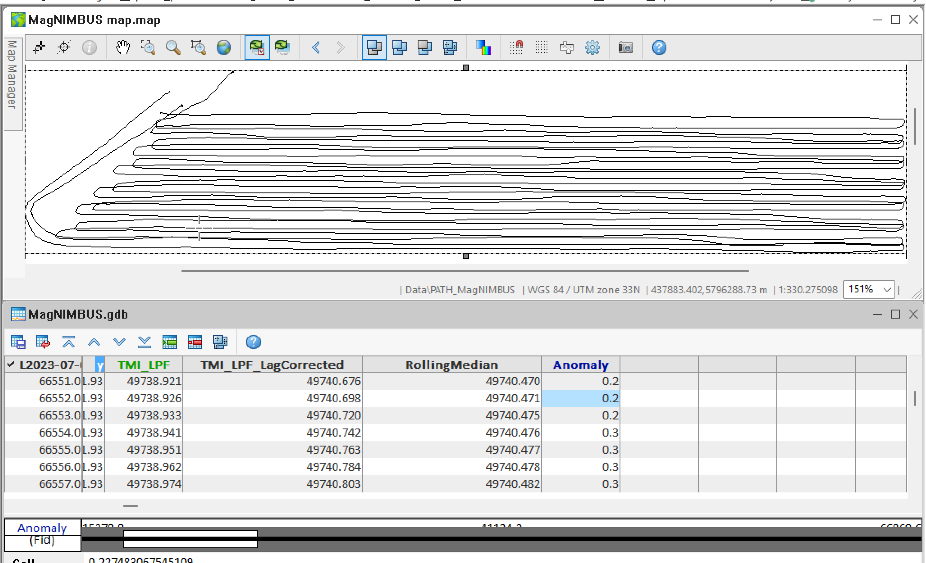
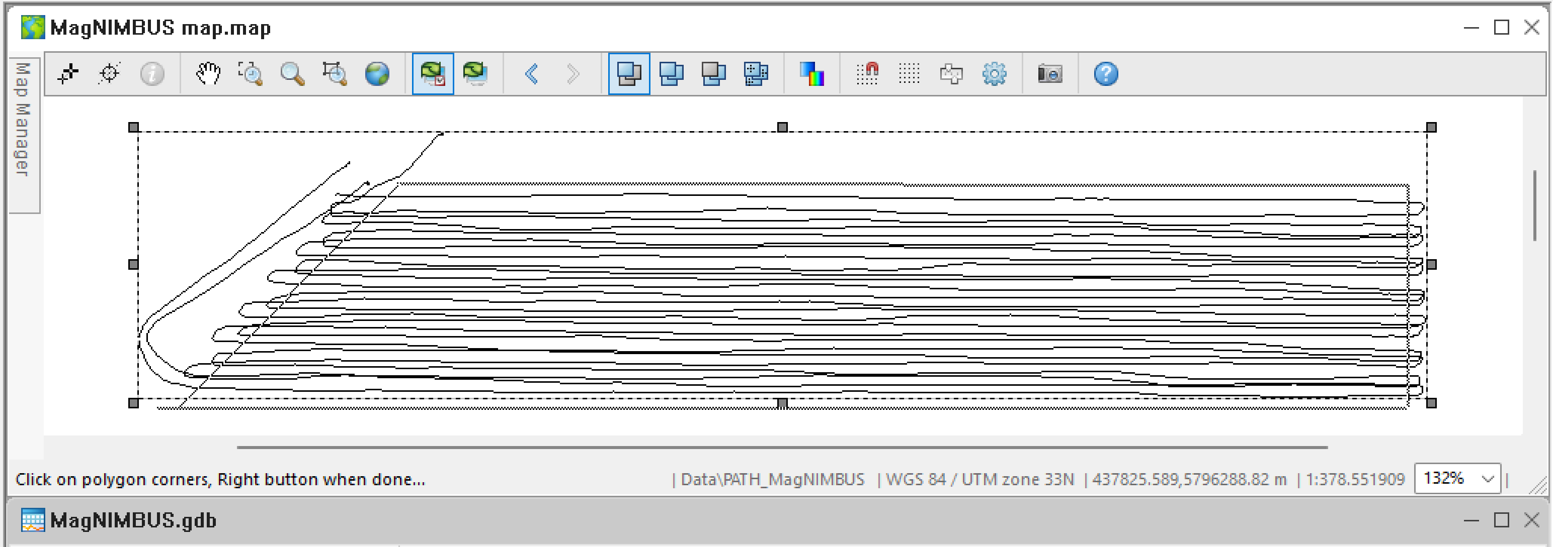
You will see data point tracks on the map.
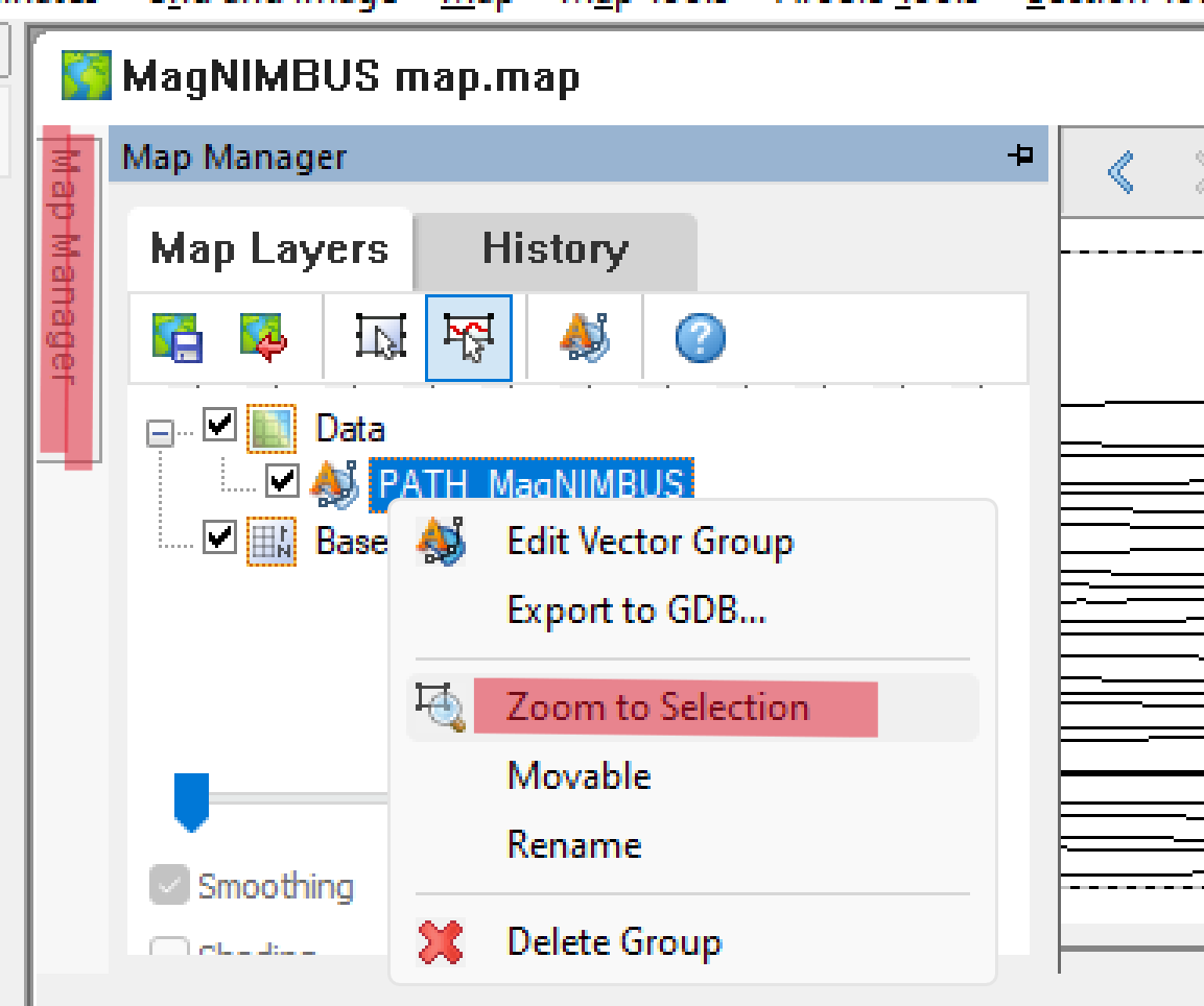
- If you don't see the track, click Map Manager, expand the Data node, right-click the PATH_MagNIMBUS node, and select Zoom to Selection.
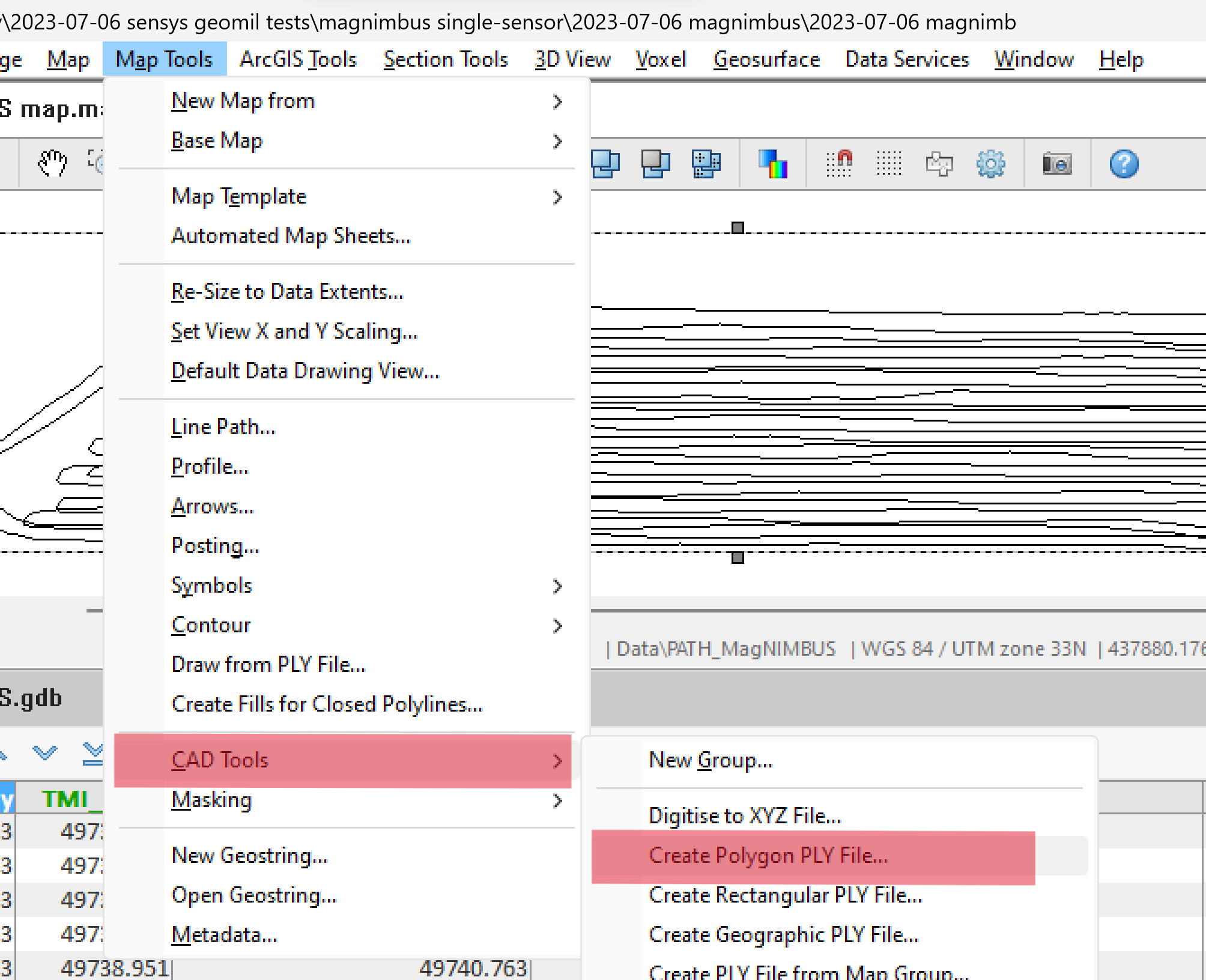
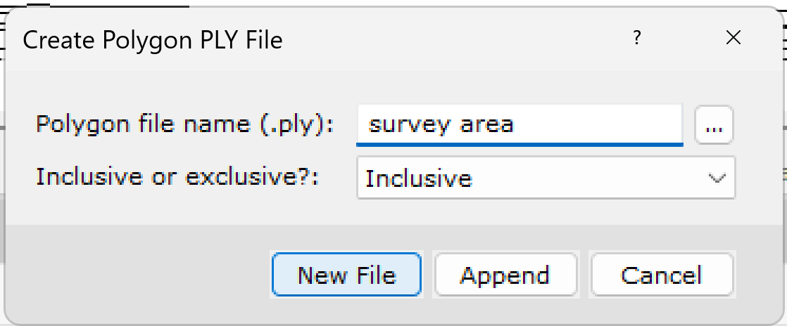
- Select Map Tools -> CAD Tools -> Create Polygon PLY File.v
- Type "survey area" in the Polygon file name field, select Inclusive in the next field and click New File.
- Read the instructions and click OK.
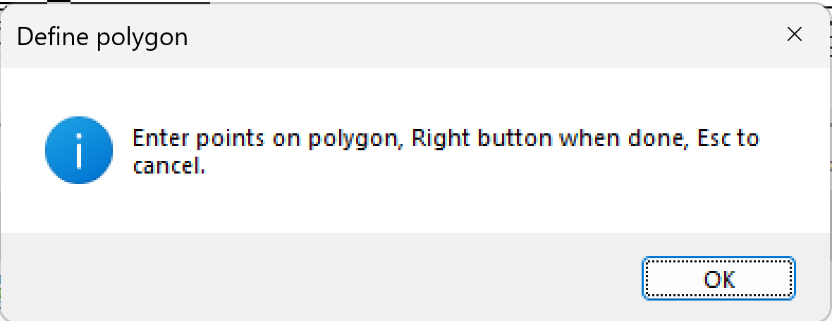
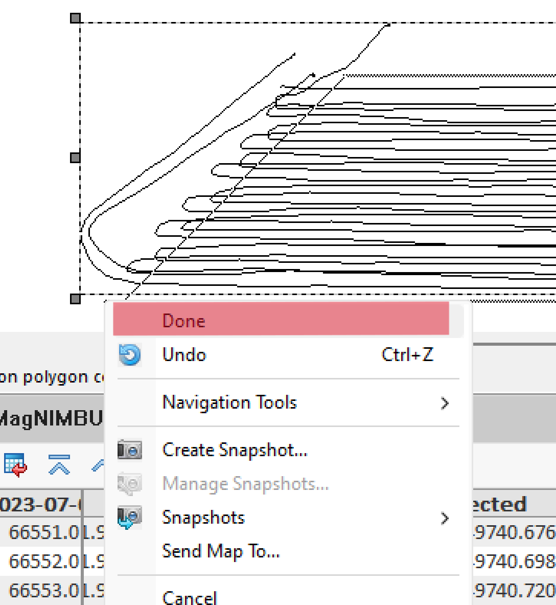
- Follow the instructions - draw a polygon around the useful area and right-click when done.
- Select Done.
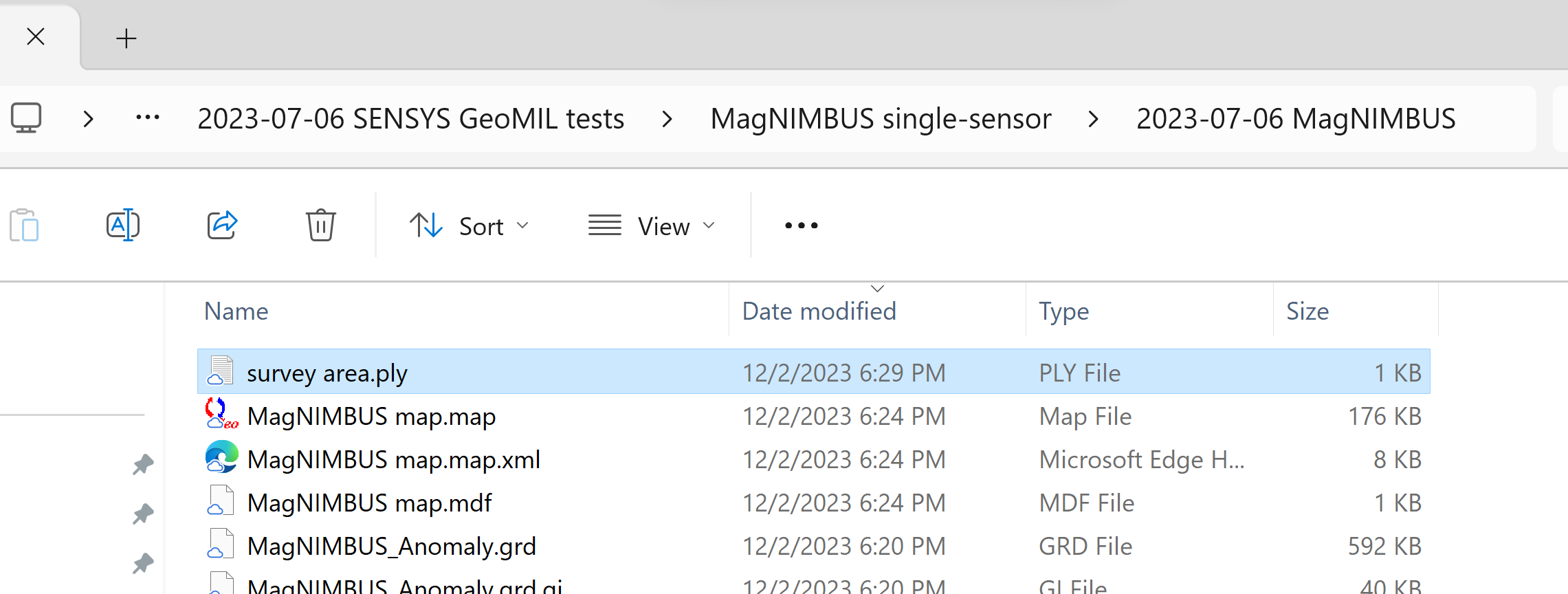
A "survey area.ply" file will be created in the project folder.
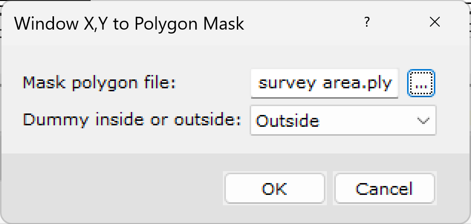
- Select Database Tools -> Window Data -> Window X, Y to Polygon Mask.
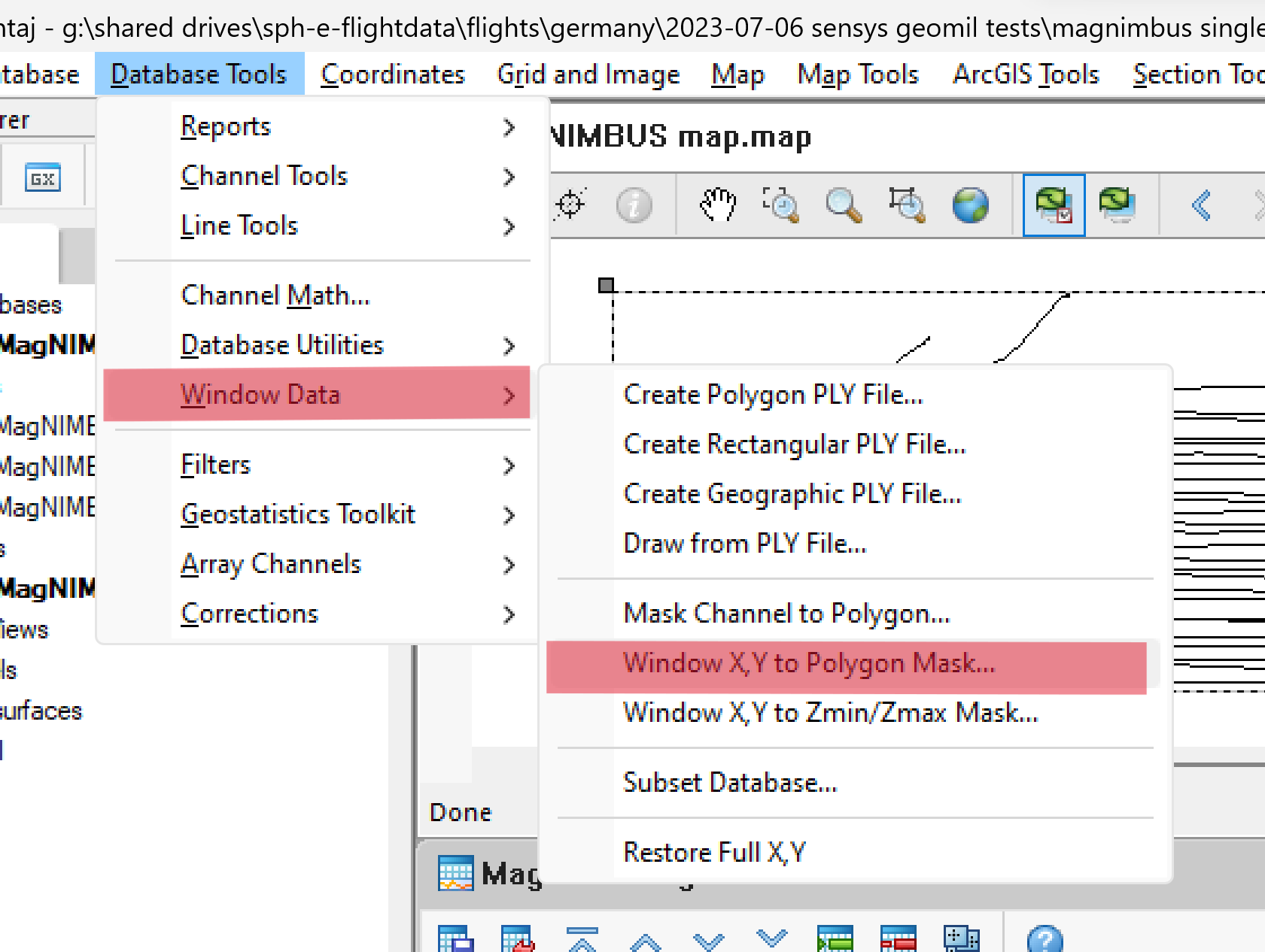
- Select the polygon file, Outside in the next field, and click OK.
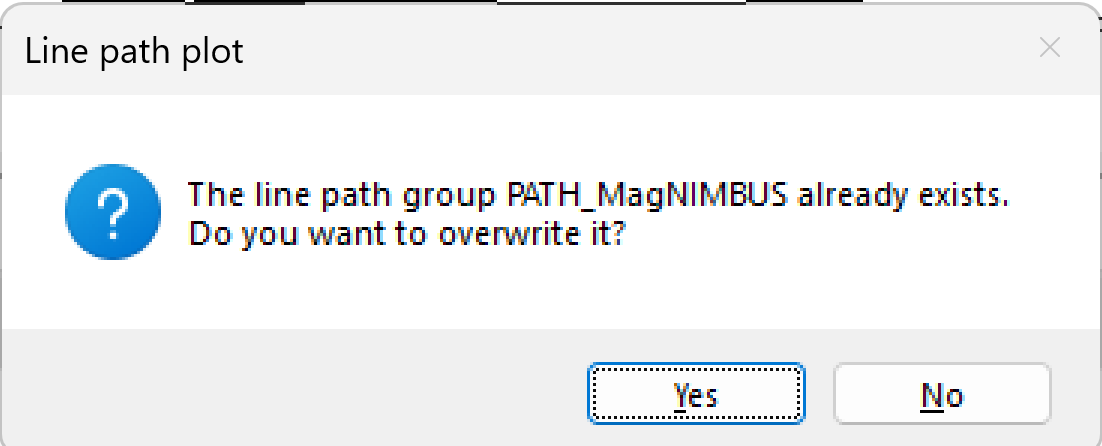
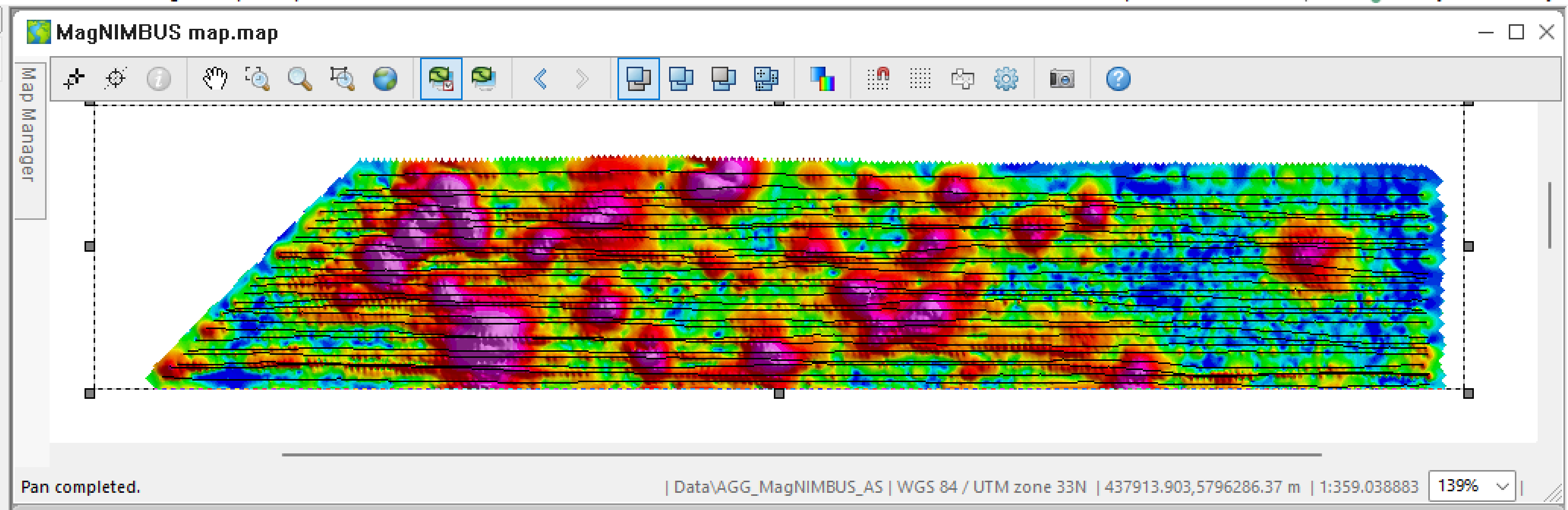
- Select Map Tools -> Line Path and click OK in the Line Path dialog window to redraw the track. Click Yes to overwrite the previously created track.
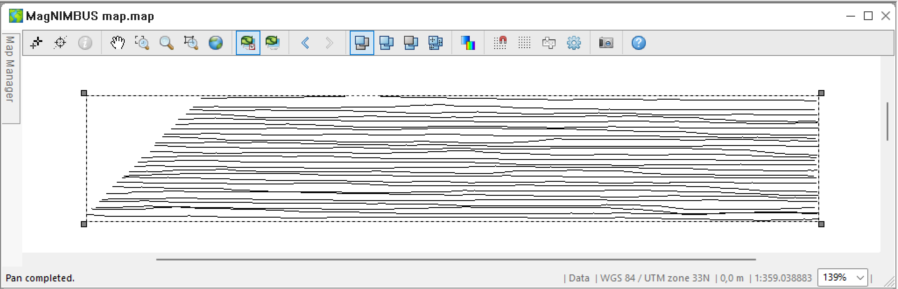
The contents of the map should look like the image below.
Splitting data files into lines
Oasis montaj supports the concept of "lines" when storing data. After import, the file's entire contents are saved in one line, which is inconvenient. For example, plotting a data value will be displayed for the entire data file, forcing you to constantly zoom in/out when analyzing/interpreting the data. Here, we will split the files into separate lines.
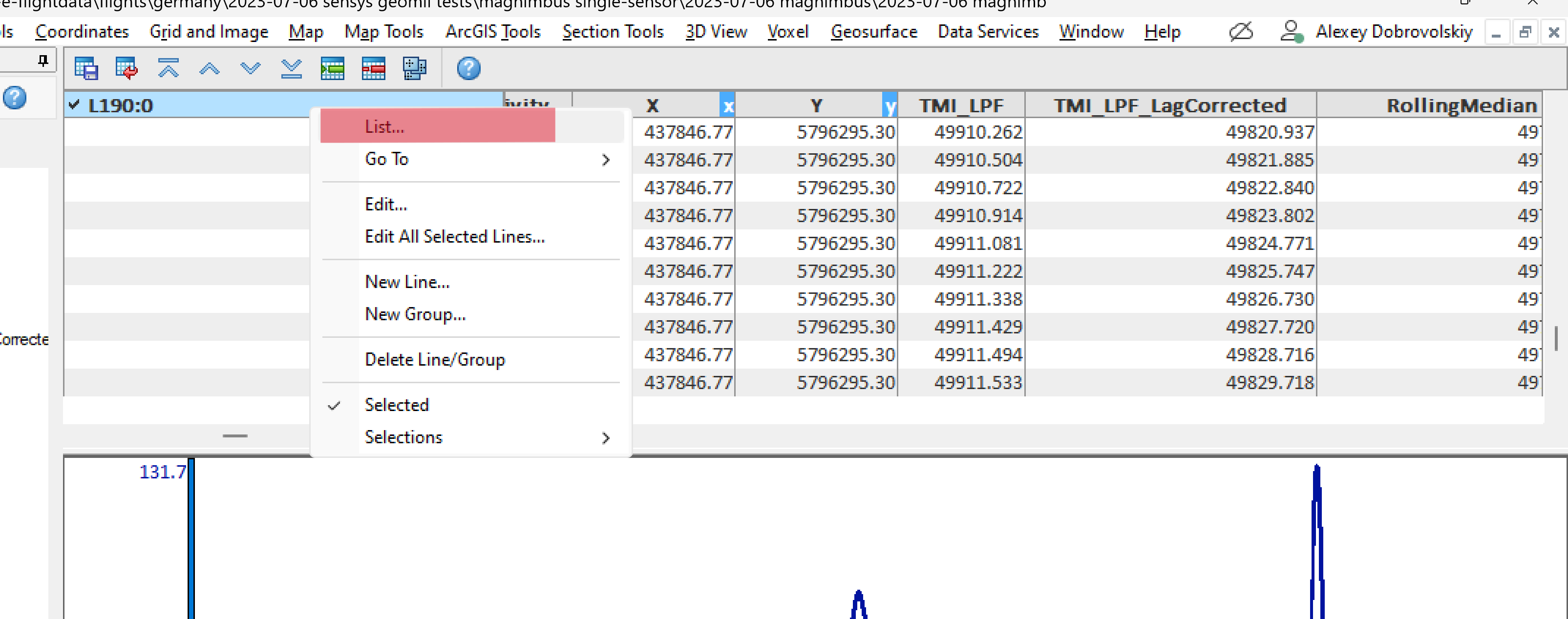
- Right-click the leftmost column heading in the database window and select List.
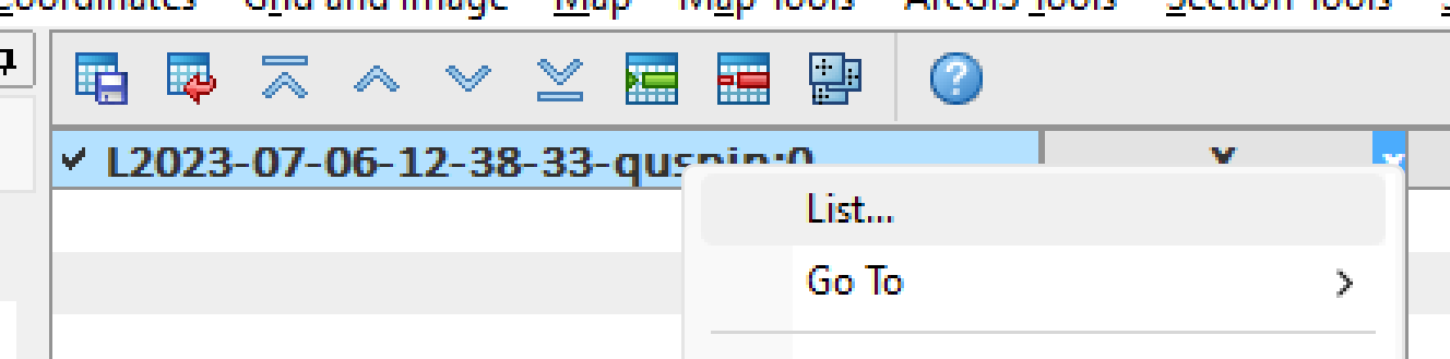
You will see two entries corresponding to the imported files.
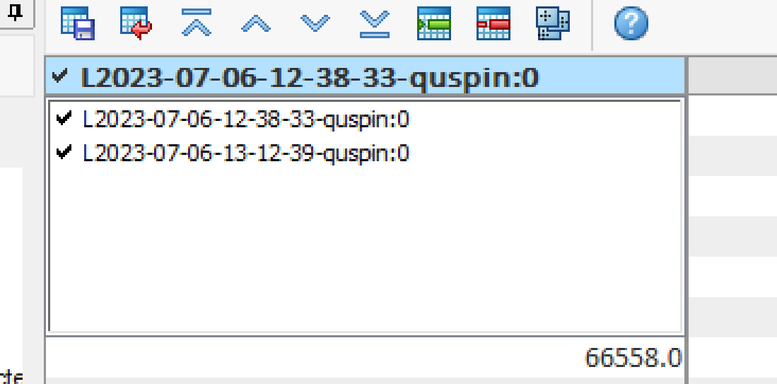
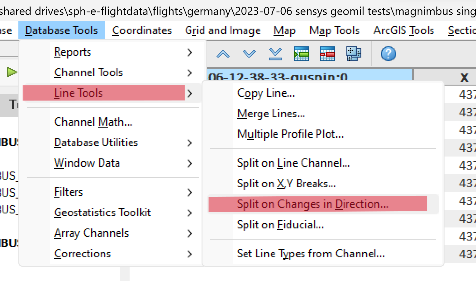
- Select Database Tools -> Line Tools -> Split on Changes in Direction.
- Fill in the values as in the screenshot and click OK.
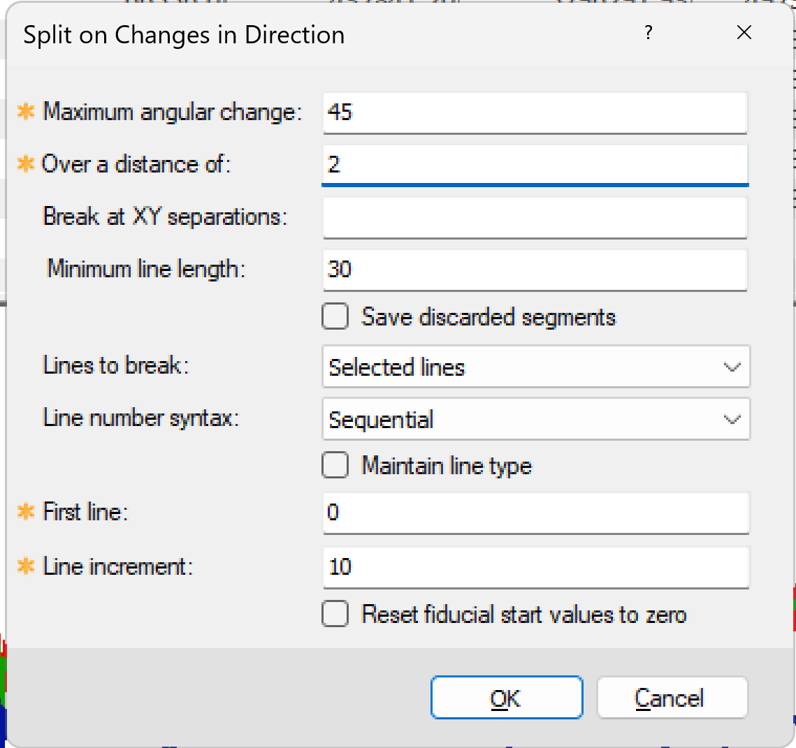
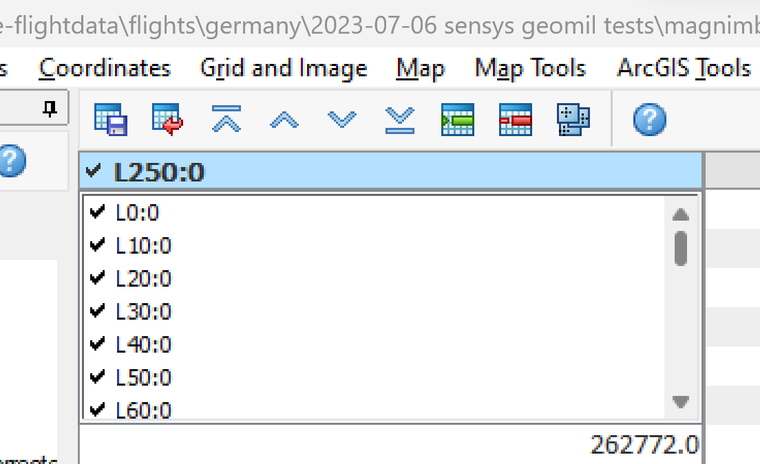
- Right-click the leftmost column heading in the database window and select List. You will now see entries named L0:0 to L250:0 corresponding to actual individual survey lines, 26 in total.
- Select Map Tools -> Line Path and click OK in the Line Path dialog window.
- Click Yes.
You can now see the individual survey lines in the map window.
- Select Gridding -> Grid Data.
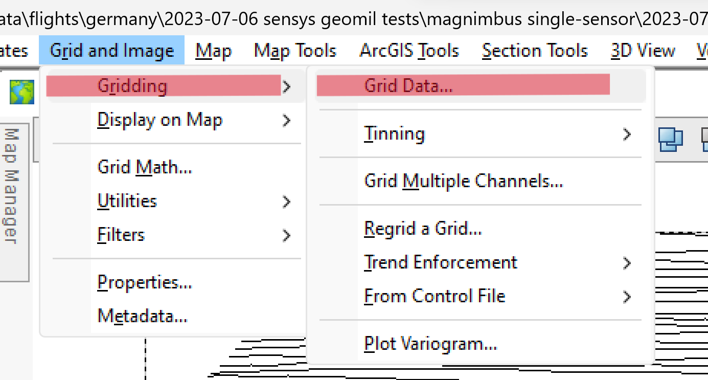
- Fill in the values as in the screenshot and click OK.
A grid will be created for the cropped data along individual survey lines.
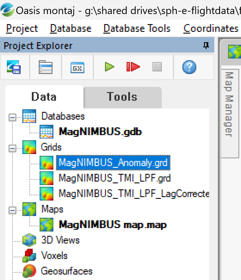
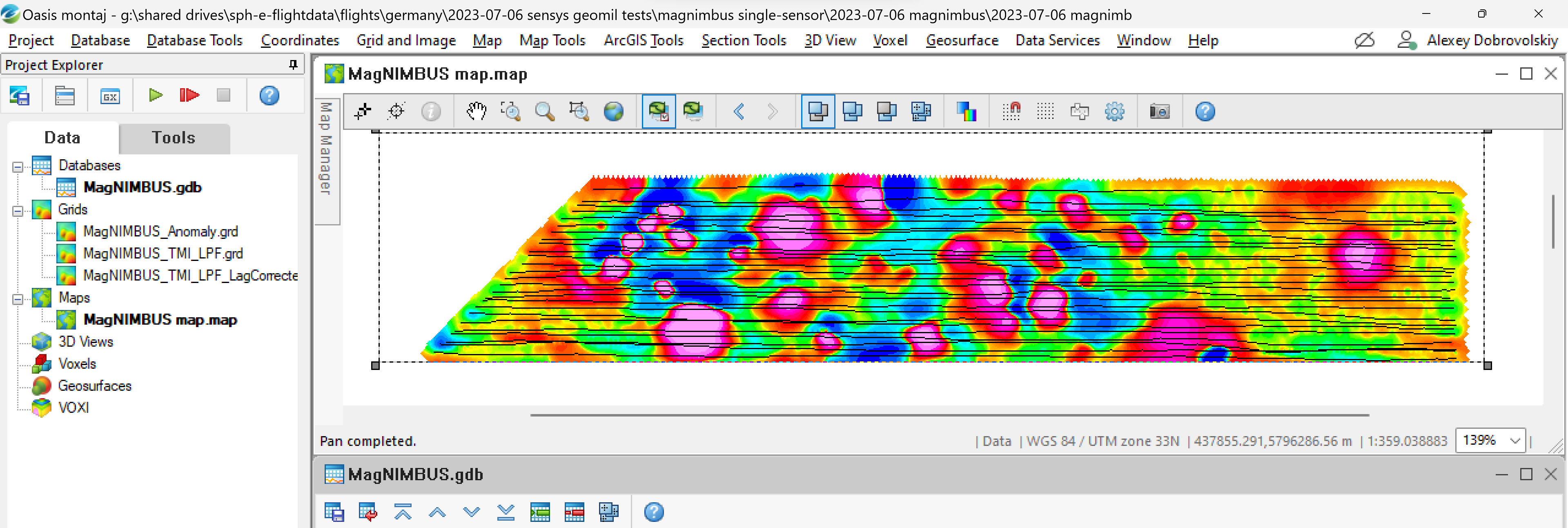
- Select the MagNIMBUS_Anomaly grid in the Project Explorer and drag it into the map window.
The map now contains a track and grid for the Anomaly value.
- Right-click the area of the graph in the database window and select Rescale All.
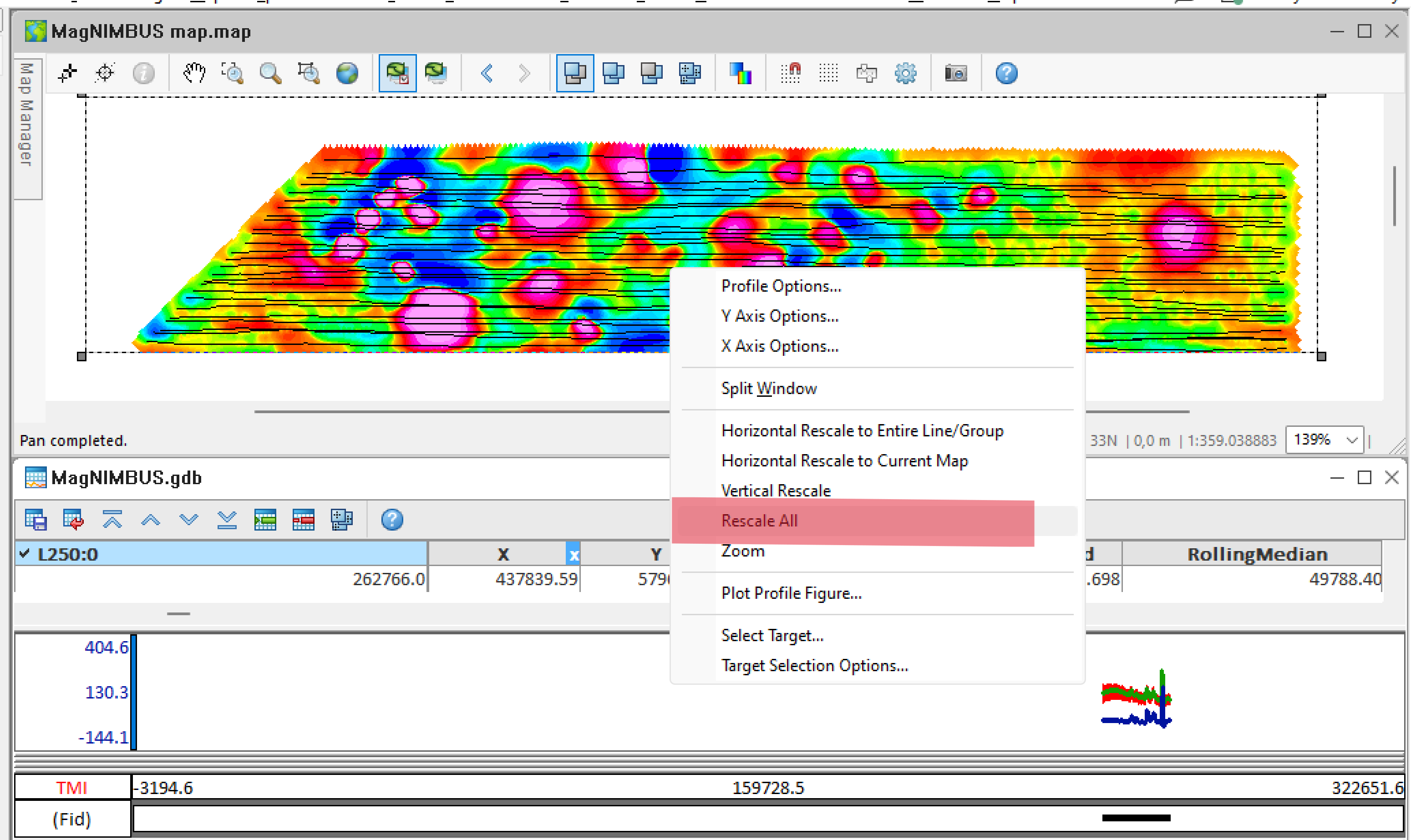
You will see graphs for the individual lines. You can move between survey lines using the up/down icons in the database window toolbar.
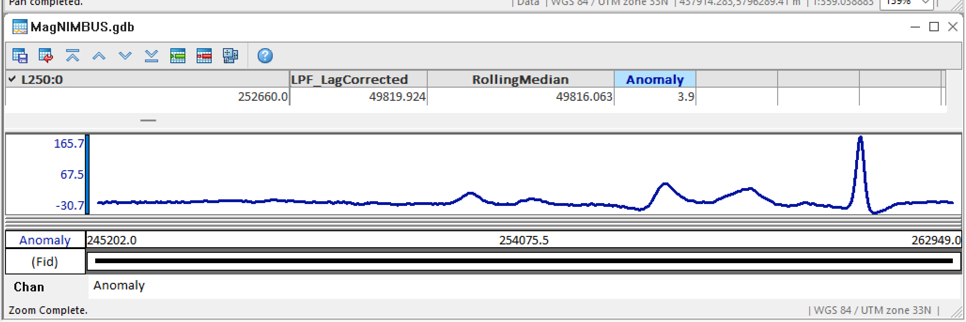
- Remove unnecessary graphs. Right-click the TMI_LPF header and select Remove Profile.
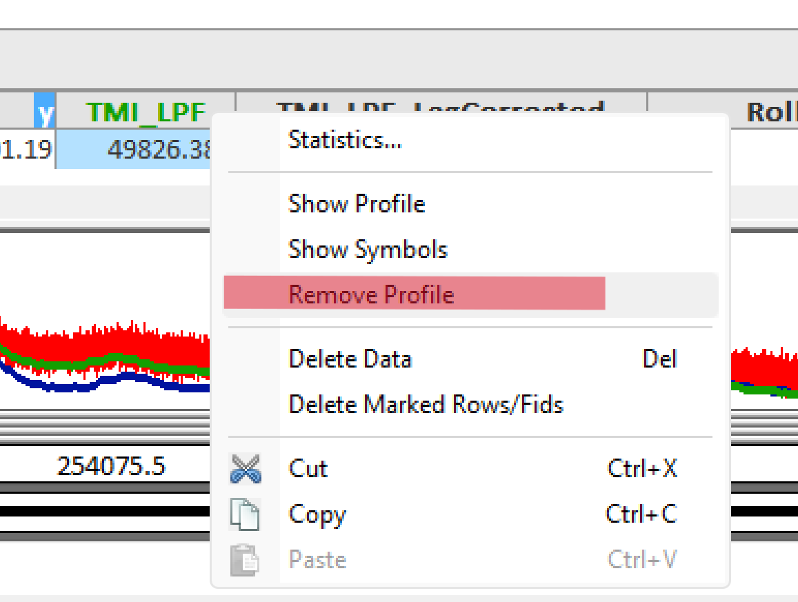
- Do the same for TMI.

Only the Anomaly will remain in the graph area.
Map and data linking
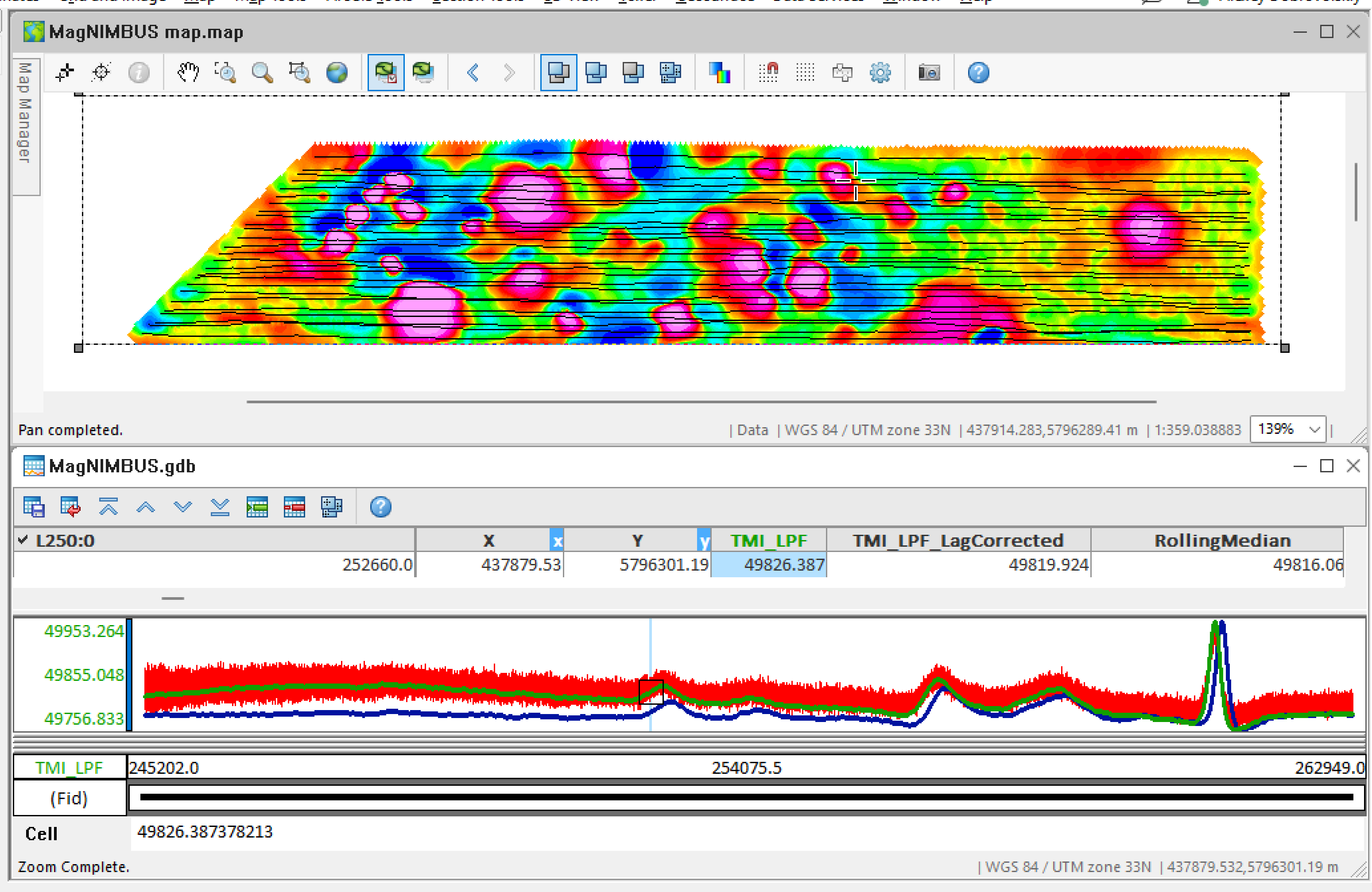
A very powerful feature of Oasis montaj is that you can drill down into the source data behind its representation on the map.
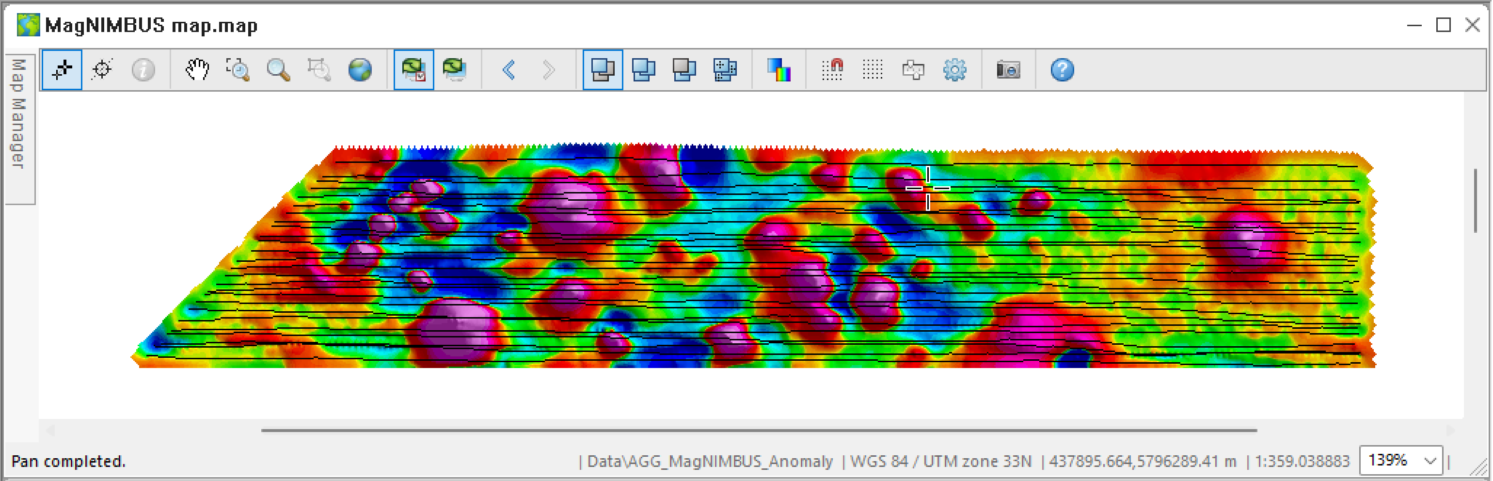
- First, let's make our map pseudo-3D. Click Map Manager, expand the Data node, select AGG_MagNIMBUS_Anomaly, and click the Shading icon.
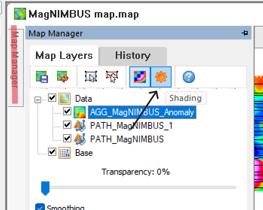
The map should look like below.
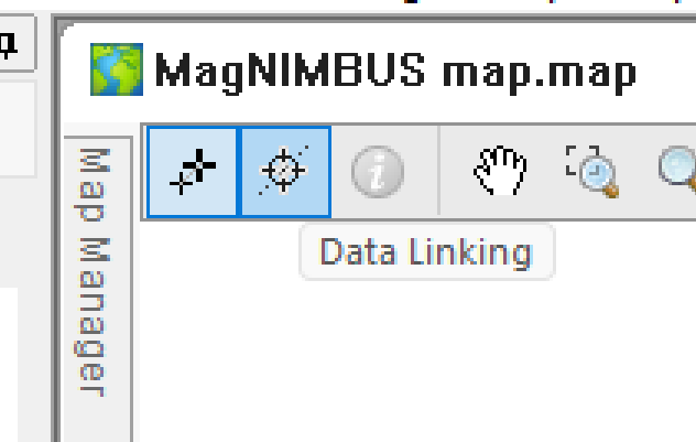
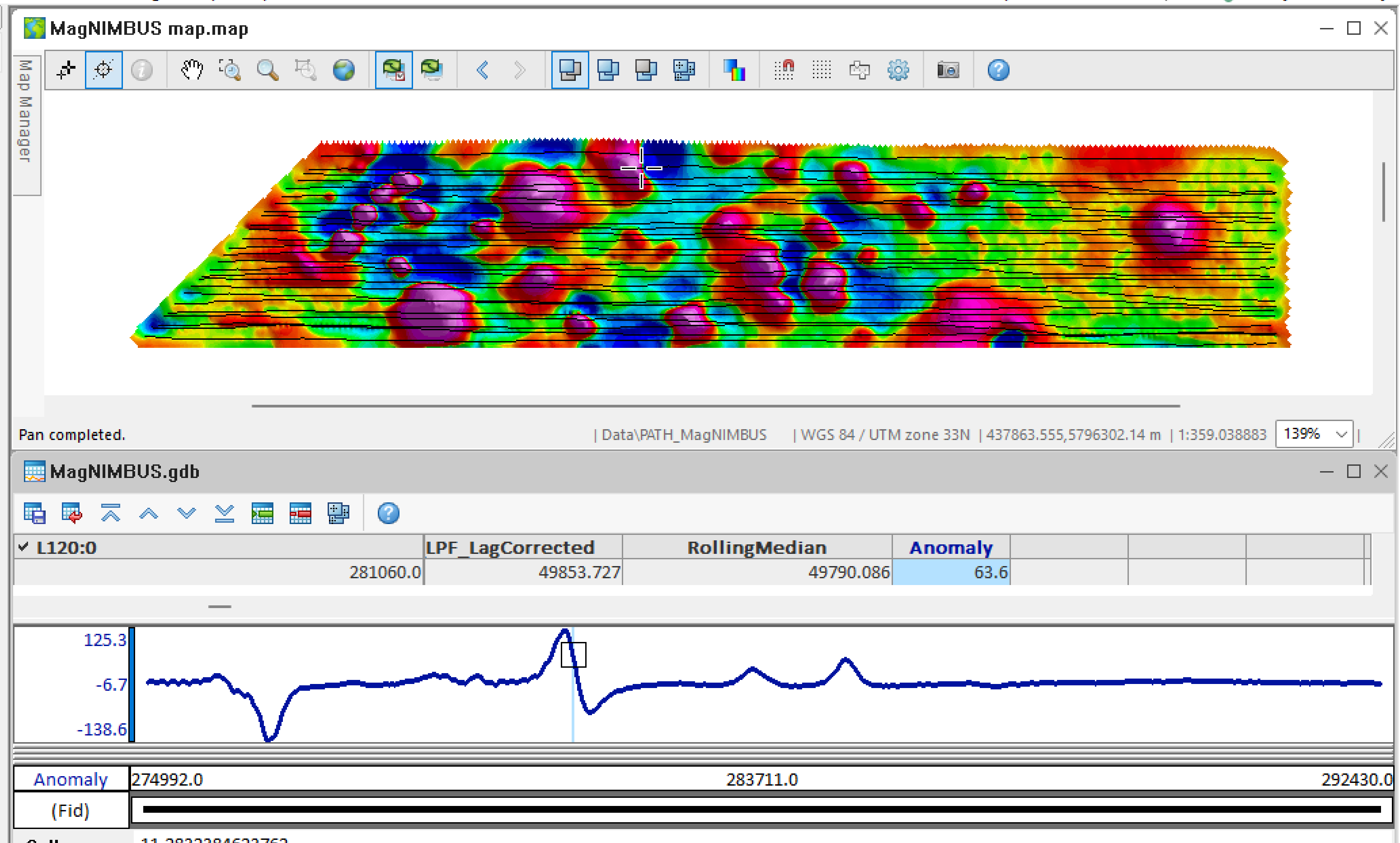
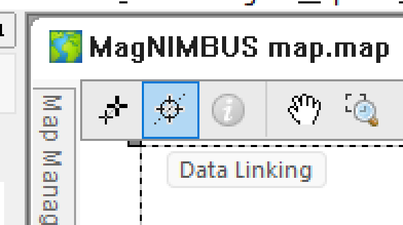
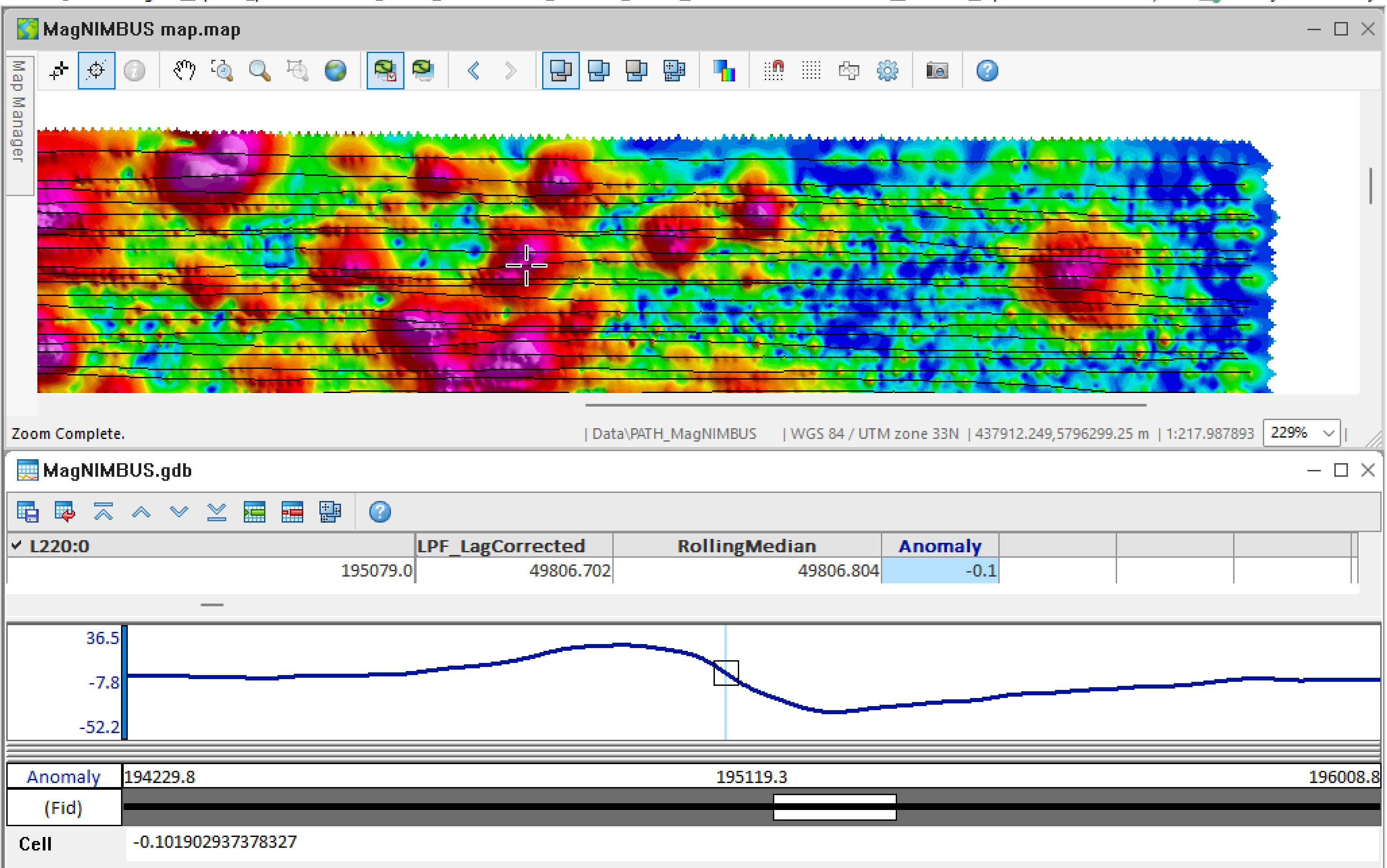
- Click the Data Linking icon.
- Now, when you click on a map, you will see the corresponding data in the database window.
Analytic Signal generation
On the map/grids created in the previous steps, you will see the positive and negative parts of the magnetic dipoles corresponding to our objects of interest. If the target is close to vertical orientation under the surface, you can see only positive or negative anomalies. When our target is oblong and nearly horizontal below the surface, the object's center is midway under the positive and negative portions of the dipole. But it is more convenient to have a representation of the data where the negative parts are “inverted,” and the map shows contours around our targets.
We will generate an Analytic Signal grid for that purpose.
- Select Grid and Image -> Filters -> Analytic Signal.
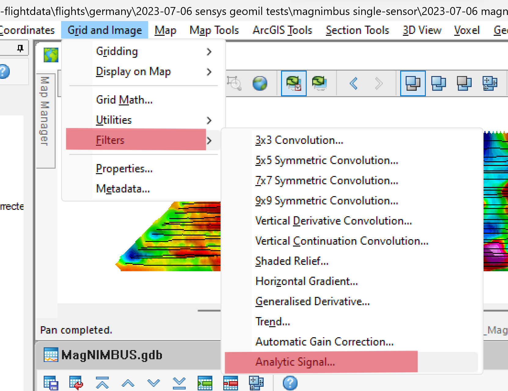
- Fill in the values as in the screenshot and click OK.
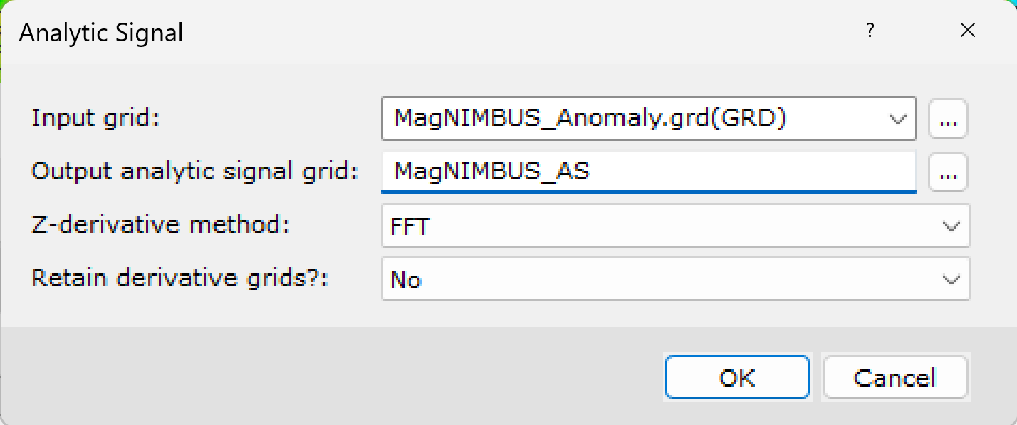
A grid of the generated Analytical Signal will appear on the screen.
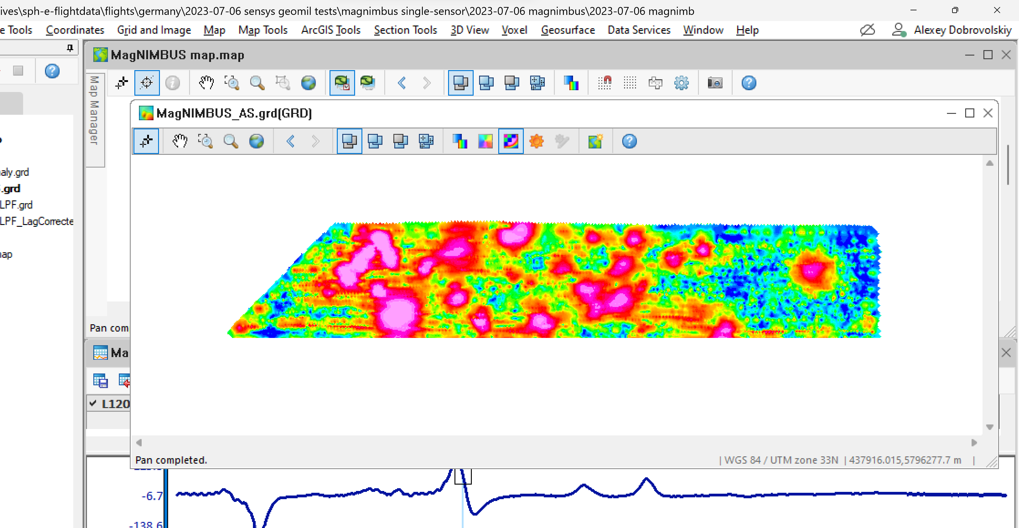
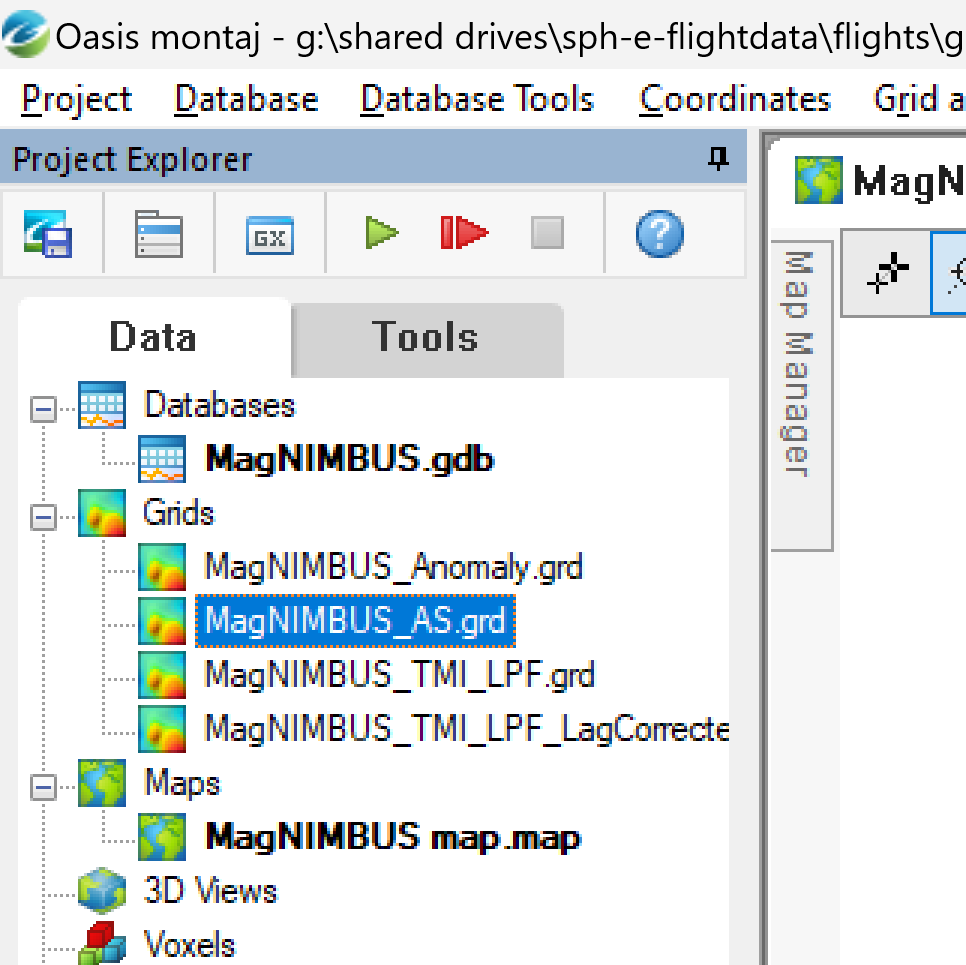
- Close the grid window and select it in the Project Explorer. Drag it to the map window.
- Select the added grid in the Map Manager and click Shading.
The map should look like below.
- Click Data Linking.
- Play with the map by clicking on the anomaly centers. You will see that the centers in the analytical signal representation are close to the centers between the positive and negative parts of the magnetic anomalies.
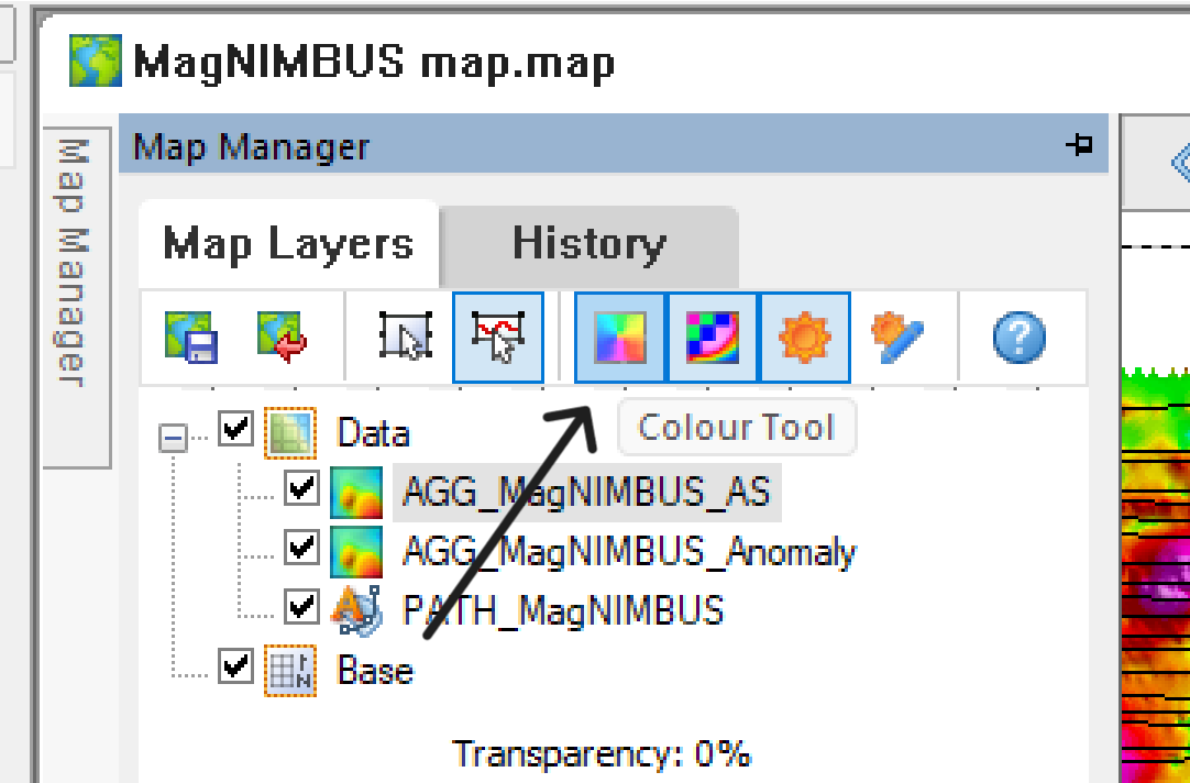
Adjusting palette
You may notice that the Analytical Signal grid appears cluttered with many weak and very small anomalies. This is because the default palette is optimized to make even minor anomalies visible in the presence of much more intense ones.
For airborne (drone-mounted) magnetometers, there is little point in displaying very weak anomalies with amplitudes below the system noise floor, so we can adjust the palette to make the data presentation cleaner and more contrasty.
- Click Map Manager, AGG_MagNUMBS_AS grid, and click Colour Tool.
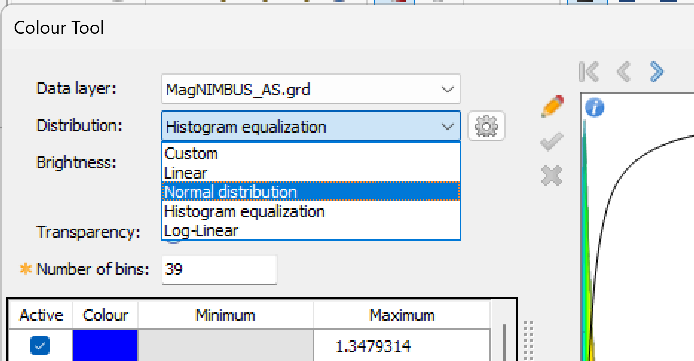
- Select Normal distribution in the Distribution list.
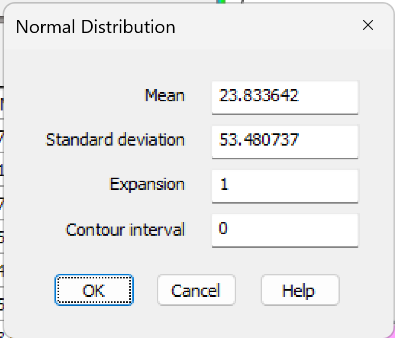
- Click OK.
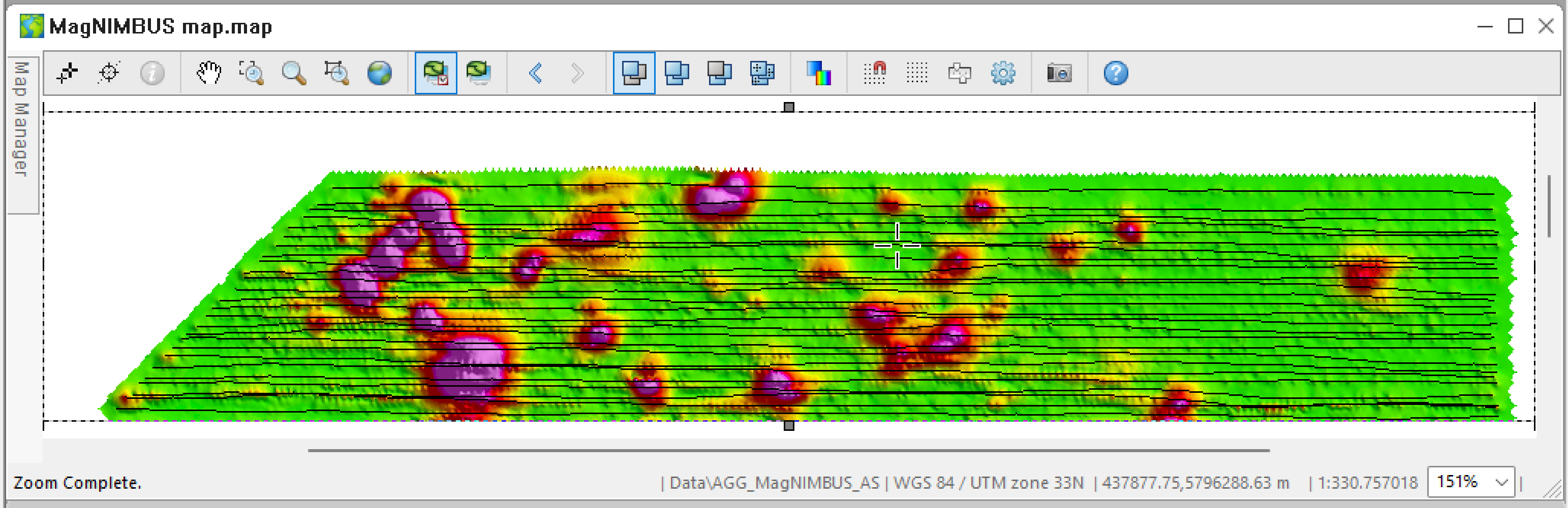
Enjoy a better view of the Analytical Signal.
We are done with data processing and visualization.
Export results: magnetic map
Doing the processing is cool, but you'll likely have to send some results to the client, and they won't have Oasis montaj in most cases.
Oasis montaj has many functions that allow you to prepare output materials, and the simplest form is the export of magnetic maps.
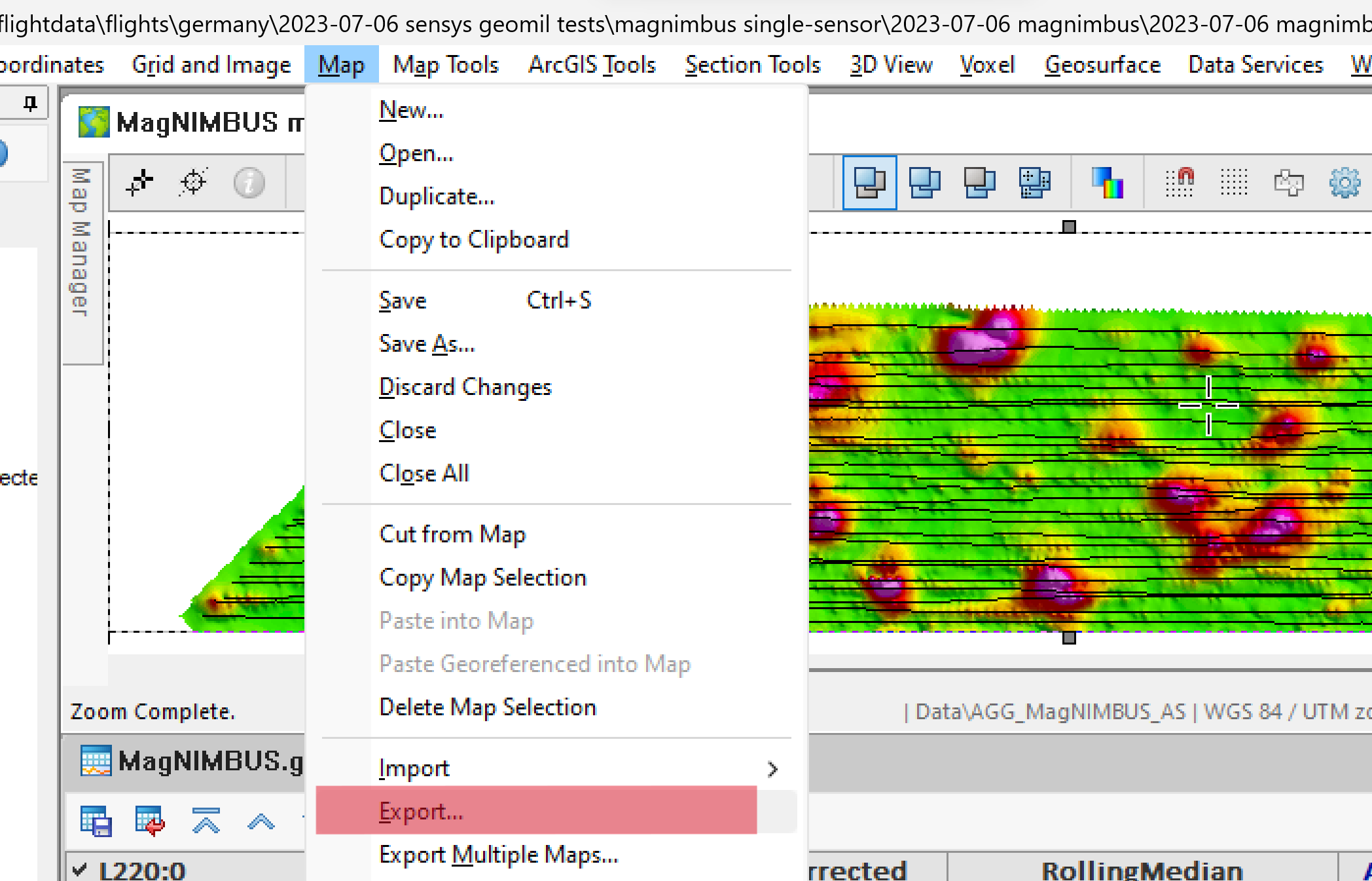
- Select Map -> Export.
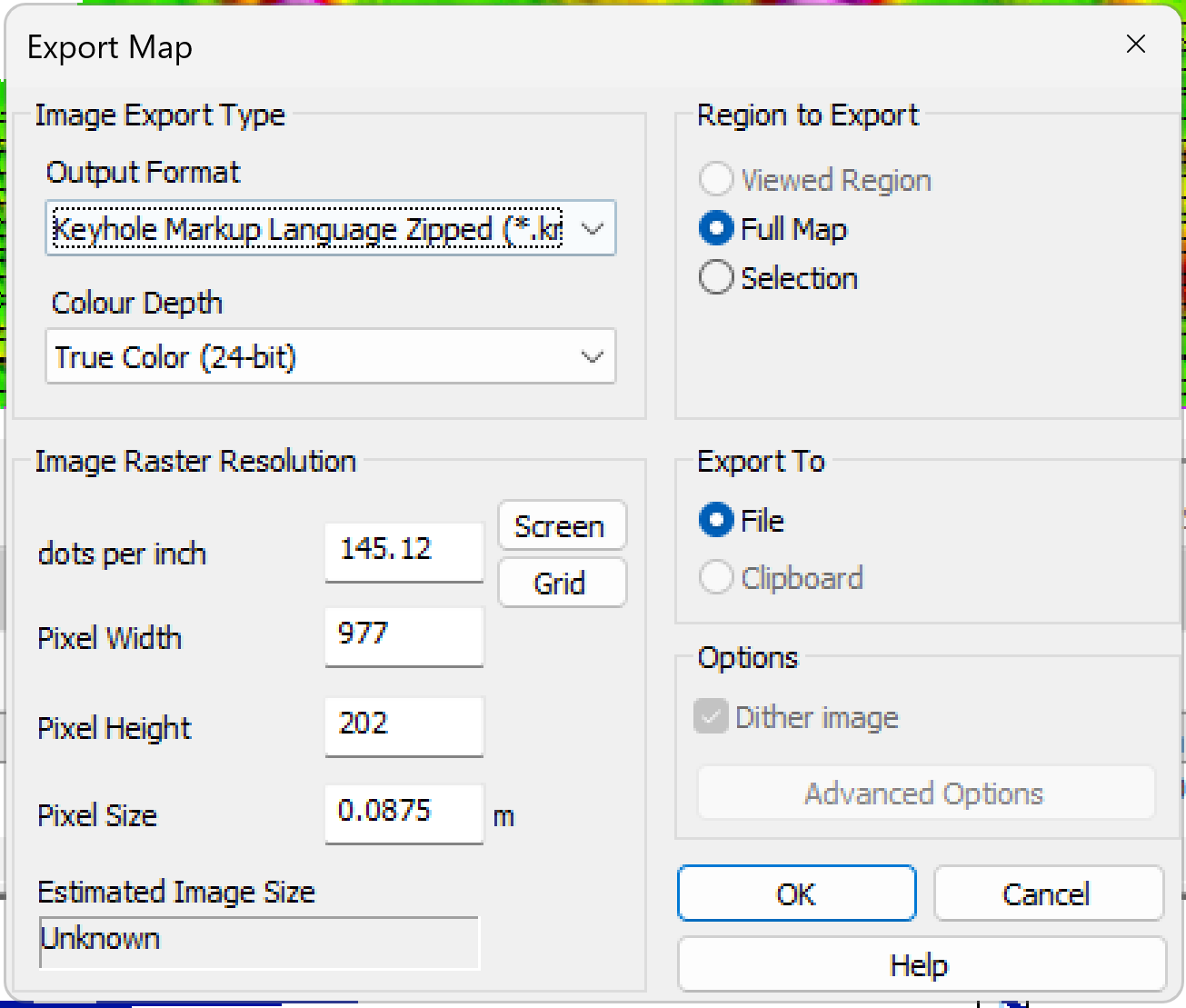
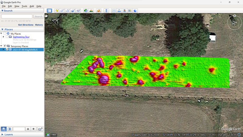
- Select Keyhole Markup Language Zipped (*.kmz) as Output Format. Click OK.
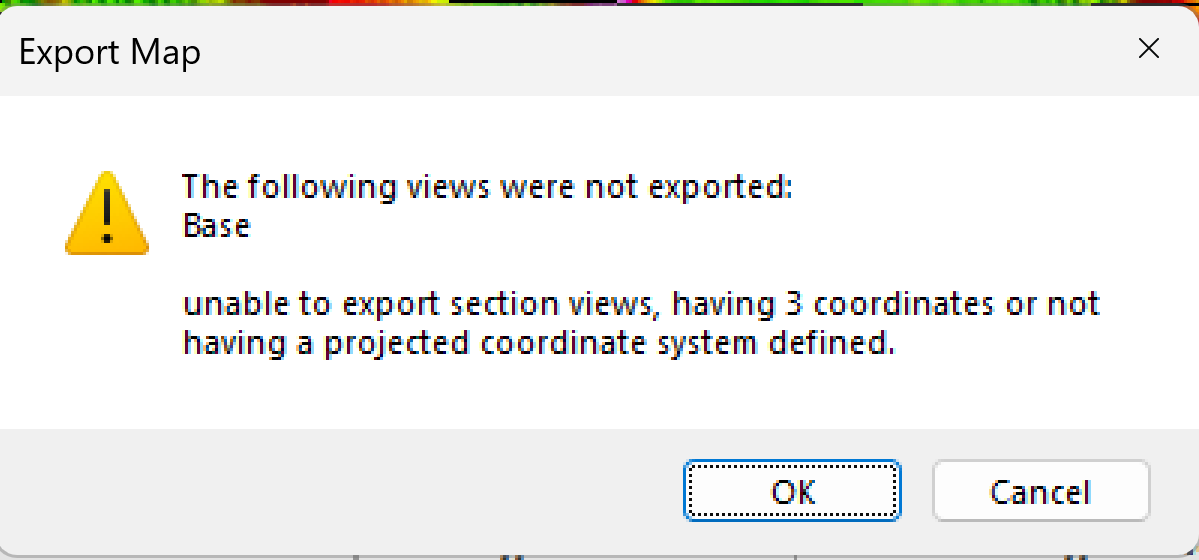
- Click OK to ignore that warning.
- Provide a name for the KMZ file, which will be created in the folder of your choice.
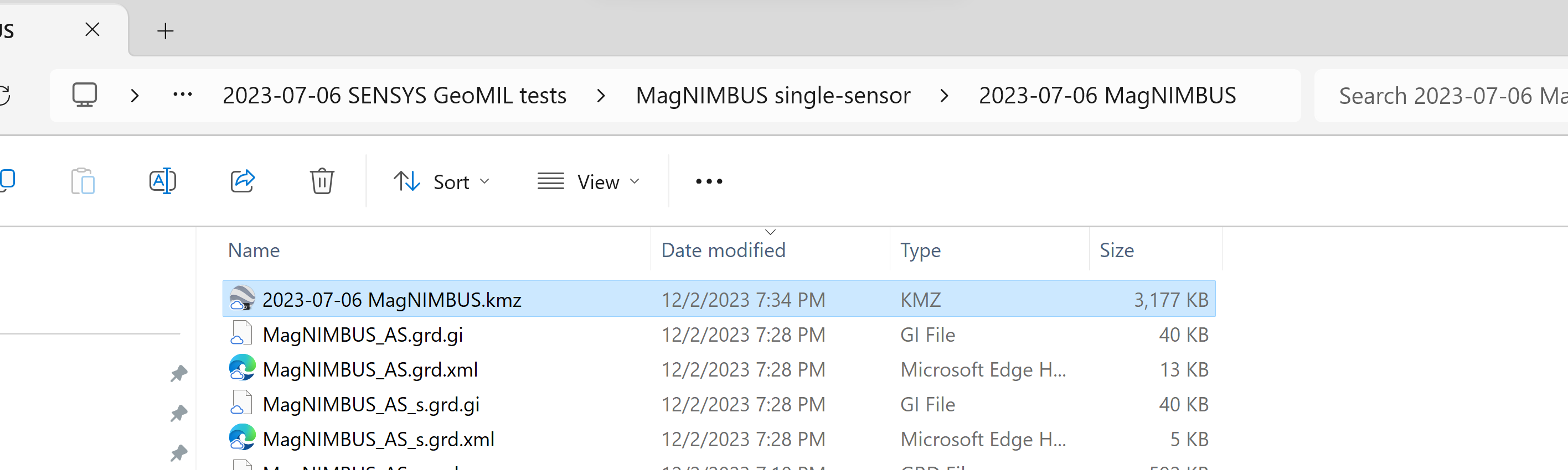
If you have Google Earth Desktop, you can open the magnetic anomaly map. Many GIS and navigation software packages can also open or import KMZ files.
List of detected targets
In many cases, you will have to provide a list of detected targets with their coordinates and some characteristics. Additional licensed modules, such as the "UXO Land" add-on for Oasis montaj can semi-automate this process. Still, if you only have the basic "Oasis montaj Essentials" license, you must manually mark all points of interest.
Let's populate the list of targets.
- Click the center of any anomaly on the map (if the Data Linking is active) or directly on the graph of the Anomaly value. Right-click and select Select Target.
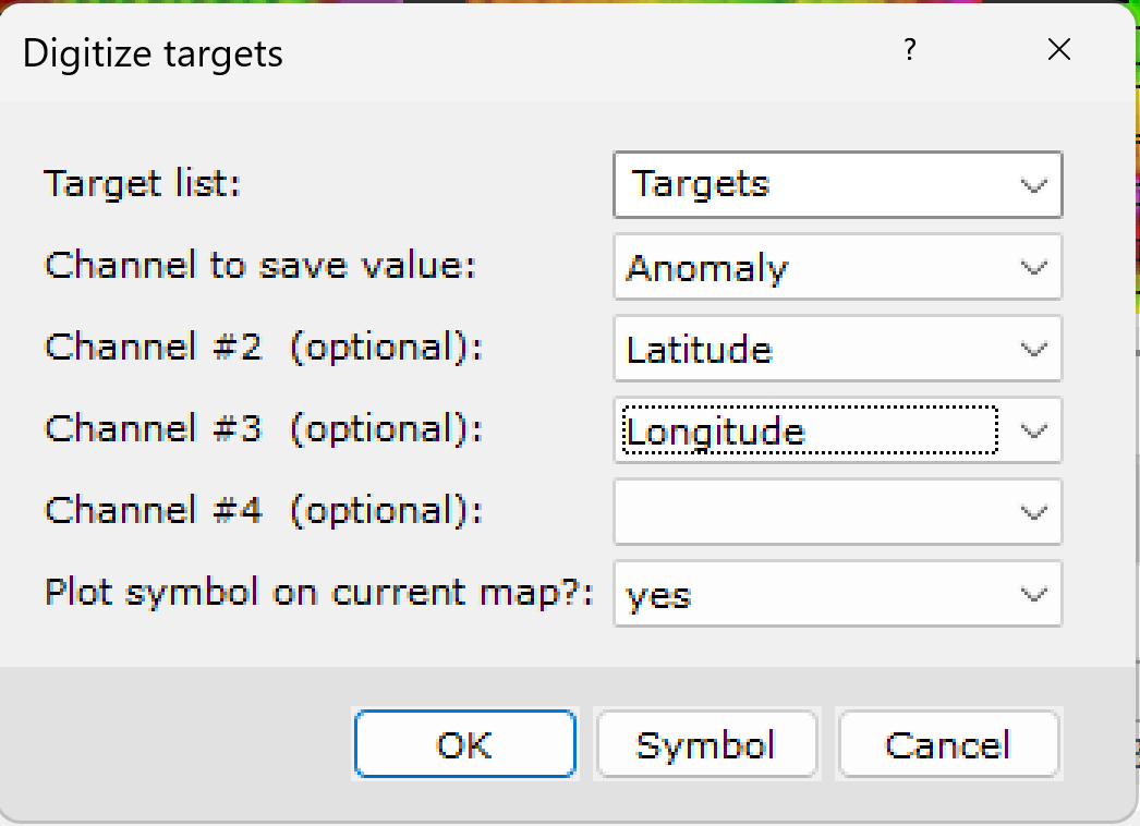
- The first time you do this, the Digitize Targets window will appear. Fill in the fields below and click Symbol.
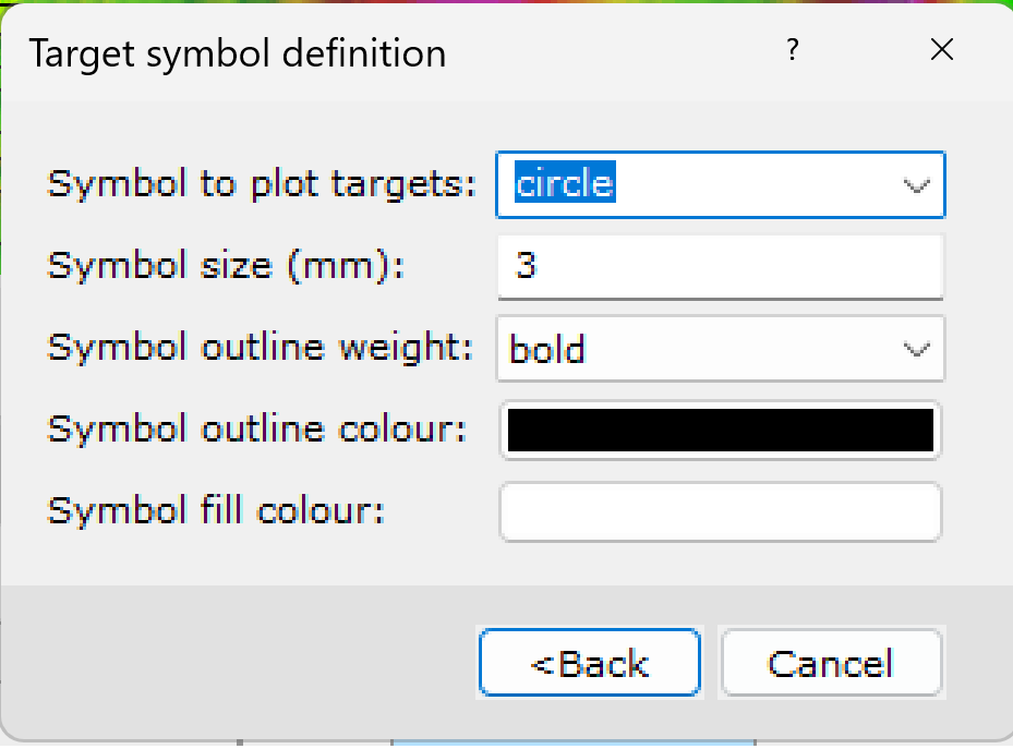
- Fill in/select the fields in the Target symbol definition window as shown below and click Back.
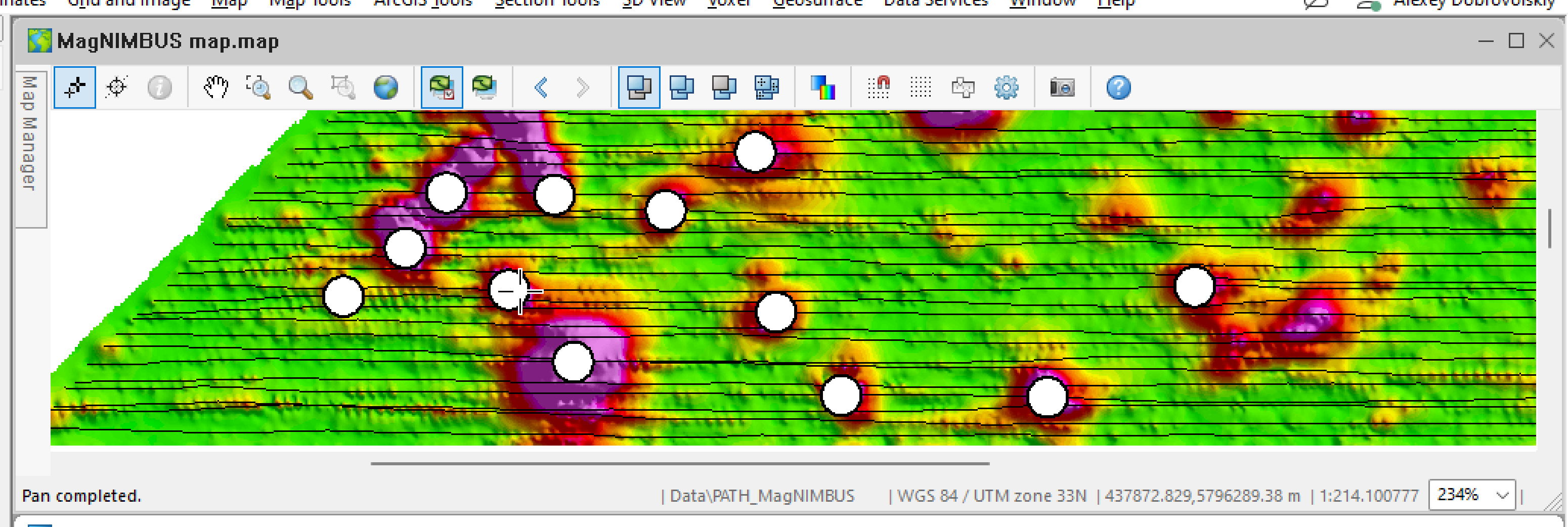
- Click OK on the Digitize Targets window. The center of the anomaly will be marked with a circle on the map. Repeat the procedure for all anomalies that you consider potential targets for excavation/investigation.
When you're done, you'll have to solve a quiz: Where is the list of targets stored? The first time, I spent a lot of time finding it :-(.
- Right-click the leftmost column header in the database window (with the line name). Click List.
- Scroll down and find the “Targets” entry. Click on this entry.
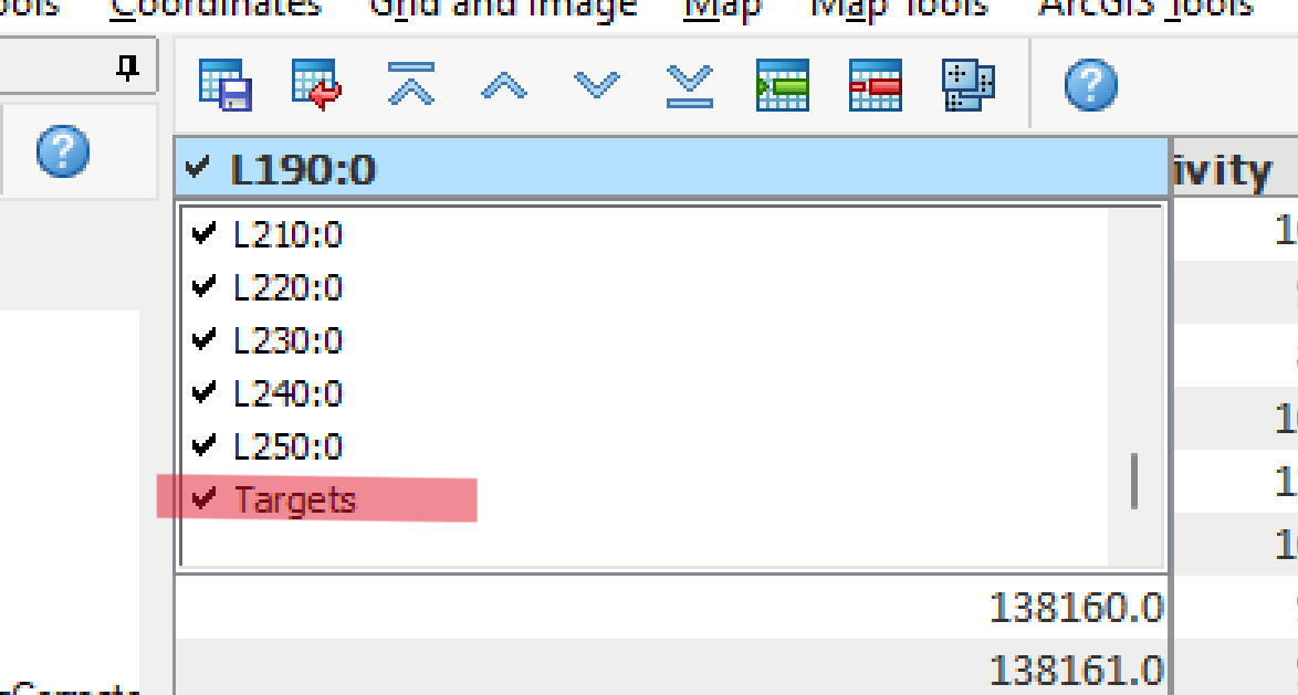
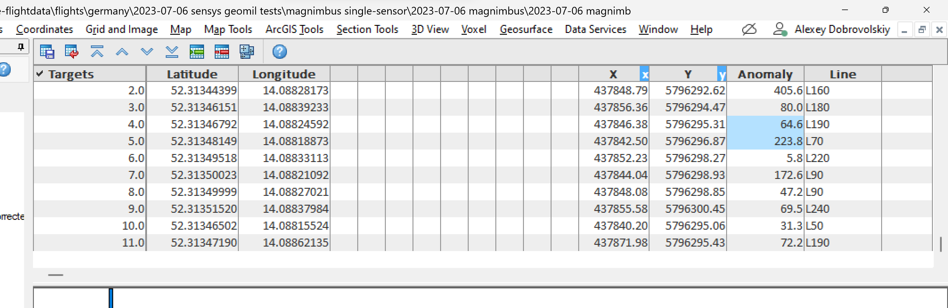
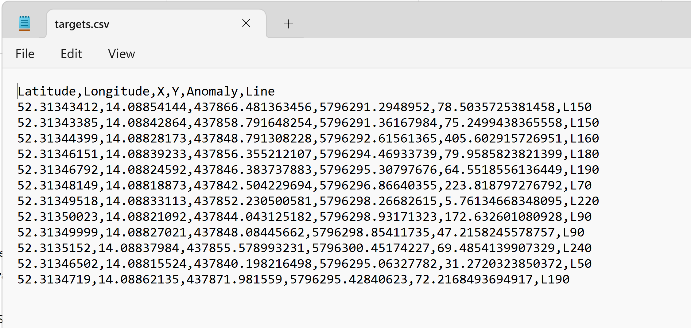
The list of marked targets is here.
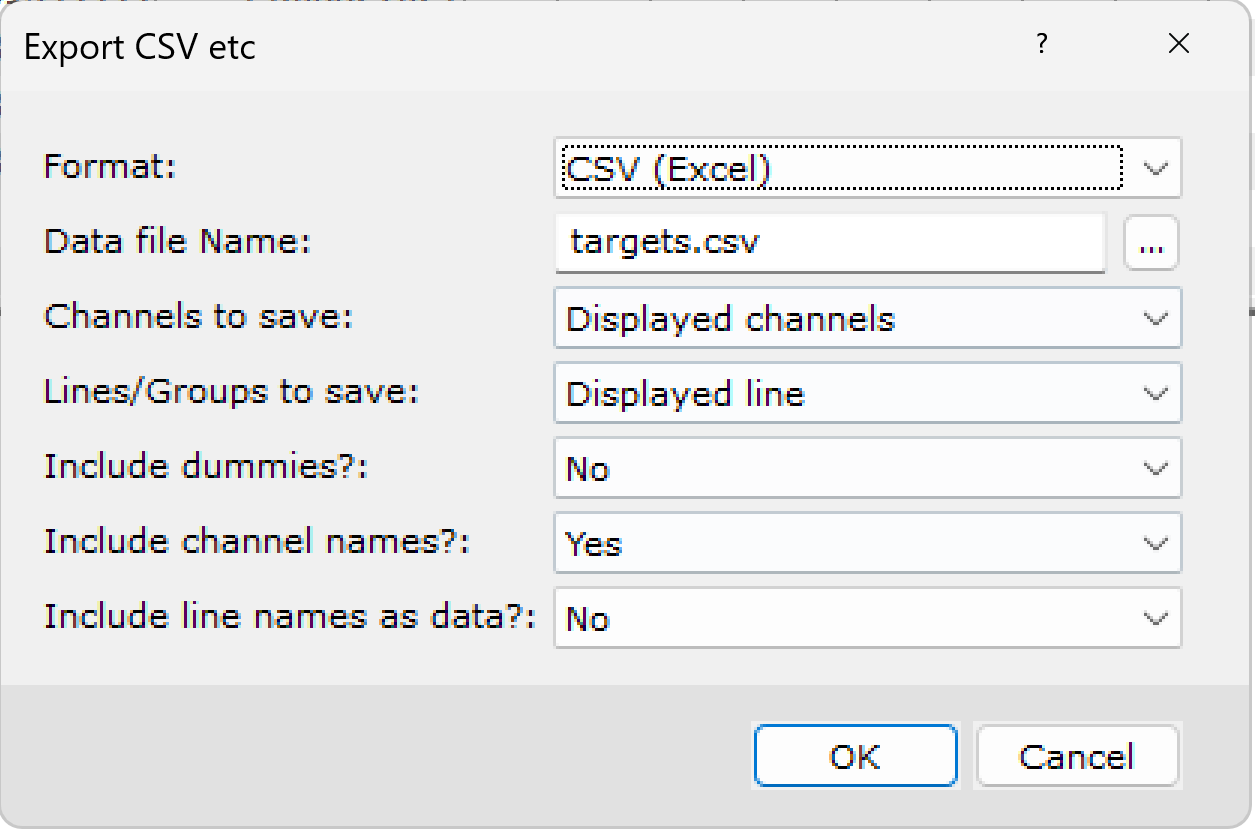
- Select Database -> Export -> CSV etc.
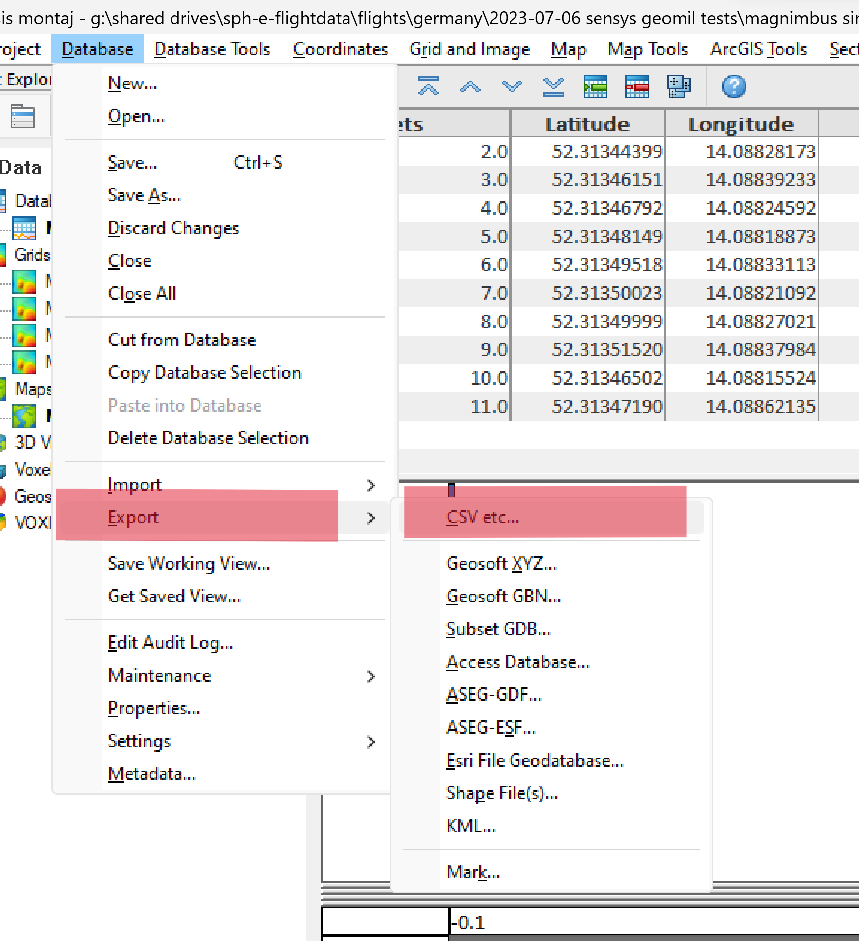
- Fill in the values as in the screenshot and click OK.
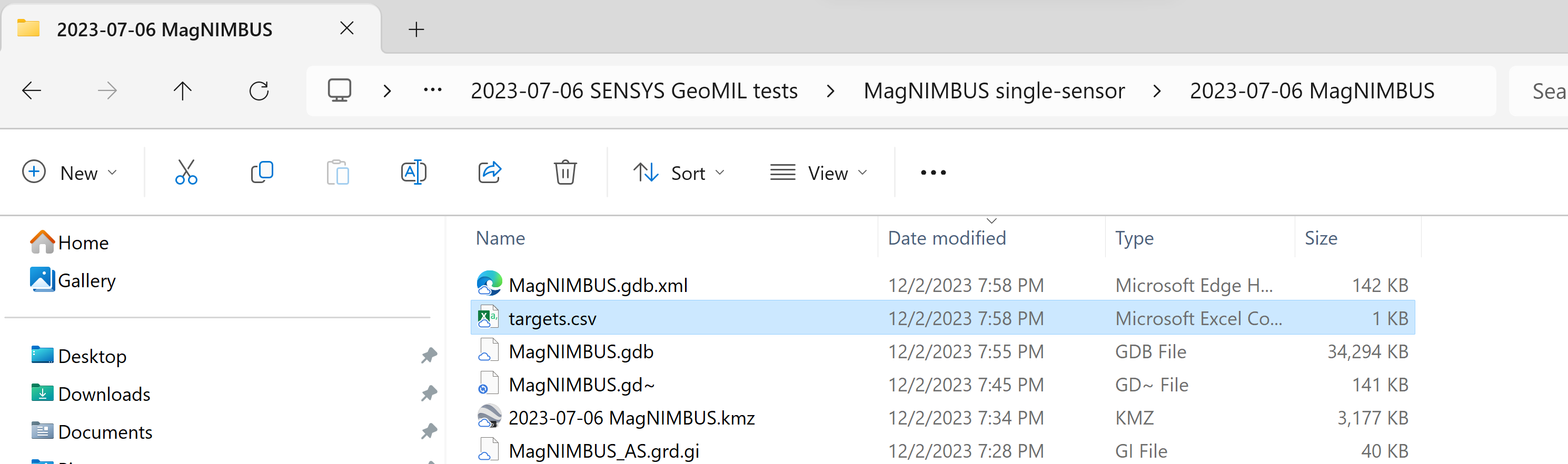
- Specify the name and folder for our ultimate final result.
- That's all.
Discover the Livestream of UXO magnetometer data processing with Oasis montaj performed by Alexey.